Bree Perú
March 2011
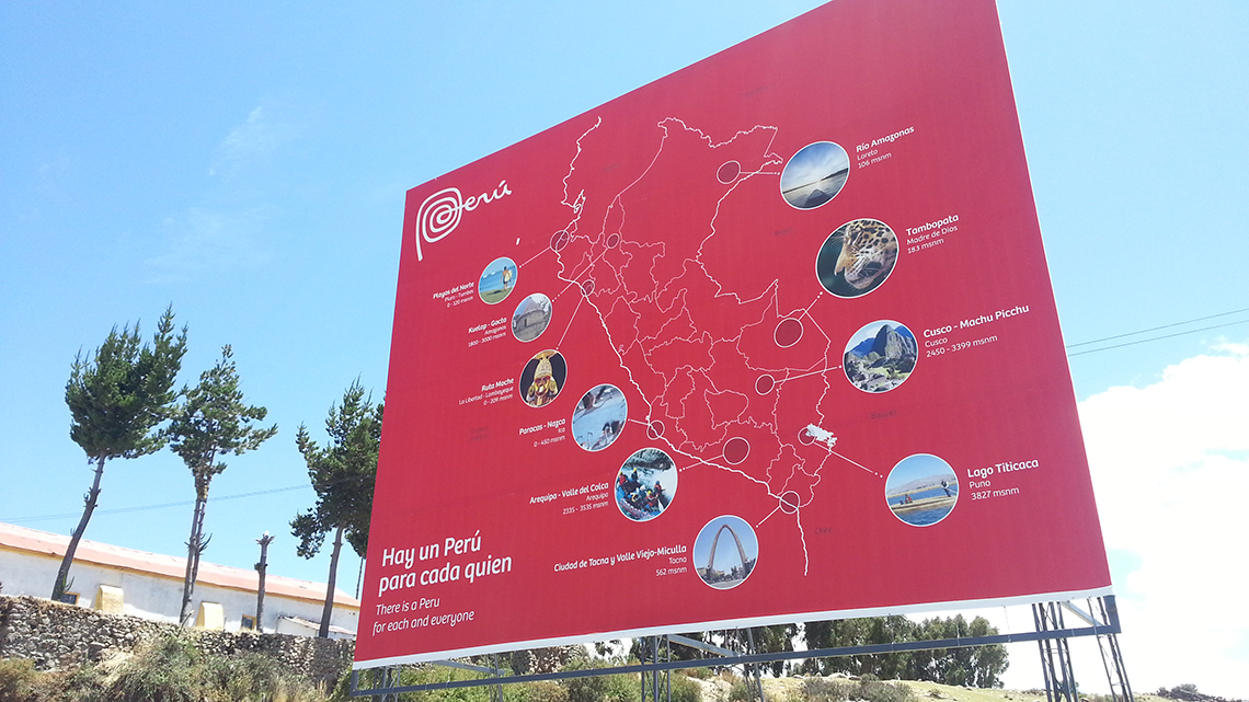
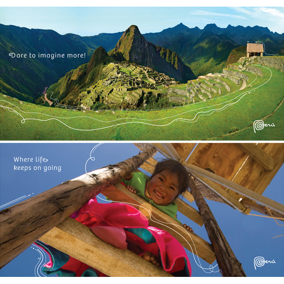
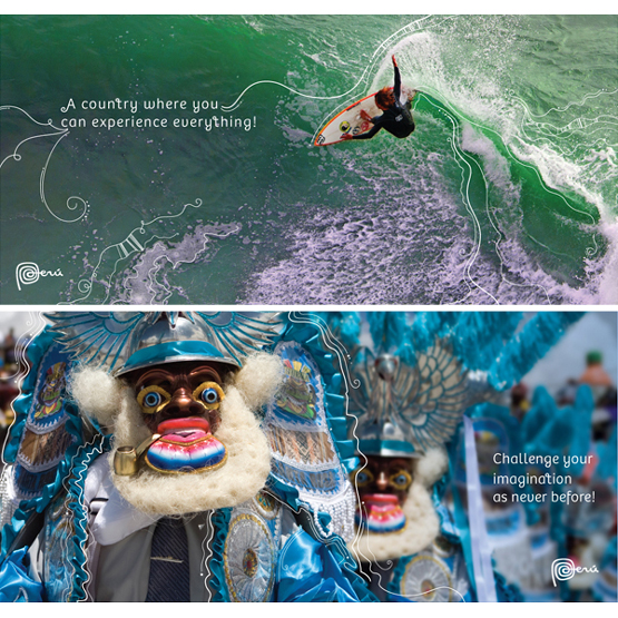
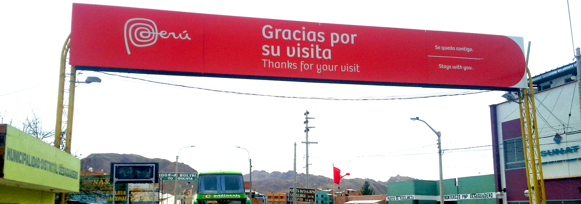
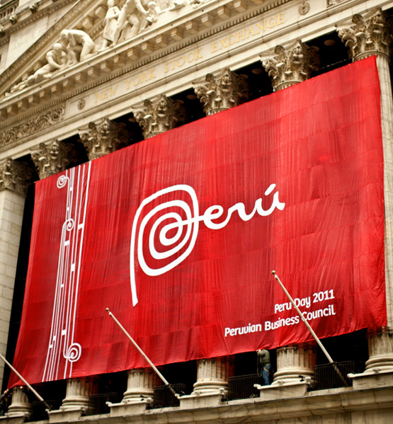
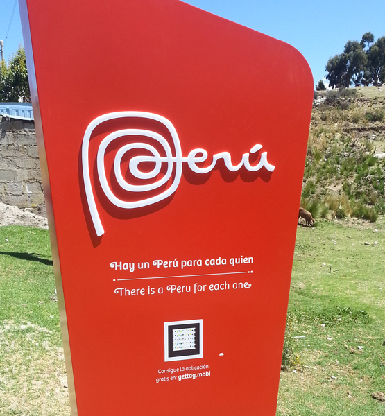
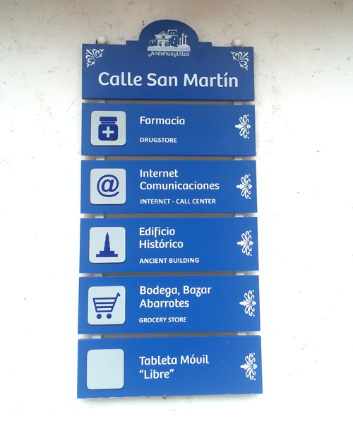
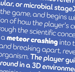
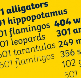
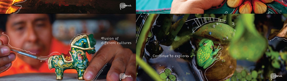
Design studio FutureBrand commissioned this customized version of our successful type family Bree. The objective was to introduce a series of changes that would help connect the typeface to the new logotype of the country brand for Perú, which is based on drawings from the Nazca lines.