|
Veronika Burian and José Scaglione met and developed a respectful kinship while completing their Master’s degrees in type design at University of Reading, UK. Established in 2006, TypeTogether is an independent, cosmopolitan type foundry that creates text typography for intensive digital and print editorial use.
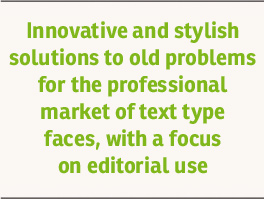 TypeTogether has grown into a core team living worldwide and invested in the daily work, networked with other type designers who intermittently cooperate on specific projects. TypeTogether creates innovative and stylish solutions to the greatest problems in the professional typography market, establishing a unique, diverse, curated font platform. This is where the greatest challenges are faced: creating typefaces that perform well in continuous reading and which also have a high degree of personality.
|
The aesthetic and functional efficiency of TypeTogether's fonts are accompanied by excellence in technical performance. This is achieved using the latest font software to create cross-platform OpenType fonts with extended character sets, including broader language support and all kinds of typographic refinements such as small caps, ligatures, and multiple numeral sets.
To carry an organisation’s unique voice across all communications, TypeTogether creates custom type solutions for discerning clients worldwide. Distinct advantages in your market can be gained through logotype creation, commissioning a brand new typeface, modifying existing typefaces, or extending language support.
Our custom typeface projects are develped upon the solid foundations of the client’s brief, targeted research, and close collaboration with all involved parties (advertising agencies, software developers, and language advisors, to name a few). A big advantage of being a small and specialized company is that this allows for closer and more direct collaboration with clients, which is often necessary to accomplish their goals and respond quickly to their needs. The quality of TypeTogether's work has already been recognized in several international competitions, including Granshan, TDC, and ED-Awards. |
TypeTogether s.r.o.
Korunní 810/104, Blok F
101 00 Praha 10, Vinohrady
Czech Republic
IČO 29034159
DIČ CZ29034159
Korunní 810/104, Blok F
101 00 Praha 10, Vinohrady
Czech Republic
IČO 29034159
DIČ CZ29034159
About Us
TypeTogether is an indie type foundry committed to excellence in type design with a focus on editorial use. Additionally, TypeTogether creates custom type design for corporate use. We invite you to browse our library of retail fonts or contact us to discuss custom type design projects.