|
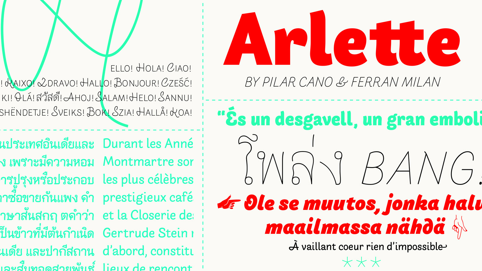
Arlette sneak peek: Expanding the sans perception
Next time you hear from us, you’ll also be seeing progress in the form of the new Arlette family. Pilar Cano (creator of the Edita family) and Ferran Milan have created a sans serif with an experimental, organic nature that has the ability to stretch the parameters of what a sans can be. Arlette will come in Latin and Thai and is perfect for editorial design, branding, teen and young adult magazines, book covers, and a lot more. It’s almost time for a bold, new addition.
READ MORE
|
| |
|
|
|
|
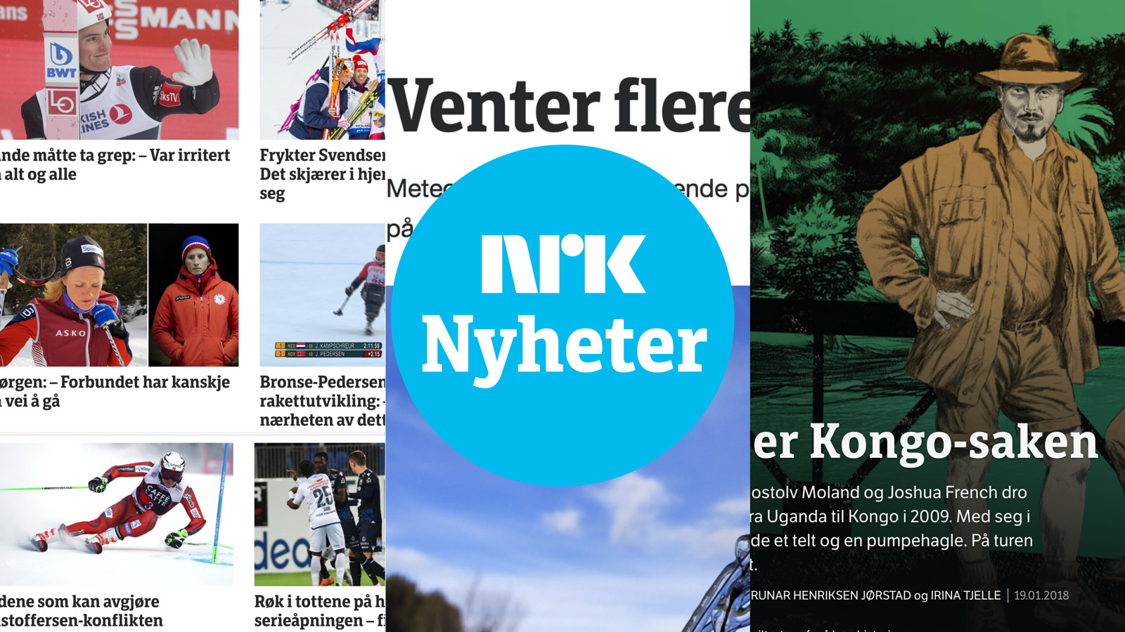
Custom fonts anchor Norway’s NRK TV & web
The Norwegian public TV station, NRK, commissioned TypeTogether to create a tailored typeface for their new branding. Based on Leftloft’s LFT Etica, which had been already established in NRK’s identity program, the custom type for NRK is a collaboration with Leftloft and Scandinavian Design Group (SDG). After several rounds of testing and refining the typefaces, the two fonts (a book and bold weight of NRK Etica Slab Semicondensed) are now used together with LFT Etica on the web and TV for headlines, graphics, and some supportive areas. As a spin-off from this custom project, Leftloft, together with Octavio Pardo, continued to expand and develop a whole set of weights which then became the workmanlike LFT Etica Sheriff. Need a custom type family or have questions about our process? Then drop by our website’s Custom Type section or send us an email.
READ MORE |
|
|
|
|
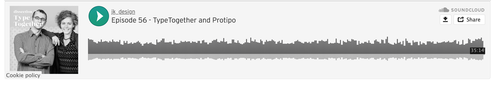
Dissection interview about Protipo
Co-hosts Christopher Holewski and Jason Alejandro run Dissection, a podcast that interviews design practitioners across a variety of fields to tell the in-depth story behind one project of their own choosing. José and Veronika were recently interviewed about the inspiration and making of Protipo, our type family for information design. This episode was sponsored by The Typographics Festival, at which Veronika and José will be speaking.
READ MORE |
|
|
|

|
Protipo Variable
When we released Protipo we said the Variable font version was on its way, and now it’s here! Whenever the entire Protipo bundle is purchased, the VAR is included. (Please get in touch if you bought the full bundle so we can provide the VAR.) This is great news because VAR is one way of making the future happen today: all possible instances of a type family in one file, a significantly smaller file size, and the ability to use it on modern web browsers like Safari and Firefox. To help explain VAR’s benefits, our own type designer and code manipulator, Irene Vlachou, has written a post about it.
READ MORE |
|
|
|
|
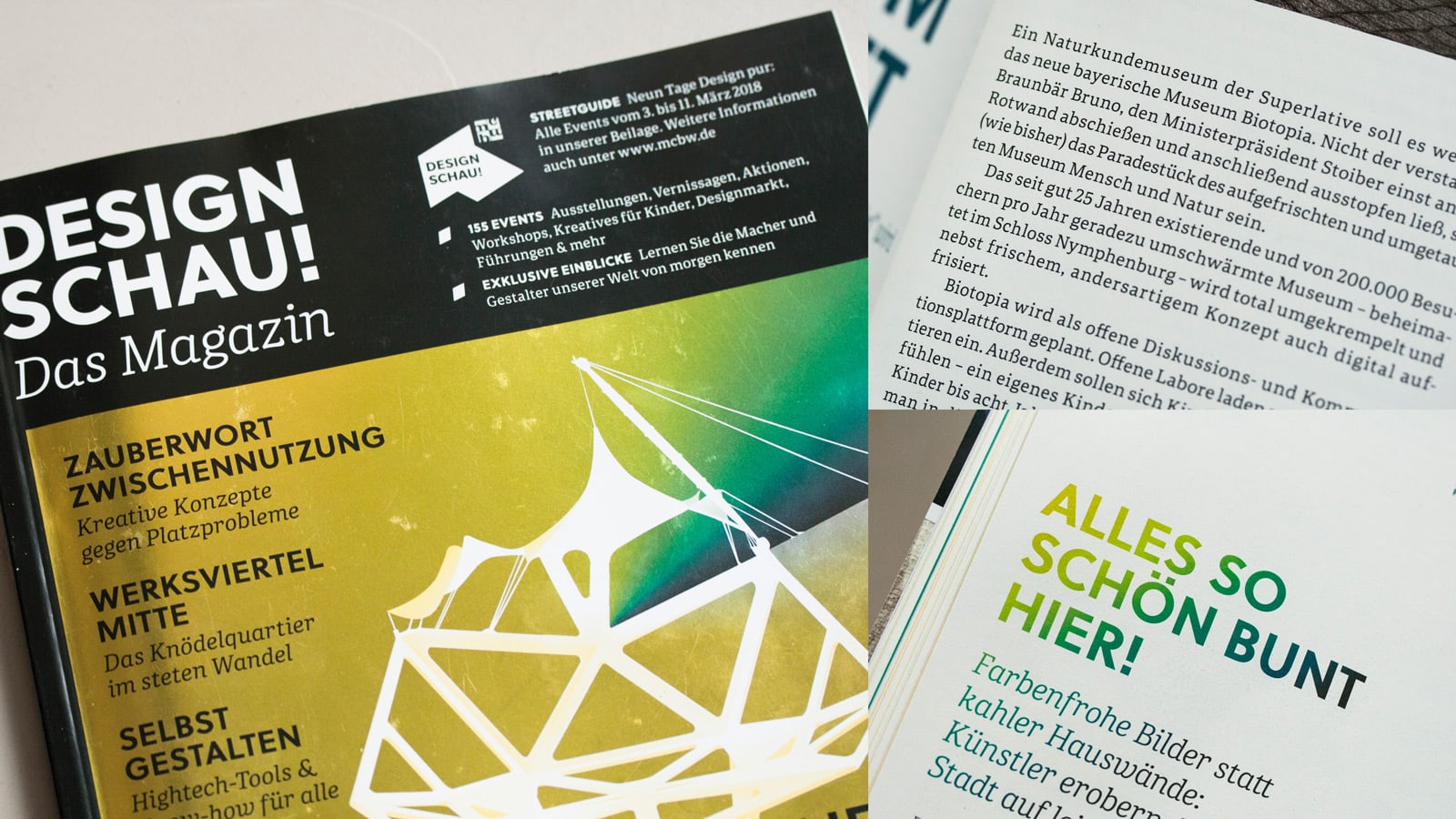
Type in use: Portada and Soleil, Design Schau Magazine
Munich celebrates design each year during the DESIGN SCHAU, organised by Munich Creative Business Week (MCBW). This year the programme consisted of 155 events, exhibitions, activities, and conferences across the whole city for the week of 3–11 March 2018. The magazine designers at Kochan & Partners chose Portada Text for all body copy and Soleil as the main titling font and for captions. A few of our other fonts also made an appearance: Trevor, Fino, Bely, and Iskra. TypeTogether is a proud sponsor of MCBW this year, and in particular of Design Schau magazine and the Editorial Design Conference (EDCH).
READ MORE |
|
|
|
%%emailaddress%%

To stop receiving these emails:%%unsubscribelink%%
|