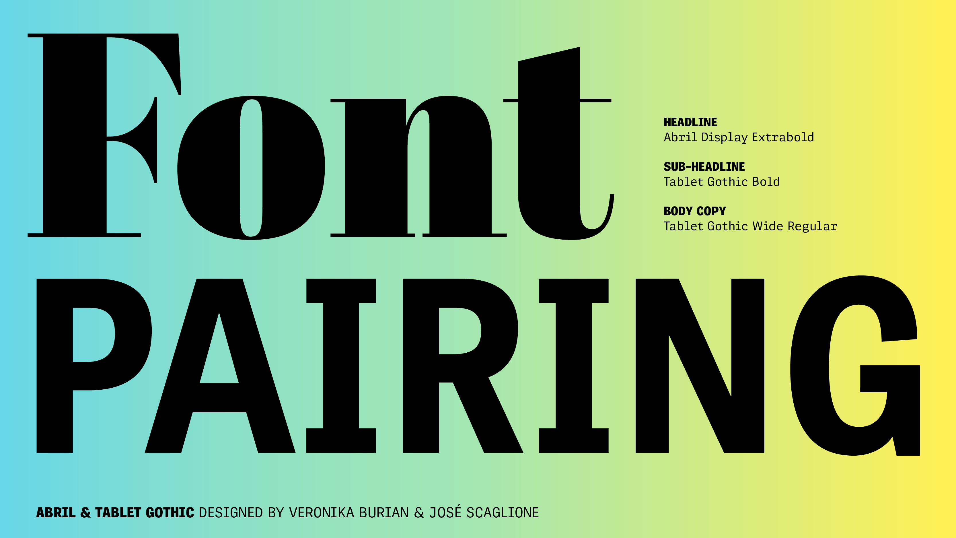
Perfect pair: Abril + Tablet Gothic
Since we design our font families with their uses and pairings in mind, we make it easy to know how to start, what to look for, and what to avoid. You can read this article on ten tips for font matchmaking later, but let’s look at a tried-and-true TypeTogether classic: Tablet Gothic and Abril. From their x-height and styles to their differences and details, this duo was quite literally made for each other.
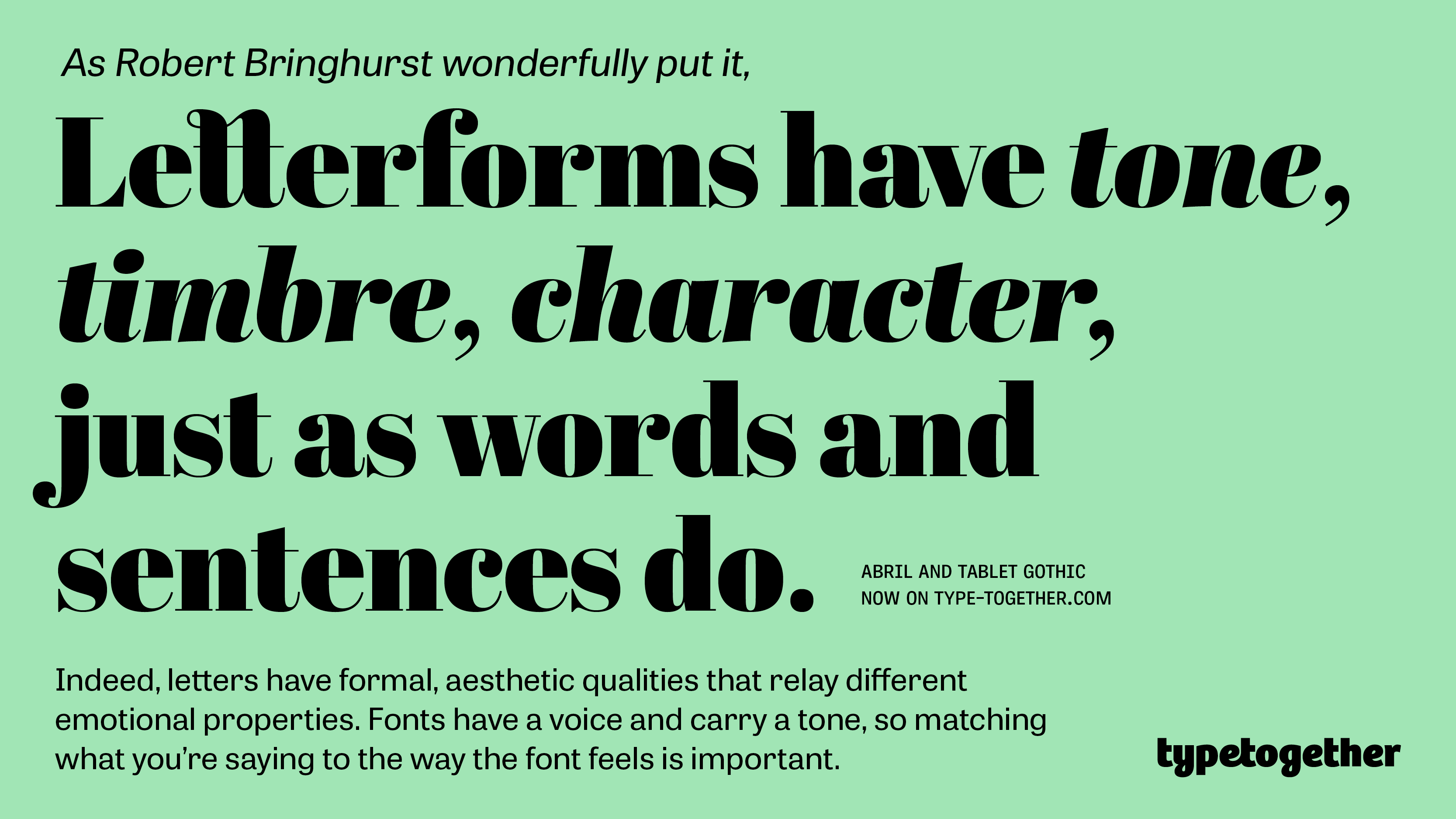
The Abril font family is a credible, contemporary interpretation of a classic newsface and is perfect for high-density use in newspapers, magazines, and digital media. The Display styles have a strong presence and a newsy feel on the page, while the Text styles were engineered from scratch to achieve the right factors for comfortable, continuous reading in pixel and print environments.
The 84 weights of Tablet Gothic make it a pleasing, comprehensive family for extensive digital and print publications. Need both flexibility and graphic coherence amidst dense amounts of information? Tablet Gothic delivers the sturdy, straightforward, and clean look expected from a grotesque while allowing its personality to stand center-page.
GO TO ABRIL
GO TO TABLET GOTHIC
|