TypeTogether’s monthly newsletter is here! The brand new Lektorat family, an article on typesetting Latin, a 25% educational discount, and more!

Typetogether - Newsletter
NEWSLETTER: OCTOBER 2020
New release: Lektorat by Florian Fecher

We are excited to announce the first release by 2019 Gerard Unger Scholarship winner Florian Fecher: Lektorat! Three variable fonts or 27 total flavors of a grotesque-style sans are now ready to set every kind of editorial you can imagine. Powerful headlines and subdued text to inform, persuade, and entertain. Read about its creation and try it on our type tester now!


GET THE FONT
Basic typesetting rules for major European languages

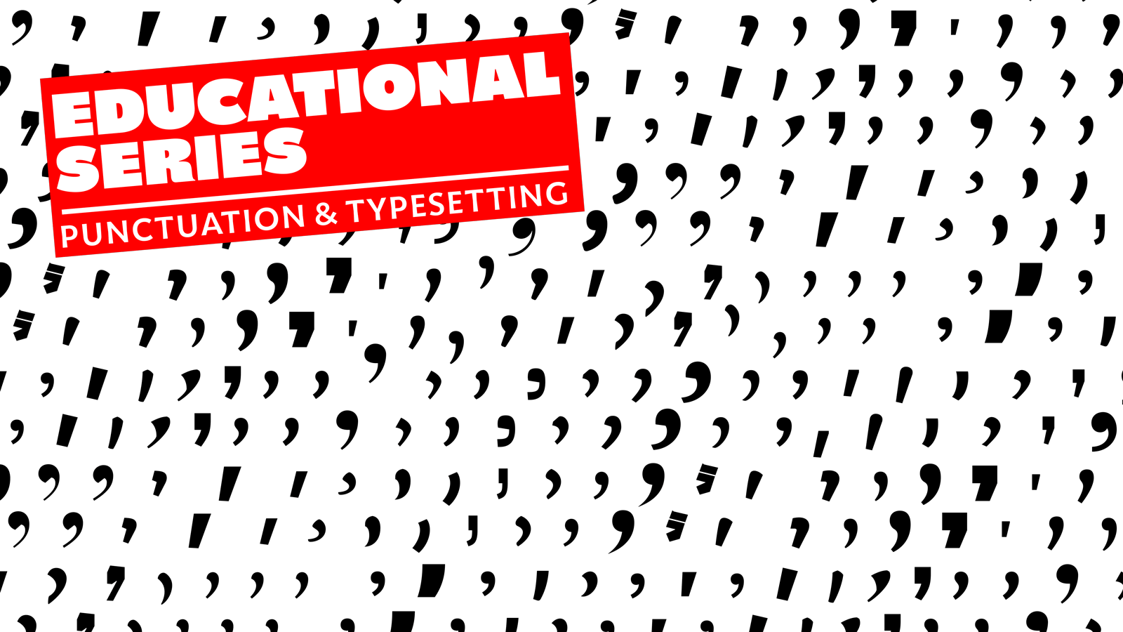
Typesetting Latin-based languages

We’ve rolled out so many educational articles over the last couple years, we’ve almost lost track. From our good friend and erudite publisher, Filip Blažek, comes the latest article on the differences encountered when setting various Latin-based text. German, Czech, French, English, Spanish, and many more are covered. Bookmark it to refer back to often!


READ MORE
type in use: Molto

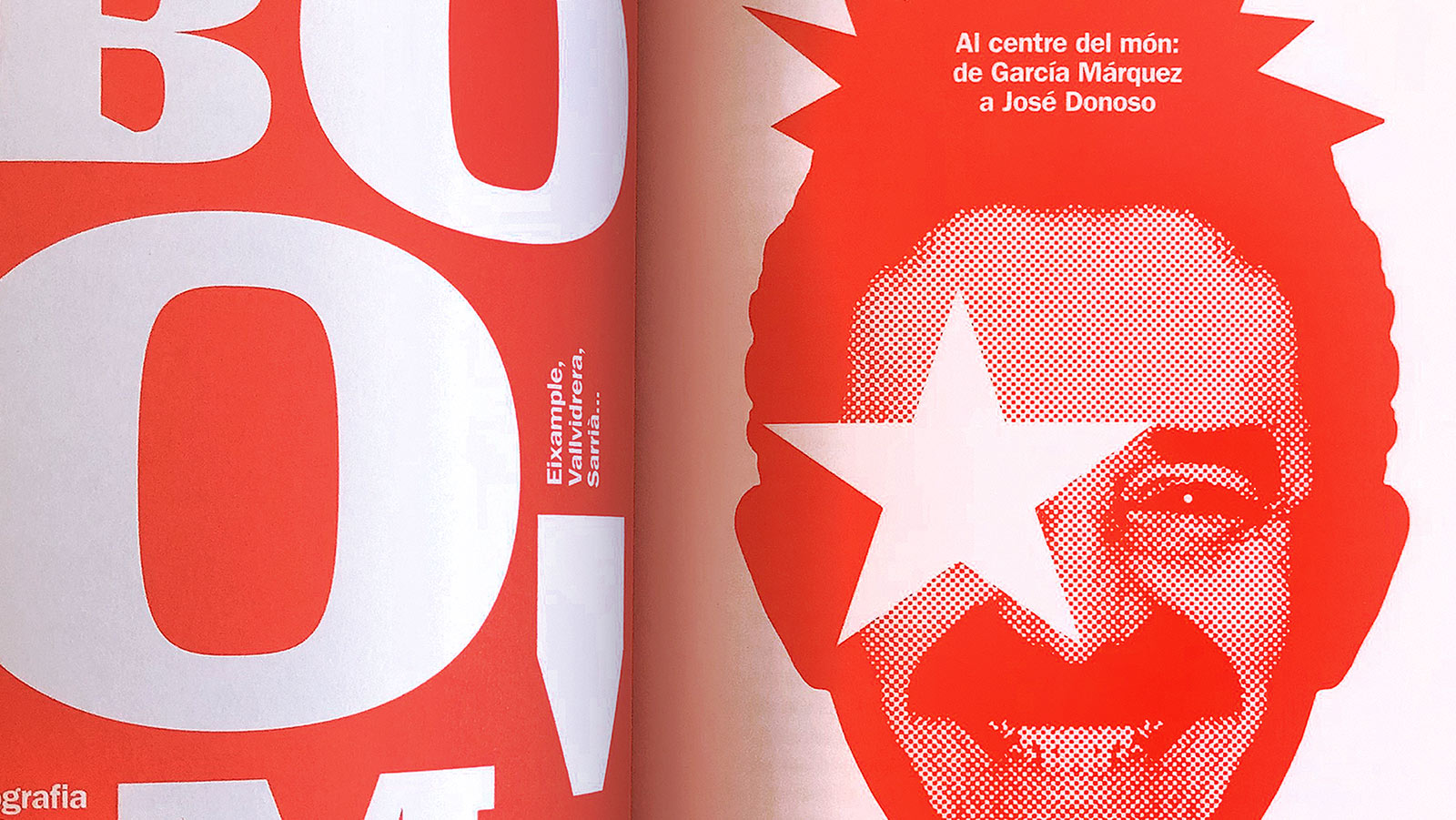
Barcelona, a literary journey

Barcelona: títol provisional: un viatge literari per la ciutat (Barcelona: provisional title: a literary journey in the city) edited by Andreu Gomila and Diego Piccininno offers the possibility of rediscovering Barcelona through the books that use the city as a main character. Eight respected authors are highlighted, and Molto’s presence is equal to them all. See the inspired layouts here.


SEE MORE IMAGES
Educational discount

25% back-to-school discount

Calling all students, teachers, and educational partakers! Thanks to 2020, you’ve likely just begun your oddest semester ever, so we’re here to make it much better. Buy anything from a single font up to entire families and get 25% off. You decided to improve yourself with education and service, so we’ve decided to improve your font library. Getting that chunk of change discounted is a simple two-step process, so send us an email to find out how.


SEE OUR FONTS
Work in progress

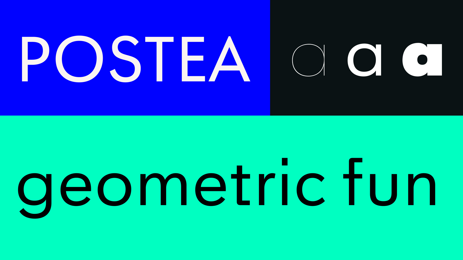
Postea: making progress with geometry

Geometric fonts often become “unfun” or aren’t high enough quality for discerning designers. We’ve been working on a little geometric something inspired by metal lettering on old post office buildings in Munich. Here’s a quick taste of what’s ahead.


SEE PREVIEW
Copyright ©2006–2020 TypeTogether. All rights reserved.

https://www.type-together.com/
						
To stop receiving these emails click here