Typetogether - Newsletter
NEWSLETTER: DECEMBER 2017
Adelle Sans Arabic

Adelle Sans Arabic

The Adelle Sans family keeps growing! We began with the Latin-based languages, then expanded to include Armenian, Cyrillic, and Greek. Now we are proud to announce the release of Adelle Sans Arabic! This family has been a long time in the making and we are happy to finally make it available to the public. Arabic is inherently more organic than Latin, so Adelle Sans Arabic should speak in a softer voice than its Latin counterpart. Stop by the website and see how they function together and how Adelle Sans Arabic builds upon the legacy of its predecessor. Designed by our incredibly talented teammate Azza Alameddine, with expert consultancy by Borna Izadpanah.


READ MORE

25% Discount

25% discount on every family

2017 has been a fantastic year for TypeTogether! We launched our brand new website, we expanded the team with two new teammates, Pooja and Joanca, and we released seven new families: Lisbeth, LFT Iro Sans, Athelas Arabic, Trevor, Noort, Noam Text, and just this month, Adelle Sans Arabic. We have travelled, we have interviewed our type designers, our typefaces have been awarded, and we have let you see it all on our blog.

To share our joy for every good thing we’ve received this year, we wanted to offer you a 25% discount on any font family in our catalogue through December 31. Please use the code ab53fc16 at checkout. But don’t wait until the new year because this discount is only valid until December 31, 2017. Our small TypeTogether team wishes you the merriest holidays!


CATALOGUE

Soleil in Poliversal

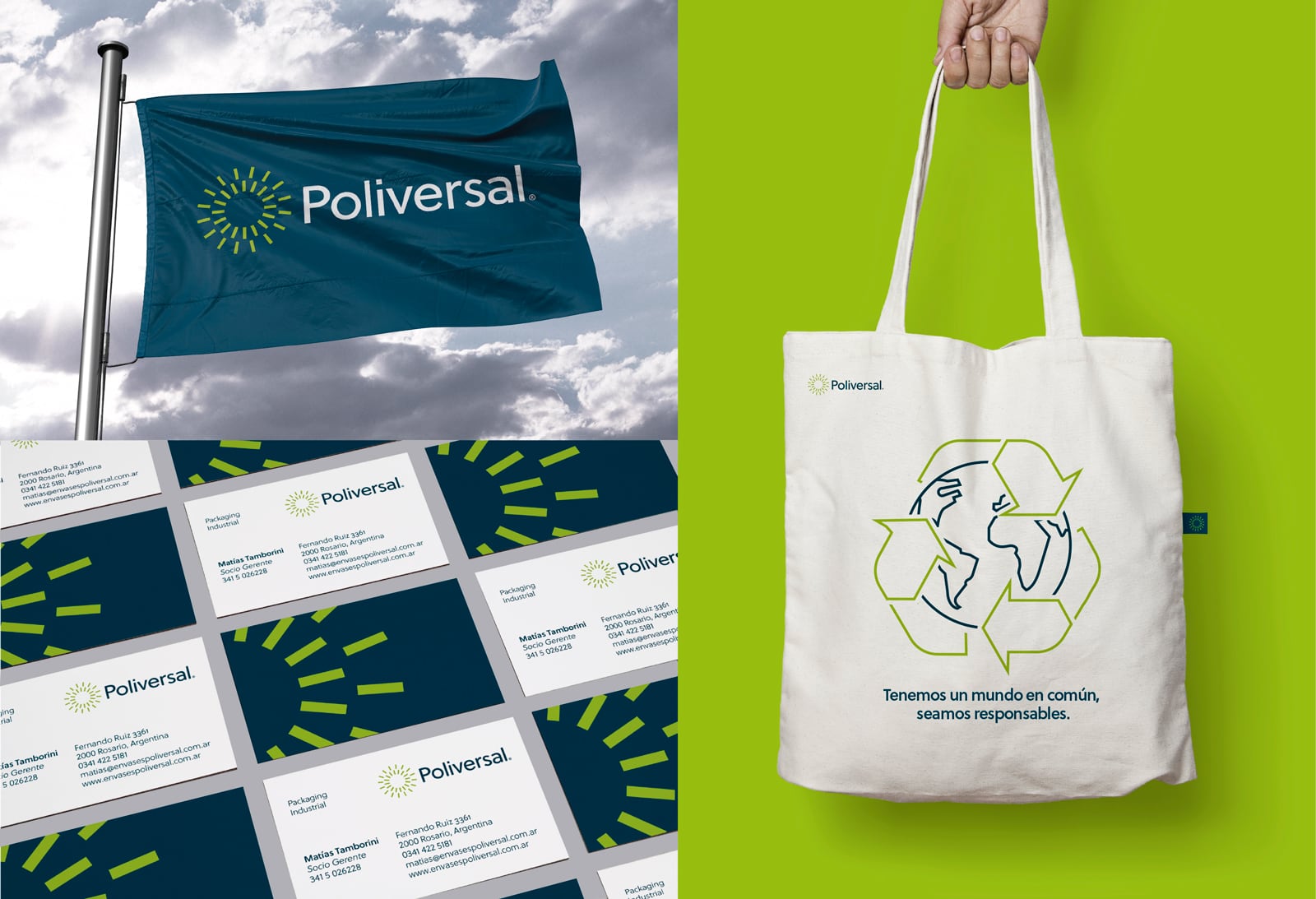
Type in use: Soleil in Poliversal

Tuco, an Argentinian design studio specialising in branding and brand strategy, recently redesigned Poliversal, a packaging company from Argentina. The new brand reflects the family-run values of the company and its commitment to the environment, while keeping a fresh and modern look.

For this task Tuco chose Wolfgang Homola’s fresh, geometric typeface Soleil. Here’s what Hernán Rosas, founding member of Tuco, said about using Soleil in Poliversal: “Soleil offers a fresh and contemporary approach. It stands out for its complex balance between geometric appearance and great flexibility, thanks to its wide range of variables and symbols. It is ideal for our new corporate image.”


READ MORE

TypeTimes specimen

TypeTimes II

There’s nothing better than seeing type printed in its intended environment. The second issue of TypeTimes features some of our newest releases — Portada, LFT Etica Sheriff, Lipa Agate, and Ebony — plus our classics — Adelle Sans, Abril & Abril Titling, Bree, Coranto 2, Capitolium 2, LFT Etica, Karmina & Karmina Sans, Ronnia, and Tablet Gothic. Designed by Filip Blažek and Eliška Kudrnovská and printed by Tomos Praha on improved newsprint paper, Viprint. As usual with our specimens, TypeTimes II is distributed for free; only the shipping/handling fee will be charged in advance.


READ MORE

Portada

Made for screens: Portada in motion

Cecilia Brarda, creator of our Fino and Bely videos, has done it again! Portada’s video shows a serif font and icon set made for a screen world. And it is as clear and readable as a sans in restrictive digital environments. How do we know? Well, Portada is used in all the paragraph text throughout our entire website. So check out the video and try Portada in the font tester.


SEE THE VIDEO

http://www.type-together.com/

%%emailaddress%%

To stop receiving these emails:%%unsubscribelink%%