Typetogether - Newsletter
NEWSLETTER: OCTOBER 2017
Sensarata

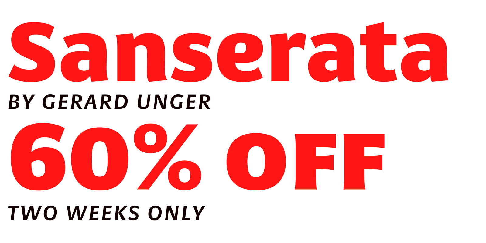
From wayfinding and newspaper text to his latest type families that express the experimental or the scientific basis for reading, Dr Gerard Unger has earned his reputation as one of the godfathers of modern type design. His two most recent families, Alverata and Sanserata, highlight the experiment and the science, respectively. Alverata replaces the straights in some weights with curves and vice versa. Sanserata puts more information about each character right in the reader’s view, making reading faster and more accurate. The best way to test this is to see it for yourself, so until November 15 you can get Sanserata for 60% off — that’s the entire family of 14 fonts for only €163 instead of €407! This promotion is only good for two weeks, so load the entire family in your cart and use code 121e9c to snag this deal. Your eyes will thank you!


READ MORE
SpecimenPack

All-new type specimens

If you’re one of the lucky few with a copy of Eye magazine, you should have seen the new Bely font specimen as an insert. We recently created a new type specimen series for Bely, Garalda, Soleil, Bree and Bree Serif, and Adelle with Adelle Sans. Each specimen has been carefully designed by Roxane Gataud and Elena Veguillas, and although there is common presentation, each specimen has been customised to the typeface’s strengths. You can pick up your own copy in the Catalogues section of our website. They’re free; we only ask that you pay the few dollars for shipping.


READ MORE

Type in use: Tablet Gothic

Tablet Gothic: Letterpressing matters

Because letterpress printing is a costly and complex process in this digital era, we rarely have the chance to see our typefaces come to life in that medium. Erik Spiekermann has found a solution for using the best of digital technology with the best of letterpress printing. Through direct-to-plate technique, Tablet Gothic, a grotesque with reminiscences from 19th century Britain and Germany, has made its way to that classic medium. Take a look at the process of making Sylvia Plath’s ‘Der Koloss’with design and typesetting by Erik Spiekermann and Ferdinand Ulrich using Tablet Gothic and printed on an original Heidelberger Zylinder.


READ MORE

Article: Nomadic Offices

TypeTogether on the move

As a decentralized team we often must make the best of any given situation. From riding on trains to setting up in almost any extra space, we do what we must to continue producing great work for you. We wrote a recent article about the many locations our core team sets up shop. And if you’re interested in more details about each team member, be watching the blog for some upcoming interviews.


READ MORE

TypeTogether Girona Quotes

Crazy talk

So you already know the TypeTogether team met in Spain this past summer for a work retreat. When type nerds get together, the conversations can go in odd directions — especially when taken out of context. Some things are best left unsaid, while others just make you wonder. Apparently we specialize in the second kind of crazy, but we’ll let you be the judge. Check out our completely-out-of-context Girona Quotes here.


READ MORE

http://www.type-together.com/

%%emailaddress%%

To stop receiving these emails:%%unsubscribelink%%