Typetogether - Newsletter
NEWSLETTER: JANUARY 2018
Protipo typeface

Protipo: A new family for data

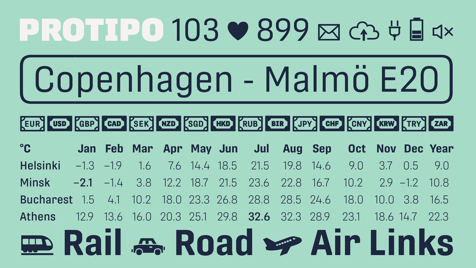
A few years ago Veronika and José began work on a type family that could fill a need within the information design category. We gave the family to some early testers who each are award-winning designers (wayfinding, infographics, and data pros), and they came back with some thrilling results. Now it’s your turn to try Protipo — the wide-ranging and impactful sans that’s ideal in all informative situations: apps, infographics, UI, wayfinding, transport, posters, display, and even internet memes. Add to all this the icon sets by Luciana Sottini and upcoming variable font capability, and you’re assured a level of creativity, productivity, and impact on scale with the greatest demands.


READ MORE

Noort updated

Sneak Peek: Noort Display & Icons

Since reading requires the ability to distinguish words that may differ by only one letter, what has its roots in cartography lends exceptionally well to paragraph text. So in July 2017 Juan Bruce released Noort, the layer-wrangling map-inspired serif that excels in clarity. Since then he’s been hard at work to complete an extra dark display style and an extended set of icons, which will be released soon. (There be monsters in here!) Until then, we’ve created a little teaser to tide you over.


SEE MORE IMAGES

Give us some credit

Give us some credit

At 2017’s ATypI in Montreal, Veronika & José gave a talk about how to credit within the type world, and it seems to have resonated. Larger teams and more complex work are moving type design toward more thorough crediting systems. But it’s only partially about the system and more about honouring the often unknown ones investing their considerable skills into producing the fonts we use and love. We at TypeTogether have already begun making improvements in this area. What considerations were taken into account and what conclusions have been reached thus far? Grab your beverage of choice and read on.


READ MORE

Tablet Gothic and Portada in use in Informe Cotec

Tablet Gothic & Portada in ‘Informe Cotec’

Annual reports combine functional and aesthetic demands into a designer’s dream, especially with new tech becoming available to the masses. This year R2 Media Factory (Pablo Ruiz and Fernando Carballo) decided to utilise augmented reality to create significant depth to the information presented. Informe Cotec, published by nonprofit Fundación Cotec, is an annual report that analyses innovation in Spanish commerce and industry, believing that innovation drives social and economic development. R2 used TypeTogether’s extensive Tablet Gothic family and the warm serif Portada to set text-intensive spreads with the readability of a good book. We are thrilled to see such exquisite work being produced with our typefaces.


READ MORE

Meet the team

Meet the TypeTogether team: Interview with Pooja Saxena

From the initial idea to the different marketing options, we have a talented core team that completes the font creation work. We are also supported by a network of great designers and partners who pitch in on singular projects in their area of strength. Though we have short bios on the About page, we decided to do a series of interviews beginning with our core team and working our way outward, starting with the newest addition, Pooja. The coming months will see more interviews published, so be on the lookout. How many countries do you think are represented at TypeTogether?


READ MORE

http://www.type-together.com/