|
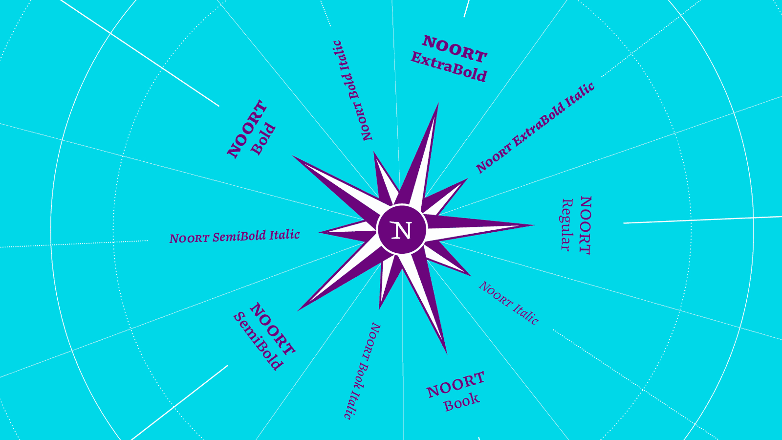
Find your way to Juan Bruce’s Noort
Centuries ago, when new lands were still new, discerning mapmakers needed to layer clear words over colours and along contours, landmarks, and topography. Those same challenges exist now in the world of information architecture, and Juan Bruce’s Noort was created to solve those modern day problems. Noort’s ability to stand apart from the visual landscape it inhabits means it can easily balance today’s complex information and complex style. Check out this newest serif release from TypeTogether, which was also the second Typographic Publishing Incentive Programme winner.
READ MORE
|
|
|
|
|
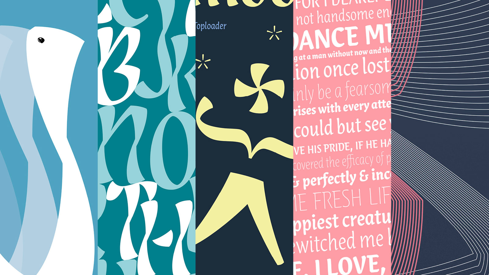
Reading’s Lisbeth Poster Project
TypeTogether is always looking for new ways to connect type design with graphic design, especially in the educational realm. Under the instruction of Sara Chapman, lecturer at Reading University’s Department of Typography & Graphic Communication, the second-year graphic design students were given a competitive project: create a poster showing off Louisa Frölich’s Lisbeth. Each student was given a licence for the family and the winner, Theodosis Demetriou, won a small sum of money for his entry. Check out the blog post to see all the entries. And if you’re in academia and would like the chance to collaborate with TypeTogether, get in touch! We’re always looking for great ideas and ways to connect.
READ MORE
|
|
|
|
|
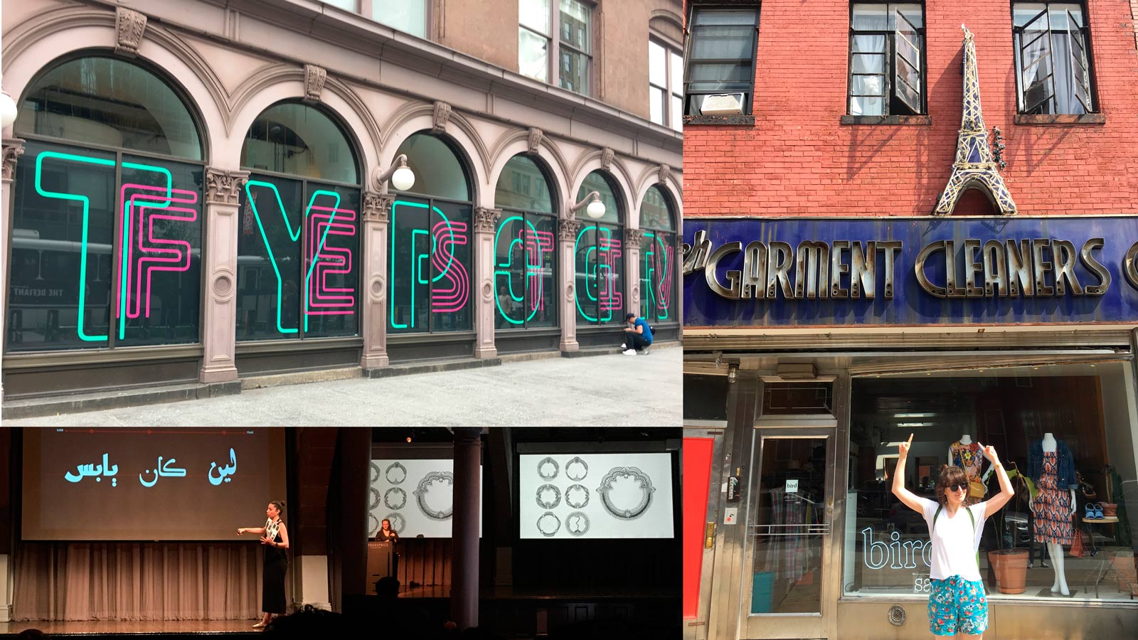
Live from Typographics New York, it’s Roxane Gataud!
Over the summer TypeTogether was proud to sponsor Typographics, a New York-based conference that talks type to graphic designers. The multitalented Roxane Gataud, both a type and graphic designer, attended the conference and wrote a little something about it for your reading pleasure. Though this is the first time someone from TypeTogether attended Typographics, it certainly won’t be our last.
READ MORE |
|
|
|
|
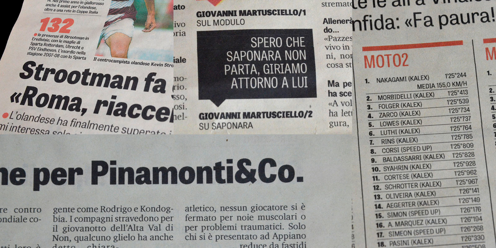
Tablet Gothic in La Gazzeta dello Sport
The daily Italian sports editorial La Gazzeta dello Sport underwent a redesign a few years ago. Leaving behind an old standby, they chose Tablet Gothic for use in headlines, short texts, and infographics. Check out the post and learn, according to the project lead, what makes Tablet Gothic better in those circumstances as well as what the designers are now asking for. (Hint: a new font!)
READ MORE |
|
|
|
|
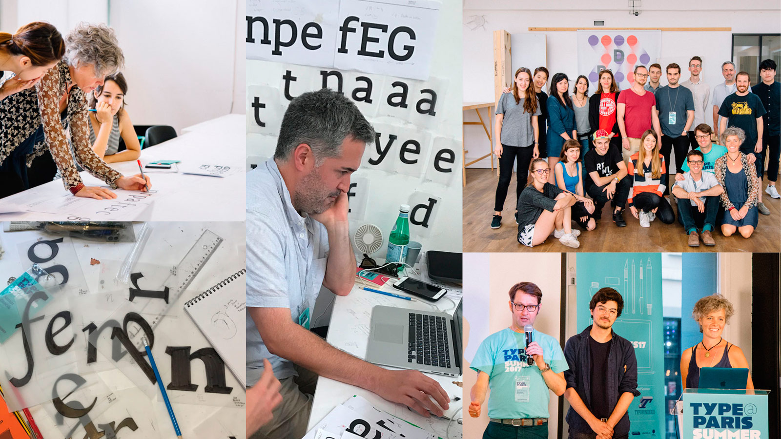
Veronika presents at TypeParis
TypeParis is a five week type programme in Paris run by type designer and instructor Jean François Porchez of Typofonderie. Many different professionals are invited to give workshops, critiques, and talks on typography and its place in the wider design world. This year Veronika Burian gave in-depth critiques to the students, followed by a presentation on the intricacies of creating unique custom typefaces for clients with exacting standards. Her presentation was recorded and is available on YouTube.
READ MORE |
|
|
|
|
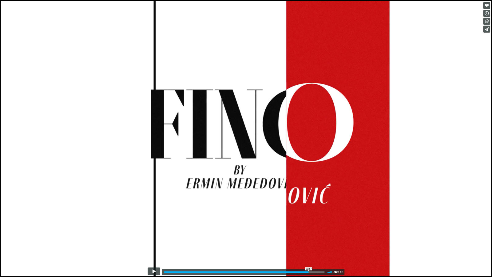
The fashionable face of style
Some things are best seen, especially things regarded for their aesthetic beauty, so we decided to make a video for Ermin Međedović’s Fino type family. Featuring the fashionable side of Fino, the video was directed by Cecilia Brarda and animated by Martín Campanella. Check out Fino’s striking and expansive sans, serif, and stencil family in the new video.
SEE THE VIDEO |
|
|
|
%%emailaddress%%

To stop receiving these emails:%%unsubscribelink%%
|