|
|
 |
| |
|
NEW RELEASE
Sirba expanded!
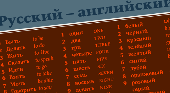
We are very pleased to present our latest release of Sirba PE, the pan-European extension to this already highly functional family. Designed by Nicolien van der Keur for warmth and evenness in complex text settings, Sirba now includes Latin, Greek, a full set of IPA symbols for phonetic spelling, and Cyrillic with Bulgarian alternates. Sirba has been recognised as the perfect tool for complex reference books and demanding applications such as multi-script dictionaries, annual reports, complex tables, and novels.
If you own the Sirba bundle and would like to upgrade, please contact us to get a discount code.
ORDER SIRBA PE NOW
|
|
|
| |
|
| |
sneak peek
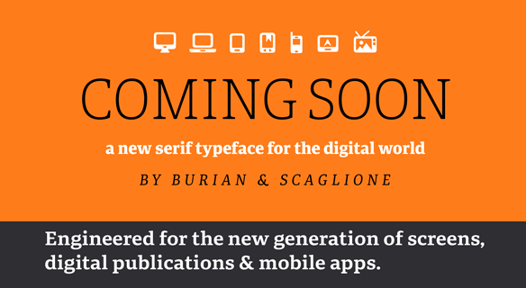
A new serif typeface for the digital world
A brand new serif family from Veronika Burian and José Scaglione is right around the corner! Created for the new generation of screens, the design provides comprehensive support for digital publications and apps. TypeTogether based this project on the results of the tailored font designed for the Clarín newspaper. It was then re-engineered according to the knowledge acquired while researching the performance of fonts for the Literata project, the custom typeface designed for the Google ebook reader app. The family will have several text and titling styles as well as an icon font, each of which put the emphasis on the digital medium first.
CLICK HERE TO DOWNLOAD A SAMPLE
|
|
|
|
| |
|
| |
promotion
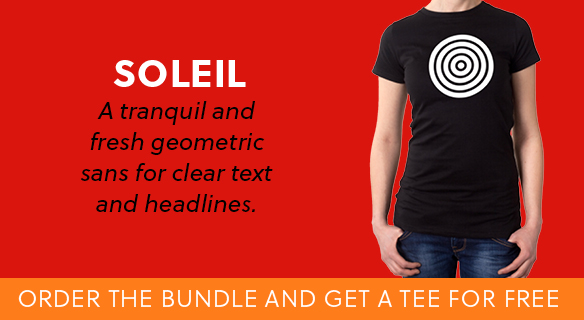
Free T-shirt with Soleil bundle purchase
We font lovers always enjoy a well-made font-themed shirt. So for a limited time, you will get a special edition Soleil T-shirt when you purchase the complete bundle of Soleil. Soleil is the award-winning fresh and tranquil geometric sans family designed by Wolfang Homola. The T-shirts feature either a target or a sun symbol silkscreened white onto either black, orange, or navy blue fabric. In line with TypeTogether’s commitment to the environment, the shirts are sustainably created with 100% fair-trade organic cotton and low carbon impact during fabrication.
ORDER SOLEIL NOW
|
|
|
|
| |
|
| |
NEWS
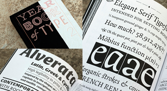
Yearbook of Type II
Since 2013, Slanted Publishers have teamed up with Niggli to publish a retrospective on the previous year’s best typeface releases. Yearbook of Type II is the second issue of the series, with a detailed selection of typefaces from around the world — from large publishing houses to small, independent typographers and foundries. The over 400-page compendium includes essays about type and typography from Rudolf Barmetter, Thomas Huot-Marchand, Jakob Runge, Alice Savoie, Ole Schäfer, and Rainer Erich Scheichelbauer. Five typefaces were selected from TypeTogether’s catalogue: Dr Gerard Unger’s Alverata, Veronika Burian and José Scaglione’s Bree Serif, Stefan Ellmer’s Essay Text, Tom Grace’s Iskra, and Ermin Međedović’s Lipa Agate.
SEE MORE IMAGES HERE
ORDER A COPY HERE
|
|
|
| |
|
| |
TYPE IN USE
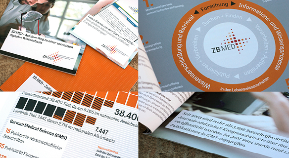
Tablet Gothic and Abril in Germany’s ZB Med Project
The German National Library of Medicine (ZB MED – Leibniz Information Centre for Life Sciences) is Germany’s central service centre for specialist information and research support in the field of life sciences. At more than 1.6 million volumes, ZB MED has the world’s largest library in its combination of subjects:
spanning from medicine, health, and healthcare systems to nutritional, environmental, and agricultural sciences. ZB MED hired the German designer Sabina Sieghart to design the new corporate identity, including an entirely new strategy and branding in line with their four areas of unique expertise, and studio 3pc was hired to implement their website. To lend credence and approachability to ZB MED, Tablet Gothic Narrow and Abril were chosen for the website and all print materials. Tablet Gothic Narrow can be seen in menus, texts, and headlines, and Abril is used in menus and short texts, usually in italics.
SEE MORE HERE
|
|
|
| |
|
| |
| |
|
|
| |
|
|
|