FONT CATALOGUE   |   CUSTOM TYPE   |   MORE NEWS   |   VISIT WEBSITE   |   FREEBIES
 

COMPETITIONS
European Design Awards 2013

We are very happy that our 84-font grotesque sans serif Tablet Gothic and Alisa Nowak's serif and Fraktur Eskapade have been awarded with the Silver and the Bronze medal respectively in the European Design Awards 2013. With these awards Tablet Gothic and Eskapade join the exclusive group of TypeTogethers fonts awarded in the European Design Awards along with Abril, Adelle, Karmina, Karmina Sans and Bree.

READ MORE
ORDER TABLET GOTHIC NOW
ORDER ESKAPADE NOW


BOOKS
Yearbook of Type I

The Yearbook of Type I, published by Slanted and Magma Brand Design, is a compendium of new typefaces created in the last three years from all over the world and from all kind of typefoundries. There is also space for designers, typefoundries and background information, with contributions by Ole Schäfer, Filip Blažek and Gerry Leonidas. Six of TypeTogether's font have been selected for this first issue: Abril, Tablet Gothic, Adelle and Adelle Sans, Gerard Unger's Capitolium 2 and LFT Etica by Lefloft.

VISIT SLANTED'S WEBSITE


SNEAK PEEK
Athelas Pan-European

As part of our continuous efforts to expand language support we are about to release the Cyrillic extended and Greek polytonic styles for Athelas typeface. The new scripts inherit the elegance and the grace of Athelas Latin, originally inspired by British literature. Athelas Cyrillic and Athelas Greek are also intended for editorial use and show their best in finely crafted book editions and good printing conditions. The new styles will be available later in the summer.

SEE MORE IN FLICKR


TYPE IN USE
Type conference websites

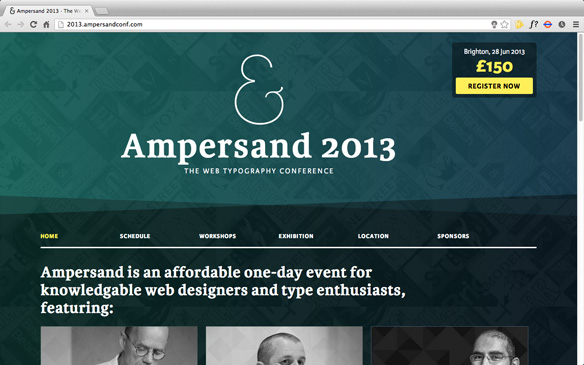
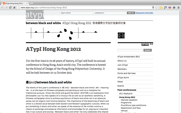
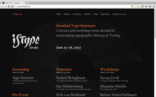
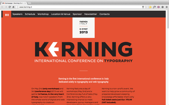
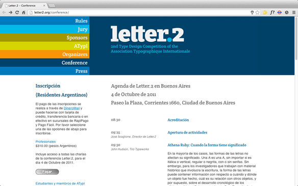
We are very pleased to announce that five international type conferences have chosen TypeTogether fonts for their website design. It is the perfect present after seven years of hard work and dedication, that those who are experts in the typographic field have decided to be represented with our fonts: Ampersand 2013, ATypI 2012, IsType 2013, Kerning 2013 and Letter2 use Adelle, Athelas, Crete, Karmina and Karmina Sans.

READ MORE

The famous web typography conference, Ampersand, employs a combination of Karmina and Karmina Sans for headlines, text and menus.


ATypI 2012 edition, held in Hong Kong, uses Adelle in the website as well as in the conference catalogue and other collateral material.


IsType 2013, the second edition of this Turkish type conference features the Athelas family for text, menus and headlines in different weights and sizes to create hierarchies.


Kerning, a new international conference organized in Italy, also uses the serif version of Adelle, in headlines and menus.


Letter2, the second type design competition of the Association Typographique Internationale, uses a customized version of Crete Rounded for headlines and menus.