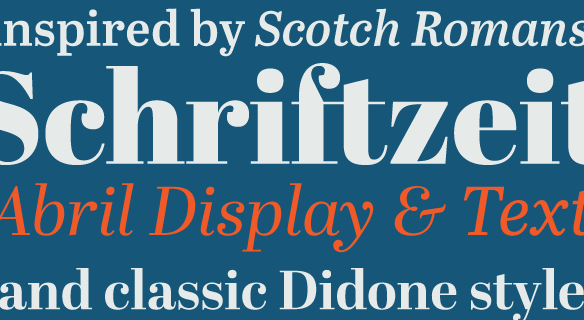
FONT CATALOGUE   |   CUSTOM TYPE   |   MORE NEWS   |   VISIT WEBSITE   
 

NEW RELEASE
Abril is here!


The new design by Burian and Scaglione is conceived specifically for intensive editorial use, whether it is in newspapers, magazines or digital media. The titling weights, based on a contemporary revamp of classic Didone styles, display both neutrality and strong presence on the page, attracting the reader's attention by good color, high contrast and meassured curve tension. Abril Text maintains consistency with the headline styles but the letter forms were engineered from scratch to achieve a color, texture and overall width that allow using the font comfortably in the most challenging environments for continuous reading, such as newspapers, magazines and books. The core weights of Abril Text are manually hinted to improve performance on web sites and electronic publications.

SEE MORE


EDUCATION
Introduction to the study of typography


Acclaimed writer and typographer Jorge De Buen Unna has released his new book "Introduction to the study of typography" (ISBN978-84-9704-589-6), a text book that is bound to become a must-have aid to graphic design educators and students in spanish speaking countries. With his usual exquisite writing, Jorge provides detailed insights into the theory and best practices of using typography. José Scaglione collaborated on the second part of the book, dealing with the basics of typeface design.

BUY IT HERE


EVENT
London design week


TypeTogether was invited by GraphicBirdWatching to participate in their event, the graphic design walk, during the London Design Festival, one of the world's most important annual design events, hosting over 280 events over 9 days. The graphic design walk will take place on the 23rd of September and will lead the visitor from the 'base camp' to 15 studios, in London's East End, of acclaimed designers working in the fields of typography, print-making, illustration, photography and film-making. TypeTogether will have an exhibition space at the base camp and Veronika is planning to design a typeface live during the event. A projector will allow the visitors to follow her drawing letters and give opportunity to ask questions directly about the design process.

VISIT LONDON DESIGN FESTIVAL
VISIT GRAPHIC DESIGN WALK


TYPE IN USE
A4 magazine


Swedish design company A4 with focus on editorial design, publishes their own magazine called #4. It is filled with articles about design, typography, photographers and illustrators that A4 finds interesting and wants to share information about. One of the particular traits of the magazine is that every issue has its own design and typography. The most recent one is featuring an interview with Veronika and uses very nicely our typefaces, Adelle, Karmina and Bree.

SEE THE IMAGES


SNEAK PEEK
Soleil, the new side of a geometric sans


Still just a sneak preview, but this wonderful sunny typeface is indeed almost ready. Only the last final touches are being applied now to guarantee Soleil's performance in a wide range of applications, from wayfinding to editorial design. Designed by the talented Austrian national Wolfgang Homola, Soleil is an innovative and fresh geometric sans serif that stands out among its peers. While its letter shapes take advantage of concepts of geometrical construction to inspire their appearance, it is its careful design process and attention to legibility that provide fluidity and cohesiveness to the typeface.

SEE THE IMAGES


EDUCATION
Typography in-depth


Renowned type designer Alejandro Lo Celso will lead a new typography course at the Universidad del Este in La Plata, Argentina. This specialised course proposes to gain sensibilization and in-depth knowledge of theoretical, practical and historical aspects of typography. José Scaglione, alongside with other specialists, will be guest lecturers during the course.

FIND OUT MORE