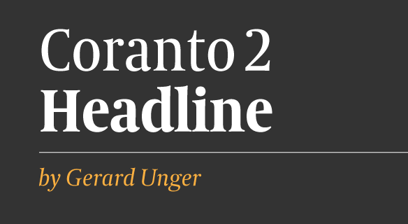
FONT CATALOGUE   |   CUSTOM TYPE   |   MORE NEWS   |   VISIT WEBSITE   
 

NEW RELEASE
Coranto 2 Headline


The new and improved version of Gerard Unger’s masterpiece now features three new styles that have been engineered specifically for headline use. Coranto 2 makes the most of current newspaper printing technologies delivering clean, economic and highly legible text blocks combined with striking headlines. Coranto 2 introduces the addition of over 250 glyphs for a wider language support, redesign of most accents, new ligatures, 4 sets of numerals, arbitrary fractions, superiors/inferiors and more.

BUY IT NOW


NEW RELEASE
Maiola Book


We added a new Book style with its accompanying italic to our successful type family Maiola. It is darker in colour, making reading an even more pleasant experience. Additionally, responding to customer feedback, we have also designed a whole set of symbols used to set logic. Customers who have purchased the Maiola Bundle and would like to add the Book styles, are welcome to a special offer. Please contact us, if interested.

BUY IT NOW


ARTICLES
Designum


The Slovakian design magazine Designum, published by the Slovakian Design Centre, asked Veronika to write an article for their latest Spring issue. The article is based on Veronika’s lecture “Decentralisation in type design” presented at the conference Kupe 6. Its general theme was “Center and Periphery”.

SEE THE IMAGES


ARTICLES
A type design workshop


The latest issue of Czech design magazine TYPO features an article about the type design workshop led by Burian & Scaglione in Cieszyn, Poland, last year. It touches on TypeTogether’s general approach to teaching type design and about the specifics of this particular group.

SEE THE IMAGES


TYPE IN USE
GNT


The design team of the Brazilian GLOBOSAT Network channel has selected our successful typeface Bree for their recent rebranding. The in-house creative team was commissioned to develop a whole new design image more in-tune with their female audience. They decided to use Bree because it suited the general concept in a very elegant way and it looks unpretentious and sophisticated at the same time; exactly as GNT’s women audience wants to be.

READ MORE


TYPE IN USE
Crisis Magazine


The renowned Argentine magazine Crisis resumed publishing after almost 35 years of silence, covering sensitive social, cultural and political issues. The new design is carefully crafted by Diana de la Fuente and the photography is simply superb. Ronnia is used for nearly everything except body copy. Its human and friendly feel works beautifully with the clean design, where images take an important role.

READ MORE