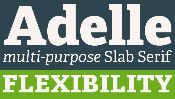
FONT CATALOGUE   |   CUSTOM TYPE   |   MORE NEWS   |   VISIT WEBSITE   |   UNSUBSCRIBE

NEW RELEASE
Adelle: A real multiple-purpose slab serif


TypeTogether is proud to present it's new release. Adelle is a 12-weight slab serif typeface conceived specifically for intensive editorial use, mainly in newspapers and magazines. Iits personality and flexibility make it a real multiple-purpose typeface. The unobstrusive appearance, excellent texture and slightly dark color allow it to behave flawlesly in continuous text setting. As it becomes larger in print, Adelle shows its personality through a series of meassured particularities that make it easy to remember and identify.

AVAILABLE EXCLUSIVELY AT OUR ONLINE STORE
Click here to see more


AWARDS
Bree wins at ED-Awards


Bree, the popular upright italic designed by Veronika Burian & José Scaglione in 2008 was awarded a Bronze prize in the Original Typeface category of the ED-Awards competition. Bree, a typeface based on TypeTogether's own logotype, is a sleek sans serif that delivers a polished and modern look and feel for branding or headline usage. It was originally released in five weights, ranging from thin to extrabold, and then expanded with matching obliques.

Read more
 
 
Type in use
Skolar

The German design studio Rastersysteme, based in Berlin, Germany, used Skolar as the main typeface for a new series of business cards, printed in letterpress. Studio owner Stephan Zavodny, webdesigner, webdeveloper and photographer, is also a typography lover, and says about Skolar: "I fell in love at first sight.."

Click here to see the images


Type in use
Bree


Karacters Design Group choose Bree for the rebranding of a product line of sliced breads for their client Silver Hill Bakery, a Canadian company. The redesign clearly freshens up the otherwise rather dull food category by using solid, matte colours on biodegradable bags with witty illustrations by Robert Hanson. Bree is used in nearly every text in the packaging.

Click here to see the images


ARTICLES
Bree
and Givry selected as favorites of 2008

Two of our typefaces appeared on yet another Best-of-list. Givry, a rotunda batarde designed by Tom Grace, and the best selling upright italic Bree. Ricardo Cordoba and Dan Reynolds wrote very nice reviews for the famous Typographica list: Our Favorite Typefaces of 2008.

Read Dan Reynold's review of Givry
Read Ricardo Cordoba's review of Bree


NEW WEBSITE
Your membership at our new site


The new TypeTogether website was launched in April and it offers some ecxiting new additions. The new membership feature allows users to modify their profile, download fonts, receive special offers and modify their newsletter subscription preferences. Just login using your email address and password.

IMPORTANT. If you signed up for our newsletter before March 20, you need to retrieve your password. You can do so following THIS LINK and clicking on the forgot password option.