Typetogether - Newsletter
NEWSLETTER: JUNE 2017
Walter

Walter

TypeTogether just released Teo Tuominen’s Walter family, a kindly and commanding slab serif that’s ready for your next project. Almost-monoline and with sturdy verticality, its robust nature and narrowness means it is personal and compelling but not demanding. Whether you loosen the leading to elevate its tone or pack it tight for a dark colour on a poster, it has seven roman weights and vintage details to carry the day.


READ MORE

Portada Silver Ed Awards

Portada wins Silver

Just recently we received news that Portada won Silver from the European Design Awards, and for that we are exceedingly grateful. You already know Portada is a rare serif made specifically for UI, small screens, and web use amidst quickly changing technology. And in these uncertain times we are humbled to be part of the global design and typography community, to be operating from Europe, and honoured to receive a European award. To one and all we say salud!


READ MORE

TypeTogether

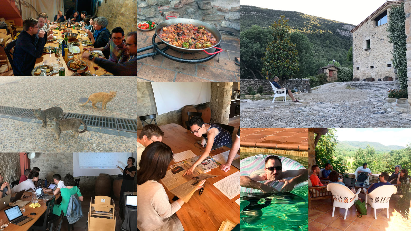
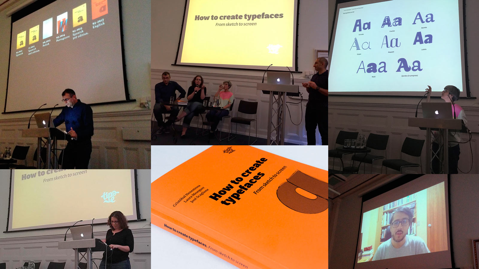
Work retreat in Girona

Last week most of the TypeTogether team and some design partners met up in Girona, Spain, and what a fantastic time it was! Several specialists gave presentations in a relaxed and inviting format, allowing for in-depth discussions throughout the talks. Since we live in different countries worldwide, it was a great opportunity to get to know each other better, have a ton of fun, and focus on workflow and upcoming projects — some of us meeting in person for the first time. A beautiful location, delicious food, and loads of productivity. You can’t ask for more. Well, except for pictures.


READ MORE

StBride

Presentation at St Bride

The English translation of ‘How to Create Typefaces’ is hot off the press and Tipo e and St Bride helped cohost the packed-house release celebration at St Bride’s Library in London. Elena Veguillas and Gerry Leonidas opened, Laura Meseguer and José Scaglione addressed the crowd in person, and Cristóbal Henestrosa sent a recorded video. As with previous language versions, the English translation has already received acclaim, being called one of the most accessible books on type design and others saying it may establish itself among important works on type. We’re just happy to see it released to enthusiastic, supportive readers. Pick up your copy below.


READ MORE

LFT Iro Sans

LFT Iro Sans in use in La Triennale de Milano

On the heels of releasing their LFT Iro Sans, Leftloft was given the opportunity to use it for the Triennale de Milano in several ways. It looks great in both 3D and 2D large signage, in neon, and on digital screens — all the things it was made for. Leftloft has taken the museum and contemporary art hub built in the 1930s and applied to it, as always, their excellent art direction and craftsmanship. Oh, is it pictures you want? Yeah, we’ve got ’em.


READ MORE

http://www.type-together.com/

%%emailaddress%%

To stop receiving these emails:%%unsubscribelink%%