FONT CATALOGUE   |   CUSTOM TYPE   |   MORE NEWS   |   VISIT WEBSITE   
 

NEW RELEASE
Portada

Sans serifs are commonly used on small screens. But for all you wishing for a modern serif that’s as clear and readable as a sans in restrictive digital environments, meet Portada. Designed for superlative performance in long form reading on screens, in UI, and apps, Portada is a serif type family with text and titling styles and an extensive (free) icon set. Is a sans better for small screens? Well, now you have the choice of a modern serif.

ORDER PORTADA NOW


MERCHANDISING
New specimen for AwanZaman

AwanZaman is the recently released Arabic typeface by Dr Mamoun Sakkal, cleverly expanded into Latin by Juliet Shen. TypeTogether’s new designer, Noel Pretorius, has created a beautiful poster marking its release. Printed by PB Tisk in Prague under the supervision of Filip Blažek, it is a two-sided, three-colour offset print over Munken Pure Smooth 130gsm paper (540 mm x 840 mm).

SEE MORE PICTURES IN FLICKR


EDUCATION
Upcoming talks and workshops

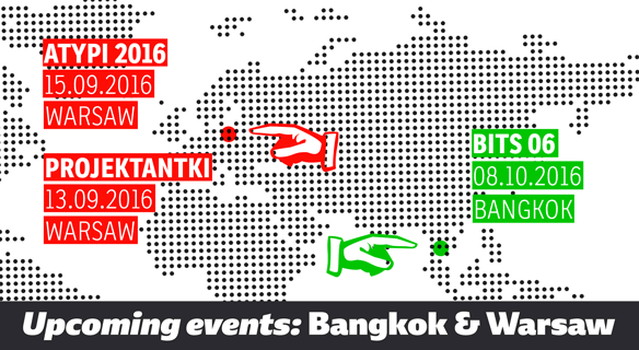
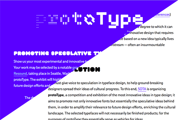
Over the next month Veronika Burian will take part in three events. First, she will again helm ATypI’s Type Crit alongside Gerry Leonidas, Jean-Baptiste Levée, and Indra Kupferschmid. Second, Veronika, along with Verena Gerlach and Laura Meseguer, will give a presentation organised by Polish graphic design association, Projektantki, on 13 September in Warsaw. Third, at the Bits Conference on 8 October in Bangkok, Thailand, she will run a workshop titled “Introduction to Typeface Design” and give a separate talk during the main sessions.
At ATypI Toshi Omagari, designer of Marco, will give a presentation about BubbleKern, his new kerning tool for type design that uses Bézier curves, and propose ideas for the future of kerning.

GO TO ATYPI WARSAW WEBSITE
GO TO BITS 6 WEBSITE
GO TO PROJEKTANTKI WEBSITE


TYPE IN USE
Sans in web: Tablet Gothic & Ebony

TypeTogether is one of the sponsors for Magfest, an annual international magazine festival and conference happening in mid-September. Their website is done entirely in Tablet Gothic, from headlines to menus and paragraphs — a perfect use since it was made for editorials. If the experts in magazine design use Tablet Gothic when given a choice, you might want to give it another look.
Prototype is a type contest emphasising experimental type design and was organised alongside this year’s TypeCon. With its bold personality and wide stance, Ebony was chosen for website paragraphs. Also, congratulations to Nikola Djurek’s multifaceted Audree type family for winning!

SEE MORE MAGFEST
SEE MORE PROTOTYPE


NEWS
ICTVC

Thanks to everyone who celebrated TypeTogether’s ten year anniversary with us in Thessaloniki! We had a great time meeting new friends, catching up with old pals, cutting the surprise cake, and posing in the funny photo booth. With a solid foundation behind us and invigorating prospects ahead, we are looking forward to the next ten years!

GO TO ICTVC'S WEBSITE
GO TO ICTVC'S FLICKR