|
|
 |
| |
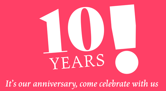
PARTY OF OUR DECADE
TypeTogether Celebrates Tenth Anniversary!
In 2006, type designers Veronika Burian and José Scaglione met at the University of Reading in England and found they had the same goals in mind — typetastic perfection, editorial excellence, and glyphic goodness. But their main priority was a desire for widespread collaboration with talented designers who had the same convictions. And so the TypeTogether family was born.
Ten years later, thanks in large part to robust cooperation with other type designers, TypeTogether is one of the most awarded independent foundries, creating and hosting an enticing and diverse type catalogue that is highly regarded across all design disciplines internationally. And we’re just getting started!
As a thanks for coming together over the past ten years, we want to invite our big design family and you, our extended family, to join us in celebrating our tenth anniversary. During the 6th International Conference on Typography & Visual Communication (ICTVC) in Thessaloniki, Greece, 5–9 July 2016, TypeTogether will officially don its birthday hat. TypeTogether is also organising the night party on Saturday 9 July. We’re going to have a great time together, so come celebrate this incredible milestone with us as one big family in Greece!
|
|
|
| |
|
| |
NEWS
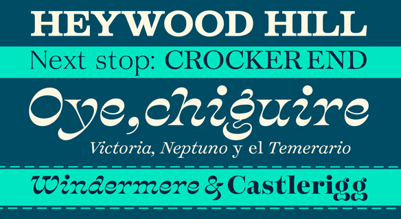
Quentin Schmerber’s Temeraire
For the past three years, type design grad students have been invited to submit their design for a chance to win mentoring, publishing, and a bit of funding from TypeTogether. The recipient of the third Typeface Publishing Incentive Program, we are proud to announce, is ESAD, France’s Quentin Schmerber with his design, Temeraire. The Temeraire family is a collection of typefaces designed as contemporary interpretations of the English letter. Each style is designed to harmonise with the others, but is also a stand-alone homage to specific parts of 19th century British lettering traditions: gravestone cutting, fat faces, master penmanship, copperplates, Egyptians, Italians, and the like. Thanks to all the participants and be on the lookout for Schmerber’s Temeraire. Congratulations, Quentin!
|
|
|
| |
|
| |
PROMOTION
Three Families for Microtypography
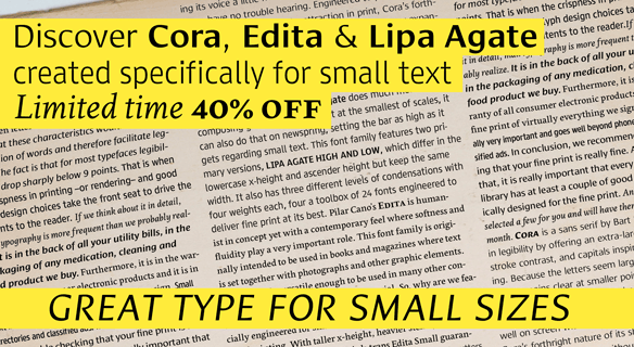
Seasoned designers know that a typeface’s size plays a critical role in its ability to be read easily. The smaller text is, the more its characteristics must be emphasised for it to look the same as it does at normal reading sizes. It’s a good idea to have a few go-to faces for minuscule type, and we’ve got just the thing.
Stop by the TypeTogether website to read an article José Scaglione wrote about small type: Is Your Fine Print Fine? While you’re there, and to promote great fine print, we are offering a 40% discount on three typefaces engineered for the smallest of text: Cora (code: 73558cf), Lipa Agate (code: 7a988fd7), and Edita Small (code: 6a4a0c71). Make your selections and enter their specific code at checkout (valid until 24 June 2016).
READ MORE HERE
ORDER CORA
ORDER EDITA
ORDER LIPA AGATE
|
|
|
| |
|
| |
TYPE IN USE
AwanZaman in Savola and Awan Newspaper
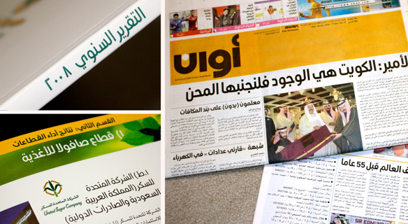
AwanZaman is TypeTogether’s first foray into the Arabic script with Dr Mamoun Sakkal, one of the highest regarded Arabic designers, and Juliet Shen, who created the Latin counterpart. As our latest release, we wanted to highlight two uses, both of which predate its expanded multilingual abilities as AwanZaman.
The annual report for The Savola Group, a major Saudi company, used Dr Mamoun Sakkal’s Awan in headings, titles, and the cover design. The second example is Awan, a daily, forward-thinking Kuwaiti newspaper which was briefly published from 2007–2010 and had an average circulation of 15,000 copies. Dr Mamoun Sakkal received the commission to design the display face for the newspaper with a modern, clean look. The monoline typeface, named Awan after the newspaper, was based on the geometric forms of Kufic script to represent headlines and story titles effectively. The Awan typeface was the first phase — the starting point — for the newly-released AwanZaman type family, which now includes a more versatile extension for text sizes, a calligraphic extension, and a Latin counterpart.
SEE MORE IMAGES OF AWAN
SEE MORE IMAGES OF SAVOLA
|
|
|
| |
|
| |
| |
|
|
| |
|
|
|