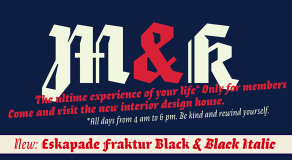
FONT CATALOGUE   |   CUSTOM TYPE   |   MORE NEWS   |   VISIT WEBSITE   
 

NEW RELEASE
Eskapade Fraktur Black & Black Italic

Alisa Nowak’s Eskapade, the typeface that created new common ground between a nimble oldstyle serif and an experimental Fraktur, now has a Black and Black Italic weight. The two new styles are intended for display sizes (headlines, posters, branding, and signage), with amplified inktraps and more tension in the contrast between straight and round forms than the text styles. The black weights of Eskapade are strident, refusing to let the white of the paper win in its tug-of-war. It also won’t give away its secrets: is it modern or historic, edgy or amicable, beguiling ornamentation or brutish presentation? Either way, it certainly isn’t tame.

ORDER ESKAPADE FRAKTUR NOW


sneak peek
Bely

Last year TypeTogether awarded Roxane Gataud their Typeface Publishing Incentive Programme scholarship for her postgraduate work on her Bely type family. Bely is a high class throwback containing four text weights and a radical, expressive display. Bely’s text weights feature balanced capitals and a play between large, triangular serifs and thick, bracketed, rectangular serifs. The display style, truly daring with its monstrous and angled contrast, was designed quite distinct from the text styles for use in packaging, identities, and headlines with attitude.

CLICK HERE TO DOWNLOAD A SAMPLE


TYPE IN USE
Restless Leg Syndrome Book

The book Wenn die Beine Kopf Stehen is a practical guide about Restless Legs Syndrome (RLS, or Willis-Ekbom disease), the irresistible urge to move one’s body in order to stop uncomfortable sensations. The 2015 publication was developed by Kochan & Partner, with the physical nature of the book playing a primary role in its publication. Each element was carefully selected, including the typefaces — Abril Titling for large and striking headlines, Adelle and Ronnia were chosen, respectively, as the serif for headlines and the sans serif for long passages of text. The result is a vivid book filled with a calming sense of hope.


SEE MORE IMAGES HERE


NEWS
365TYPO

The brand new 365Typo annual book, published by étapes in collaboration with Association Typographique Internationale (ATypI), features 365 stories by the world’s best writers in the field of typography, visual communication, and type and graphic design. Presented are not only engaging behind-the-scenes stories and crucial facts, but analyses and predictions of future developments which also help readers find their way through the labyrinth of current events, trends, and ideas. Veronika Burian and José Scaglione both wrote featured articles, and TypeTogether, its advancements, and its awards are mentioned more than a few times.

SEE MORE IMAGES HERE
ORDER 365TYPO


NEWS
Etapes

The French publication étapes Magazine has published an article listing the 50 best typefaces of 2014, with the first place award going to Dr Gerard Unger for Alverata. Stefan Ellmer’s Essay Text and Ermin Međedović’s Lipa Agate also were included in these esteemed awards. Congratulations to the winners in our TypeTogether family!
Wining is one thing, but to see a typeface used in heavy rotation is another kind of compliment. Étapes Magazine also chose TypeTogether’s Abril Text and Abril Display for its announcement of the 50 best typefaces of 2014. The Abril family is a credible and contemporary newsface covering every conceivable parameter for setting editorial text, from enormous edge-to-edge headings to the smallest readable text.

SEE MORE IMAGES HERE