FONT CATALOGUE   |   CUSTOM TYPE   |   MORE NEWS   |   VISIT WEBSITE   
 

NEW RELEASE
Adelle Sans Condensed

Adelle Sans Condensed is a new release by Veronika Burian and José Scaglione, in this case part of the flexible and personable Adelle Sans family. These new condensed weights have the same flavour and OpenType features as Adelle Sans, including icons and other typographic niceties one would expect, and they excel in providing superior readability in short texts. With seven styles plus matching italics, Adelle Sans Condensed is primed to save space and keep legibility high — both nonnegotiable when it comes to an editorial’s voice and look.

ORDER ADELLE SANS CONDENSED


SPECIALS
Lipa Agate Discount

For a limited time, make your minuscule text shine with a 50% discount off the international award-winning Lipa Agate bundle. Ermin Međedović’s Lipa Agate is a two-height sans cleverly designed for clarity in the smallest text sizes, precisely where other type fails to perform. Until October 05, use discount code b134dd at checkout on the Lipa Agate Bundle and you’ll be ready to take on every detail.

ORDER LIPA AGATE


MERCHANDISING
Alverata Poster

Now available in our merchandise section is a beautiful new poster by talented Turkish designer Begüm Bahçecik in collaboration with TypeTogether. This two-colour offset print features Dr Gerard Unger’s award-winning Alverata, a contemporary and eclectic typeface drawn from medieval European roots. This poster is distributed for free when you pay only the €4.5 shipping fee. 

ORDER ALVERATA'S POSTER
SEE MORE IMAGES


SNEAK PEEK
Eskapade Black

Take a look at the upcoming expansion of Alisa Nowak’s Eskapade, the type family that created new common ground between a nimble oldtyle serif and an experimental Fraktur. The new Black and Black Italic styles are meant for display sizes while the original styles are better suited for text sizes. A typeface with this much tension needs to keep a good harmony between strokes and counters, so Eskapade Black has amplified inktraps and a more dynamic structure seen in the contrast between straight and round forms. These qualities make the family bolder and more enticing, especially with the included uppercase alternates. Be on the lookout for these two additional weights, but for now this small preview will have to suffice.

CLICK HERE TO DOWNLOAD A SAMPLE


TYPE IN USE
Karmina Family in non-fiction books

Karmina is used as the text typeface for a collection of non-fiction books published by Fondo de Cultura Económica (FCE) in México. The books themselves are great representations of a finished product that is well designed and well printed. The rather dark colour of Karmina delivers a pleasant and even texture for comfortable, leisurely reading. Additionally, Karmina Sans performs very well in the smaller sized footnotes, captions, and references.

READ MORE HERE


TALKS
Atypi SP 2015

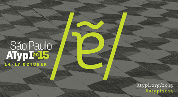
The TypeTogether team regularly gives back to the creative community through educational workshops and engaging talks. On the docket is the upcoming ATypI conference being held in São Paulo (Brazil, October 2015). There Toshi Omagari, designer of the lively, humanist type family Marco, will deliver a talk about the Siddham script. Veronika Burian will be part of the type crit session alongside Jan Middendorp, Sumner Stone, and Gerry Leonidas. And as current president of ATypI, José Scaglione will be overseeing the entire event. Register at the website and make sure to say hi if you’re at the conference.

GO TO ATYPI'S WEBSITE