FONT CATALOGUE   |   CUSTOM TYPE   |   MORE NEWS   |   VISIT WEBSITE   |   FREEBIES
 

NEW RELEASE
Abril Text Light

We are happy to present two new styles of Burian and Scaglione's award wining take on the Scotch Roman style, Abril Text . Whether in digital or printed media, Abril has become a proven success in a wide range of publications, both in terms of economy and readability; a de-facto replacement for newspaper classics such as Utopia or Nimrod.

ORDER ABRIL TEXT LIGHT


SPECIALS
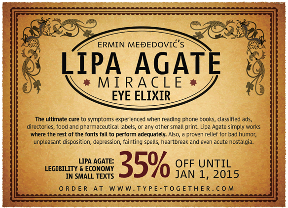
35% off on all Lipa Agate packages

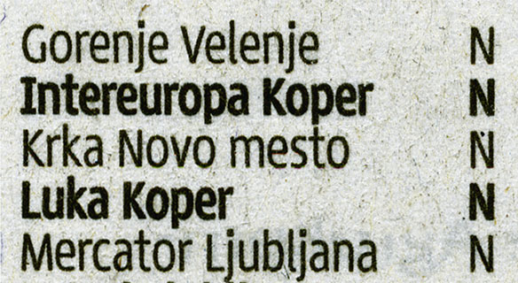
TypeTogether is proud to present Ermin Međedović's Lipa Agate, a sans-serif designed and engineered to be used at the smallest sizes, where most fonts fail to perform adequately. Perfect for phone books, classified ads, directories, food labels and pharmaceutical information, or any other job requiring economy without jeopardising legibility. Lipa Agate provides: 3 levels of condensation, 4 weights (Light, Regular, Medium and Bold), and 2 sets with different x-heights (High and Low).
Take advantage of this limited-time offer – all Lipa Agate packages are reduced by 35% until January 1, 2015.

ORDER LIPA AGATE


TYPE IN USE
Lipa Agate in the newspaper Delo

Lipa Agate is shown here in very small text sizes in the daily Slovenian newspaper, Delo. The font family is used in a variety of places, including score-tables, menus, classified-ads and short texts, all printed at very much reduced point sizes. In all of these applications Lipa Agate maintains a high level of clarity, legibility and space-saving efficiency.

SEE MORE IMAGES HERE


SNEAK PEEK
Soleil Magic Caps

Ladies and gentlemen, girls and boys, TypeTogether is proud to present the mysterious and wonderful show of Fabulous Homola, typography's favourite illusionist! Seriously, we invite you to take a peep at the playful Soleil Magic Caps, a display companion to the geometric sans Soleil, designed by Wolfang Homola – with release date scheduled for early 2015.

CLICK HERE TO DOWNLOAD SAMPLE


TYPE IN USE
Abril & Adelle Sans in Diario Las Américas

Diario las Américas is the oldest Spanish-language newspaper in Miami (USA) and went through a major redesign in 2013, led by the renowned studio Cases i Associats; the result transformed it into a "tidy daily, more readable and modern". Diario las Américas uses Abril Display for headlines and Abril Text for subheadings and continuous text; Adelle Sans is used to counterbalance Abril in headlines, subheadings, menus, tables, figures and other small text.

SEE MORE IMAGES HERE


MERCHANDISING
2014 Font Catalogue

Don't miss out on our beautifully printed 32-page catalogue, covering all new and updated typefaces of the TypeTogether retail library from 2009–2014. The catalogue provides examples of each font being used in various sizes and in different languages.

ORDER A COPY
SEE MORE IMAGES IN FLICKR