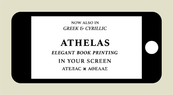
FONT CATALOGUE   |   CUSTOM TYPE   |   MORE NEWS   |   VISIT WEBSITE   |   FREEBIES
 

NEW RELEASE
Athelas now speaks Greek & Cyrillic!

In 2008 we released Athelas, an elegant typeface looking to the beauty of fine book printing. This award-winning font, was recognised even further when Apple chose it for the iBook application, its mobile e-book reader. Now, we are happy to announce the release of the Cyrillic and Greek additions for Athelas, expanding the family as part of our continuous effort to increase language support. Despite the differences between the three scripts, they have been designed to harmonise well when used together. The Greek extension was done by Greek specialist Irene Vlachou and the Cyrillic by Tom Grace.

IMPORTANT NOTE: Please contact us if you own Athelas and would like to upgrade to the PanEuropean (PE) version.

ORDER ATHELAS NOW


AWARDS
Premios Clap

We are happy to announce that three of our typefaces have been awarded in the 2013 edition of the Premios Clap: Tablet Gothic, our 84-fonts grotesque sans serif, awarded Clap Platinum, maximum recognition, and both Adelle Sans, a multi-purpose family, and the exquisite Abril, have been awarded best design in their category. The Premios Clap organised by Foroalfa and Veredictas reward the best works in the areas of branding, editorial design, graphics in advertising and digital graphics from Latin America.

READ MORE
SEE THE WINNERS IN CLAP WEBSITE [IN SPANISH]


TYPE IN USE
Capitolium 2, in Politiken

Politiken,"World's Best-Design Newspaper" in 2012 and 2013, employs Gerard Unger's Capitolium 2 as a fundamental piece in its design. In 2011, Art Director Søre Nyeland launched a sophisticated and bold redesign of Politiken, Denmark's second-largest morning newspaper. As a result the newspaper obtained the highest recognition at the Society for News Design (SND) awards. In this new design Capitolium 2 is used extensively throughout in both capacities, display and text. Unger's typeface is also being used at the website of the newspaper, served by the webfont provider and our partner Webink.

SEE MORE IMAGES


TYPO MATCHING
Eskapade Fraktur & Karmina Sans

In this Typo Match edition we introduce Eskapade Fraktur, the fresh blackletter by Alisa Nowak, and Karmina Sans, a vivid humanist sans. The later is a versatile tool for editorial design, excellent for setting short texts in its intermediate weights, matching nicely with the broken forms of Eskapade Fraktur and its mixture of round and straight forms. The clarity of Karmina Sans tunes perfectly with the daring touch of Eskapade Fraktur decorative capitals.

BUY ESKAPADE AND KARMINA SANS


BOOKS
The book Cómo crear tipografías now in Polish

The book specialised on type design Cómo crear tipografías (How to create typefaces) by Cristobal Henestrosa, Laura Meseguer and José Scaglione, is now available in Polish: Jak projektować kroje pisma. Previously released in Spanish by publishing house Tipo e, the book has been translated and released by Polish publishing house d2d.pl with Adam Twardoch's supervision. This is a skilful translation, edited with care and loyal to its original edition. It is on sale online at the publishing houses' website, for 40 zł (c.10 euros) plus shipping.

READ MORE
READ MORE OR BUY THE BOOK [IN POLISH]