FONT CATALOGUE   |   CUSTOM TYPE   |   MORE NEWS   |   VISIT WEBSITE   |   FREEBIES
 

EXHIBITIONS
TDC Tokyo 2013


The Tokyo TDC Exhibition 2013 presenting the results of the Tokyo TDC Awards 2013 was held at Ginza Graphic Gallery in Tokyo from April 4, 2013 until April 27. The exhibition presented a total of 150 works including the award-winning and nominated works and works which won high marks at the primary selection. We are very happy that our Tablet Gothic made it too.

LEARN MORE ABOUT TABLET GOTHIC


EDUCATION
No typo with tipos workshop

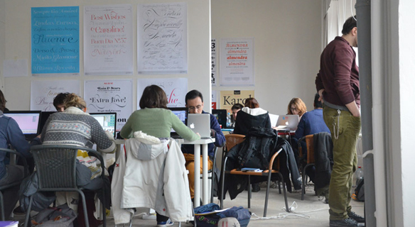
Veronika Burian and José Scaglione lead a two-day workshop in Prague, just after the Tipos Latinos 2012 exhibition opening. This intermediate level workshop dealt with many aspects of the type design process, including glyph drawing, spacing and kerning techniques, multiple master technology, character set and font family expansion and more. Very intensive practical sessions were combined with open critiques and short lectures to create a fast paced workshop and a very fun working environment.

SEE MORE IMAGES
VISIT TIPOS LATINOS


FEATURED PROFILE
Gerard Unger

Gerard Unger is a legendary type and graphic designer. His diverse and prolific career includes stamps, coins, magazines, newspapers, books, logos, corporate identities, annual reports, highway signage and many other objects, and of course, typefaces.

Unger teaches and lectures in England and Holland about his own work, type design, the reading process, and related subjects linking the usually limited scope of type and typography with a wider cultural view. His work is continuously pushing the boundaries of type design but without forgetting functionality and readability. He has been awarded several Dutch and international prizes and honors and his book Terwijl je leest – About Reading – has been translated in Italian, English, Spanish and German.


Capitolium 2
Soon after the completion of Capitolium in 1998 – it was the central part of the project for a wayfinding and information system to guide pilgrims and tourists through Rome during the Jubilee of the Roman Catholic Church in 2000 – Unger began contemplating the possibility of bringing the atmosphere of this design to newspapers. Capitolium 2 has been adapted for newsprint, it has a bigger x-height and, as is possible with most of Unger's type designs, Capitolium News 2 can be condensed and expanded without any harm to the letterforms. Capitolium News 2 is a thoroughly modern newsface, with classic letterforms linked to a strong tradition. Capitolium 2 was finalist at ED-Awards 2012 and it was one of the winners of Letter.2, the 2nd type design competition of the Association Typographique Internationale.

   
Coranto 2
Coranto 2 is originally based on Unger's typeface Paradox, and arose from a desire to transfer the elegance and refinement of that type to newsprint. Newspaper production still demands many letter forms, but advanced printing brings out details better and makes typography more appealing to readers. To satisfy these new possibilities Coranto 2 is more robust and has a larger x-height. In addition the Headline version is more condensed and therefore space-saving and has an even taller x-height for good legibility.
   

THE GERARD UNGER FONT COLLECTION

For a very limited time TypeTogether is offering the complete Gerard Unger Font Collection for just €499.00. A saving of €536.00. The package includes the most complete version of th font families Capitolium 2, Capitolium News 2, Coranto 2 and Coranto 2 Headline: OpenType Pro. BUY IT NOW! OFFER EXPIRES ON June 30.