FONT CATALOGUE   |   CUSTOM TYPE   |   MORE NEWS   |   VISIT WEBSITE   |   FREEBIES
 

NEW RELEASE
Tablet Gothic Oblique

Our largest type family just got bigger! Originally designed by Veronika Burian and José Scaglione as a titling typeface, Tablet Gothic is quickly becoming a news designer's favourite. The font delivers the sturdy, straightforward and clean appearance expected from a grotesque combined with a good measure of personality. Now with the obliques making it a total of 84 fonts with six grades of condensation, Tablet Gothic can deliver consistent impact even better, whatever the publication format. Please contact us if you wish to upgrade your copy of Tablet Gothic to include obliques.

BUY IT NOW


AWARDS
Iskra wins at TDC

Tom Grace's Iskra has been selected by the jury of the renowned TDC competition to receive the Certificate of Excellence in Typeface Design, and will be included in the Annual of the Type Directors Club, Typography 34. Iskra manages to detach itself from the usual sans serif stiffness by paying tribute to the less-predictable style of brush lettering. The typeface was conceived to challenge the limits between utilitarian and decorative.

GET ISKRA NOW


EXHIBITIONS
No Typo with Tipo

We are very happy to bring Tipos Latinos 2012, the Fifth Biennial Show of Latin American Typography for the first time to the Czech Republic this April. The objectives were clear; expose the local Czech design scene to Latin American typography and nurture the exchange of knowledge and experience. As part of this endeavor, we also invited several czech designers to contribute their recent type work, that hasn't been exposed to the general public before. The exhibition will open on the 4th April at the Gallery Vernon in Prague 7. At opening night a special token will be the screening of the film "Making Faces" by Richard Kegler.

LEARN MORE


EDUCATION
Scaglione to lecture in Barcelona

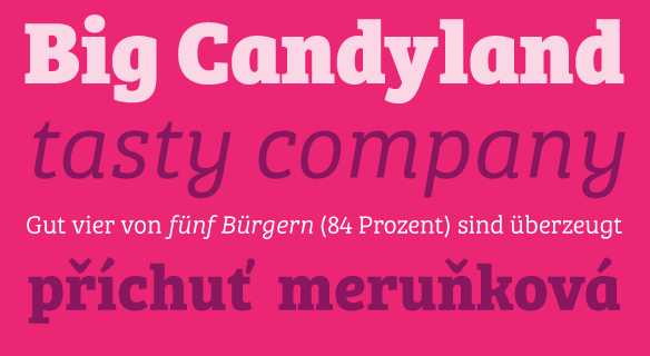
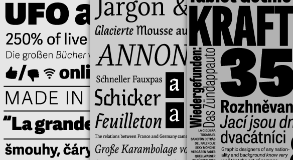
TypeTogether's schedule in Catalunya is already set and includes two lectures by José Scaglione in Barcelona. On Tuesday, April 9, at 7:30pm, do not miss Typographic Matchmaking, a primer to successful combination of type families, at BAU. And on Thursday, April 11, at 7:00pm, José will visit ELISAVA to present Shaping Types, Form and Usage. Both lectures are open to the general public.

VISIT ELISAVA'S WEBSITE
VISIT BAU'S WEBSITE


SNEAK PEEK
Bree Serif almost here!

Some time ago, TypeTogether partnered with Google to bring you a prototype version of Bree Serif Regular as a free font. Bree lovers will be pleased to hear that we are now getting ready to publish other 5 weights of Bree Serif upright, which will be followed by matching italics in the near future. We posted a few images to let you know what is coming!

SEE MORE IMAGES


AWARDS
Three of our fonts selected by Typographica

Typographica's long awaited Best Typefaces of 2012 is out, featuring 3 of our fonts, Adelle Sans, reviewed by Nadine Chanine, Eskapade, reviewed by Matthew Butterick, and Tablet Gothic, reviewed by Ivo Gabrowitsch. We also recommend to read the Brief Thoughts on the State of Type, by Typographica's editor, Stephen Coles.

READ ADELLE SANS REVIEW
READ ESKAPADE REVIEW
READ TABLET GOTHIC REVIEW