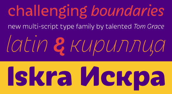
FONT CATALOGUE   |   CUSTOM TYPE   |   MORE NEWS   |   VISIT WEBSITE   |   FREEBIES
 

NEW RELEASE
Iskra, by Tom Grace


We are happy to announce the release of Iskra, a new sparkling sans serif designed by Tom Grace. It was conceived to challenge the limits between utilitarian and decorative. Sporting a low-contrast profile, it is a study of bridled energy in the Cyrillic and Latin scripts. Its eye-catching forms are an oblique tribute to the less-predictable style of brush lettering, and contain daring, elegant curves, economical proportions, and a slight top-heavy asymmetry. Its warmth comes from the subtle emphasis on the structures and details of individual letterforms, whereas its solidity is demonstrated through its balanced rhythm over long spans of text.

BUY IT NOW


NEW RELEASE
Eskapade Roman

The experimental Eskapade fraktur by Alisa Nowak, received two additions to the family. This time, Alisa created two fonts of the old-style nature adapting a humanist structure with condensed proportions. Both, the roman and italic have strong links to the Fraktur providing for a balanced harmony in mixed text-settings. Please contact us for details, if you wish to upgrade to the full Eskapade family.

LEARN MORE


ONLINE STORE
New features at our online store

We are pleased to announce two new features that will enhance the user experience at our online store. Firstly, we have enabled new payment processing capabilities. Customers can now choose to pay by Paypal or by credit card. The new credit card payment process is secured by Verified by VISA and MasterCard SecureCode technologies. Additionally, we introduced a new font tester with improved rendering, faster loading time and easy access to pangrams and useful strings of text and an improved version of the character set viewer.

VISIT WWW.TYPE-TOGETHER.COM


TYPE IN USE
University of Chicago Spanish-English dictionary


The University of Chicago Spanish-English Dictionary, Sixth Edition is based on the fifth edition done by Jill Shimabukuro of The University of Chicago Press. Talented designer Matt Avery created this new edition with much enthusiasm and typographic insight, successfully using the sturdy typeface Sirba, by Nicolien van der Keur. Special phonetic characters were designed and added to Sirba in cooperation with Matt Avery.

SEE THE IMAGES


TYPE IN USE
Abril and Tablet Gothic in the news


The renowned studio Cases i Associats selected Abril and Tablet Gothic for the redesign of local newspaper "Chad" from Mansfield, UK. The carefully crafted design takes advantage of the versatility provided by these two families. In the main news section Tablet Gothic Narrow is used for headlines with incredible presence on the page and Abril Text for body copy. Tablet Gothic also functions as a multiple-purpose font on footnotes, highlights and titles of different sizes.

SEE THE IMAGES


MERCHANDISING
Adelle specimen


Talented czech designer Olga Benešová designed this beautiful fold-out featuring Adelle, our successful typeface popular in print as well as on the web. This limited edition Adelle specimen features samples of the full family including Adelle Sans and Cyrillic versions. It folds out to 54x28 cm and has been printed by T.A. tisk on Munken Lynx.

NOTE: If you are a subscriber to EYE magazine, you will receive one copy in the Autumn issue 2012.

ORDER NOW
SEE MORE IMAGES