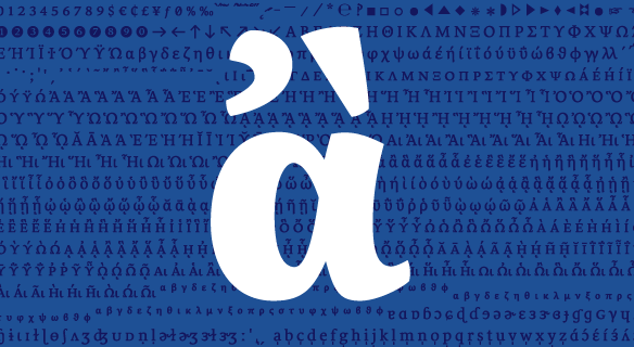
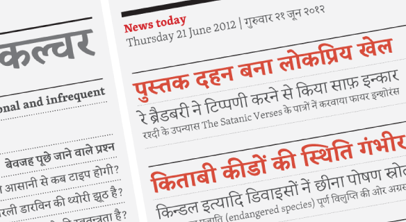
FONT CATALOGUE   |   CUSTOM TYPE   |   MORE NEWS   |   VISIT WEBSITE   |   FREEBIES
 

NEW RELEASE
Sirba speaks Greek


Sirba, a robust typefamily by Nicolien van der Keur, for complex text environments, now offers even more possibilities. The recent update includes a full set of phonetic symbols, designed upon request for the use in dictionaries, and the extension to polytonic Greek. Although the historical way of writing Latin and Greek is very different from each other, the Greek is designed to harmonize well when used together with the Latin. Irene Vlachou and Gerry Leonidas assisted the development of Sirba polytonic Greek with their professional expertise.

SEE SIRBA


SPECIALS
Academic discounts


We are committed to further education in typography and improve opportunities in this field. From the start, we have been offering a 25% educational discount for students, teachers, faculty and school. Please contact us with a valid Student ID or write from your university email to receive the discount coupon.

GO TO THE E-STORE


SPECIALS
Skolar Devanagari

Released by our sister foundry Rosetta, Skolar Devanagari is a collaboration between David Březina and Vaibhav Singh. It has been designed as a companion to the Latin keeping the nuances and characteristics of the Devanagari script foremost while providing a complementary design for multi-script typography. The fonts support Sanskrit, Hindi, Marathi, Nepali, along with a wide range of regional languages that use the Devanagari script. Take advantage of the introductory offer: 50%off!

LEARN MORE


TYPE IN USE
Coranto De Tijd


London based editorial designer, Mark Porter, former creative director of The Guardian, selected Gerard Unger's Coranto 2 typeface for the recent design of De Tijd. This Belgian daily newspaper that focuses on economy and politics. Coranto 2 is used for both titles and body copy, delivering a newsy and assertive feel to this well established newspaper.

SEE THE IMAGES


WEBFONTS
Adelle hinted!


One of our most popular webfonts, Adelle, has been updated for better screen rendering and cross-platform consistency. Eight of its styles (light to bold and matching italics) have been optimised for low resolution rendering. The new webfonts provide a more consistent performance and overall better appearance at smaller pixel sizes. Please consult your webfont service provider for availability: TYPEKIT - FONTDECK - WEBINK

SEE ADELLE


EDUCATION
Istanbul Workshop


Thanks to the energetic ISType organisers Onur Yazıcıgil and Alessandro Segalini, Veronika and José spent some wonderful time in Istanbul this June giving a type workshop and presenting their latest talk about "typefaces for current editorial design".
The workshop "Introduction into digital typeface design" covers many areas of the typeface design process and aims to jumpstart both beginners and amateurs into alphabet-drawing. After some initial experimentation on their own design, the students were joined in small groups to develop the selected designs further and digitise them. A short video about the process will be available shortly on our website.

SEE MORE IMAGES