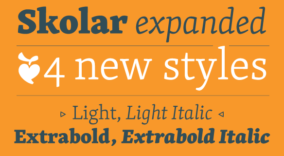
FONT CATALOGUE   |   CUSTOM TYPE   |   MORE NEWS   |   VISIT WEBSITE   
 

NEW RELEASE
Skolar expanded!

Here is a nice treat for all the Skolar fans. The popular award-winning family designed by David Březina has been updated and now includes four new styles: Light and Extrabold with accompanying italics. Loved by readers and designers alike, Skolar has proven its versatility. It was used for all kinds of applications and was one of the favorite choices for webfont pioneers. The new styles bring you yet more functionality with the same robust and playful feel.

IMPORTANT NOTE: If you already own a Skolar licence please contact us to upgrade to the new complete bundle at a discounted price.

LEARN MORE


SNEAK PEEK
Adelle Sans


Just a bit of patience, Adelle Sans is almost here. Since the release of our award winning slab serif Adelle we have been flooded by requests for further expansion of the family. This sans serif companion seeks to bring a wider range of tools to designers dealing with complex pieces. It is also a perfect option for those of you looking for a grotesque sans that approaches the reader in a warmer and more friendly way than the usual suspects.

SEE THE IMAGES


TYPE IN USE
DOOR

The Dutch magazine DOOR, designed by studio inQUE, celebrates the 400 years of existence of the Hofjes Codde en van Beresteyn foundation. The main idea behind it builds on the concept that older people remain an important part of society. In the grain of Dutch type tradition, Nicolien van der Keur's
robust but warm typeface Sirba works very nicely throughout the entire publication.

MORE IMAGES


TYPE IN USE
Margriet


We are happy to see our latest font family Abril already in use. The Dutch Women's magazines "Margriet", started to implement Abril Display for headlines, pull-out quotes and various other functions within the entire magazine.

SEE THE IMAGES


EDUCATION
Upcoming lecture at Ampersand


José & Veronika have been invited to speak at this year's Ampersand conference in Brighton in June.
It is the second edition of the successful one-day event on web typography bringing together the
industry’s leading thinkers and designers from across the worlds of type and web design.

LEARN MORE


AWARDS
Best of 2011


The popular Typographica blog is back with its well curated review of "Best typefaces of 2011". The invited group of people to review their choices of typefaces ranged from writers, educators to type designers and type users. This year, we are happy that two of our typefaces were selected. Claus Eggers Sørensens choice was Capitolium News 2 by Gerard Unger, and Abril by Veronika Burian & José Scaglione was selected by Tim Brown.

VISIT TYPOGRAPHICA'S WEBSITE