FONT CATALOGUE   |   CUSTOM TYPE   |   MORE NEWS   |   VISIT WEBSITE   
 

NEW RELEASE
Crete Round


Crete Round started as a tailored version of Crete, created specially to serve as corporate typeface for the upcoming type design competition Letter.2. It is more independent from the original with modified terminals and serifs to create two new fonts that deliver a more contemporary and functional appearance. After being available only as webfont, Crete Round is now obtainable in our webshop. For a limited time, we offer a 25% discount on the Crete Round bundle (USE CODE 99d11132 DURING CHECKOUT).

ORDER NOW


TYPE IN USE
Editorial Pack in Sardegna Quotidiano


The Italian daily newspaper Sardegna Quotidiano has been recently re-designed by Milan based studio, Alberto Valeri srl. The newspaper is published by the Journalist Association of Sardenia and covers mostly national and regional news together with local cultural events and sports. Valeri successfully used our editoral bundle, consisting of Ronnia for titles and Karmina for body text.

SEE MORE IMAGES


ARTICLES
Gerard Unger
in Creative Characters

Jan Middendrop recently interviewed Dutch type designer Gerard Unger for the popular Creative Characters by MyFonts. He talks about how he started in type design, his time with Wim Crouwel, his design philosophy and more. Read the full interview here. TypeTogether published two of his typefaces, Coranto 2 and Capitolium News 2.

READ THE INTERVIEW


TYPE IN USE
Traveling with Adelle


Continental Airlines passengers now have the company of TypeTogether's Adelle for their journey. The airline's magazine Hemispheres features several weights of Adelle for a wide range of functions, from main headlines to body copy. The magazine is sober and carefully designed, and takes advantage of the contemporary feel and friendliness that has become Adelle's trademark.

SEE THE IMAGES


EDUCATION
Wokshop in Portland


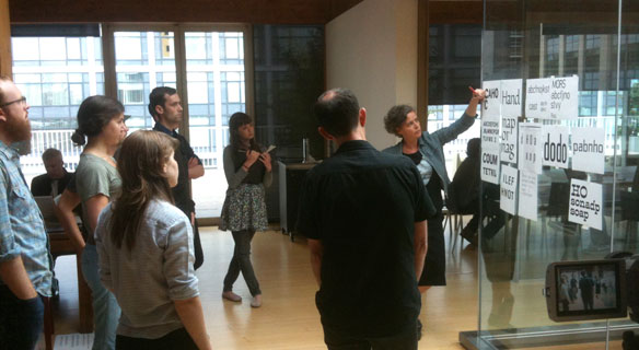
A few weeks ago, Veronika gave a two-day type design workshop in Portland, Oregon. It was organised by Pete McCracken, owner of Crack Press, and hosted by Wieden & Kennedy, an internationally recognized ad agency. The main focus of the workshop was on expanding the students' knowledge in basic practices of type design, such as optical corrections, shape/countershape relationship and bezier curve drawing. Additional to individual feedback, Veronika held open-crit sessions of the student's work and short theoretical lessons.

SEE THE IMAGES


COMPETITIONS
Letter.2: last call for submissions


Letter.2, the 2nd type design competition organized by the Association Typographique Internationale, is open for submissions until August 15. All type designs finalized between August 2001 and August 2011 are eligible for entering this contest. The jury will meet in Buenos Aires in October 2011 and will make a selection of winning entries based on their design excellence. The winning designs will be exhibited at the 2012 ATypI conference.

VISIT LETTER2.ORG NOW