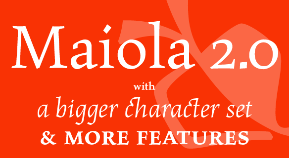
FONT CATALOGUE   |   CUSTOM TYPE   |   MORE NEWS   |   VISIT WEBSITE   
 

NEW RELEASE
Maiola 2.0


We are proud to announce the new release of Veronika Burian’s multi-award winning Maiola. Originally released in 2005, Maiola was an immediate success. It won the renowned TDC competition in 2004 where it was also recognized as a “judge’s choice”. The update to this beautiful font family includes the addition of over 240 glyphs to the original character set covering Latin A, Cyrillic and Greek. Maiola 2.0 features new ornaments, stylistic alternates, ligatures, superior letters, fractions and more. Furthermore, several glyphs were significantly improved and the kerning was fine tuned for better performance.

SEE MORE


TYPE IN USE
12 games for children and adults


A new book by Czech publisher Práh is using our font family Athelas for main body text. Very well-designed by prague-based Klara Kvízová from ReDesign studio, it features 12 rather unusual games for the whole family. The beautifully executed and witty illustrations are done by Michaela Kukovičová.

SEE THE PICTURES


EDUCATION
Letter and Text conference


José Scaglione was invited to lead a workshop and present a lecture in the upcoming Editorial Design Conference that will be held in Santa Fe, Argentina, on October 12-14. The conference programme includes discussion panels, lectures and exhibits that will deal with subjects related to typography, typesetting and legibility in the context of editorial design.

LEARN MORE AND REGISTER


ARTICLES
Interview in Étapes


The July 2010 issue of French design magazine étapes is featuring an interview with Veronika Burian, the first of a series about women lecturers at this years TYPO Berlin. Linda Kudrnovská, the chief editor of the czech magazine TYPO, starts with questions about Veronika's talk on type combinations, continued by asking about her view on type trends and her experience with multilingual/-script typography.

READ MORE


TYPE IN USE
City Press


Adelle was selected to be used in the redesign of City Press, a Sunday newspaper, aimed at black readers in South Africa. It is the third biggest selling newspaper and is distributed nationally and in neighbouring countries including Botswana, Lesotho, Namibia and Swaziland. Adelle is primarily used in the masthead, section titles and city press magazine. Redesign by Peter Ong.

SEE THE IMAGES


EDUCATION
Type design workshop in Ljubljana


Veronika Burian was invited to hold a type design workshop during the "Festival of Letters", organised by Marko Drpić, tipoRenesansa, in Ljubljana, Slovenia. The workshop covers many areas of the typeface design process and aims to jumpstart both beginners and amateurs into alphabet-drawing. The first day, students did some sketching exercises and developed their own design. On the second day, followed by a basic introduction to Fontlab, the students started to digitise their design and expand the character set.

SEE MORE IMAGES