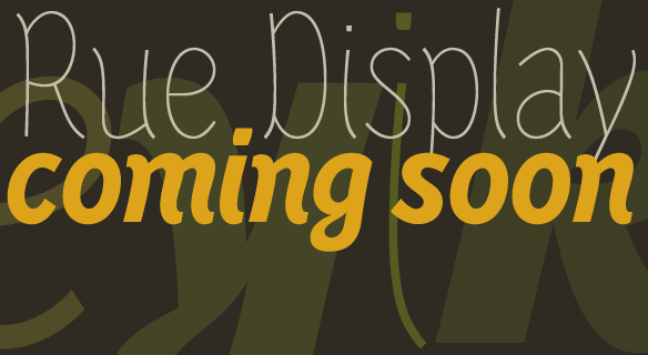
FONT CATALOGUE   |   CUSTOM TYPE   |   MORE NEWS   |   VISIT WEBSITE   
 
NEW RELEASE
Edita small text


Two new fonts were added to Pilar Cano's gorgeous type family Edita. The new weights are engineered for small text setting. They will prove to be a perfect addition to the family for those designers with a keen eye for detail. Edita is a gentle typeface, humanistic in concept yet with a contemporary feel, where softness and fluidity play a very important role. It is a general book typeface, versatile enough to be used in many other contexts, from novels to promotion material.

See more


FREE FONTS
Adelle: two weights for free!


Santa is late but he's finally here! The OpenType Basic version, full commercial licence, of Adelle Bold and Bold Italic can be downloaded free of charge at TypeTogether's website. Adelle is a dynamic slab serif designed by Veronika Burian and José Scaglione. While it is conceived specifically for intensive editorial use, its personality and flexibility make it a real multiple-purpose typeface. These two fonts are also provided for free for web usage by our trusted partner Typekit.

GET THE FONTS NOW (USE CODE 872821f)
USE ADELLE IN YOUR WEBSITE


TYPE IN USE
Pentagram calendar


Celebrate each month of 2010 with another font. This classic Pentagram typography calendar was developed together with Veer and features two of our typefamiles. Crete sweetens the month of April and Karmina Sans gets hot in August. There are two sizes available, desk-size 18" x 12" and super-sized at 33" x 23".

SEE THE IMAGES


SNEAK PEEK
Rue


Rue, by Singaporean designer Winnie Tan, is a candy to typographer's eyes. Its casually ornamental appearance with random traces of calligraphic tendencies, make it a spirited and exploratory design. Rue's organic shapes invite for applications in aesthetics, wellness and botanicals. The ten-style family is expected to be released in February.


TYPE IN USE
The Leither


Scottish designer Gavin Munro selected Adelle as the secondary typeface for the redesign of the monthly community magazine, The Leither, based in Edinburgh. Various weights of Adelle, in particular the italics, are greatly used mainly in headlines, subheadlines and shout-outs.

SEE THE IMAGES


EDUCATION
Burian to speak at Brno


The Czech art academy in Brno, AGD FaVU, VUT Brno, invited Veronika Burian to give a talk to their students and a wider interested audience. It will take place on the 21st January 2010 at the academy at 18:00. Veronika will touch on topics related to the everyday running of an independant typefoundry and talk about the pros and contras of retail and custom-made typefaces showing her own and collaborative work.

MORE INFORMATION