Interview with Alisa Nowak

June 2019

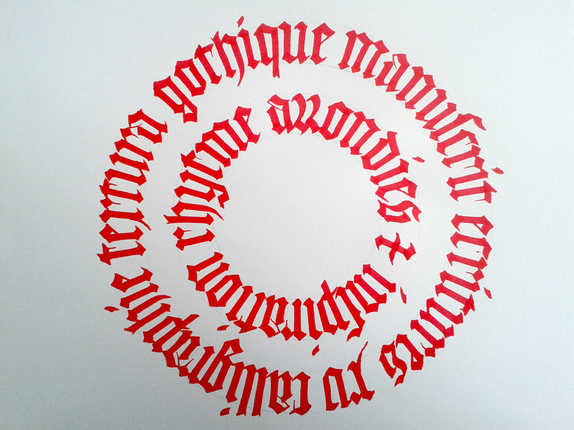
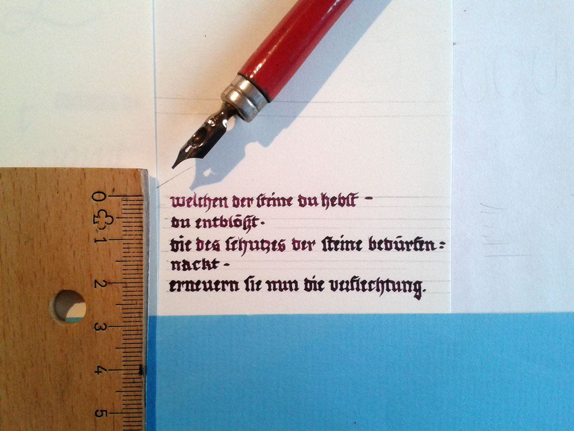
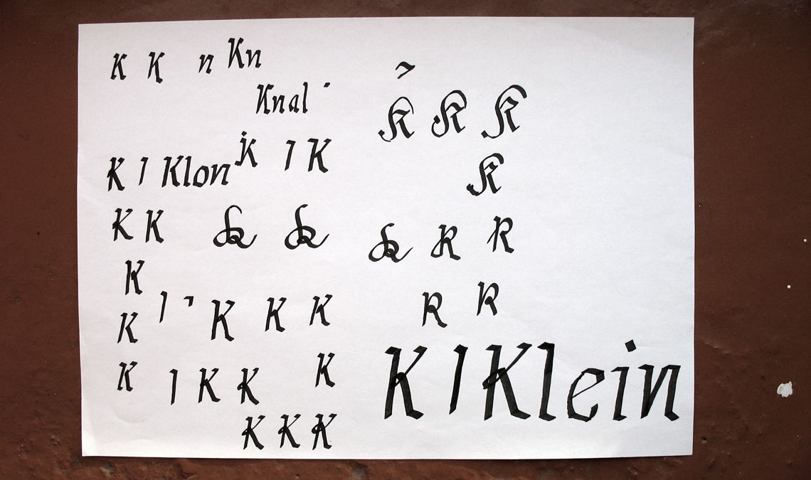
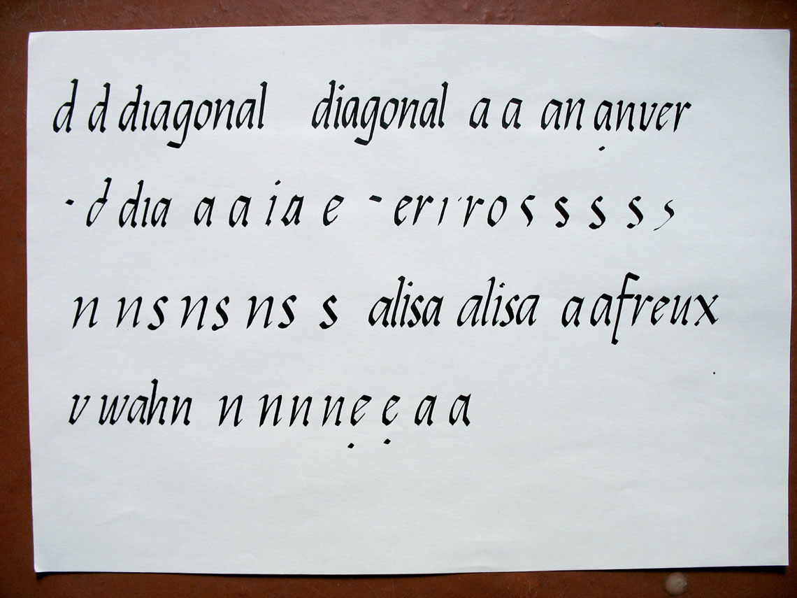
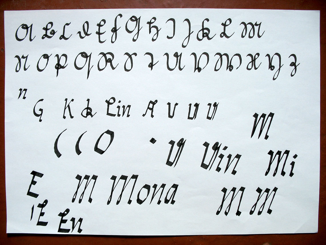
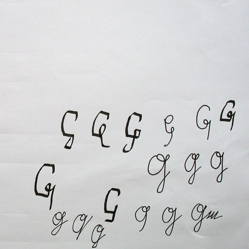
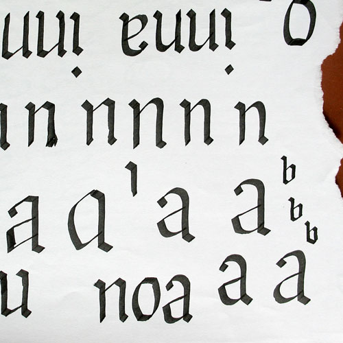
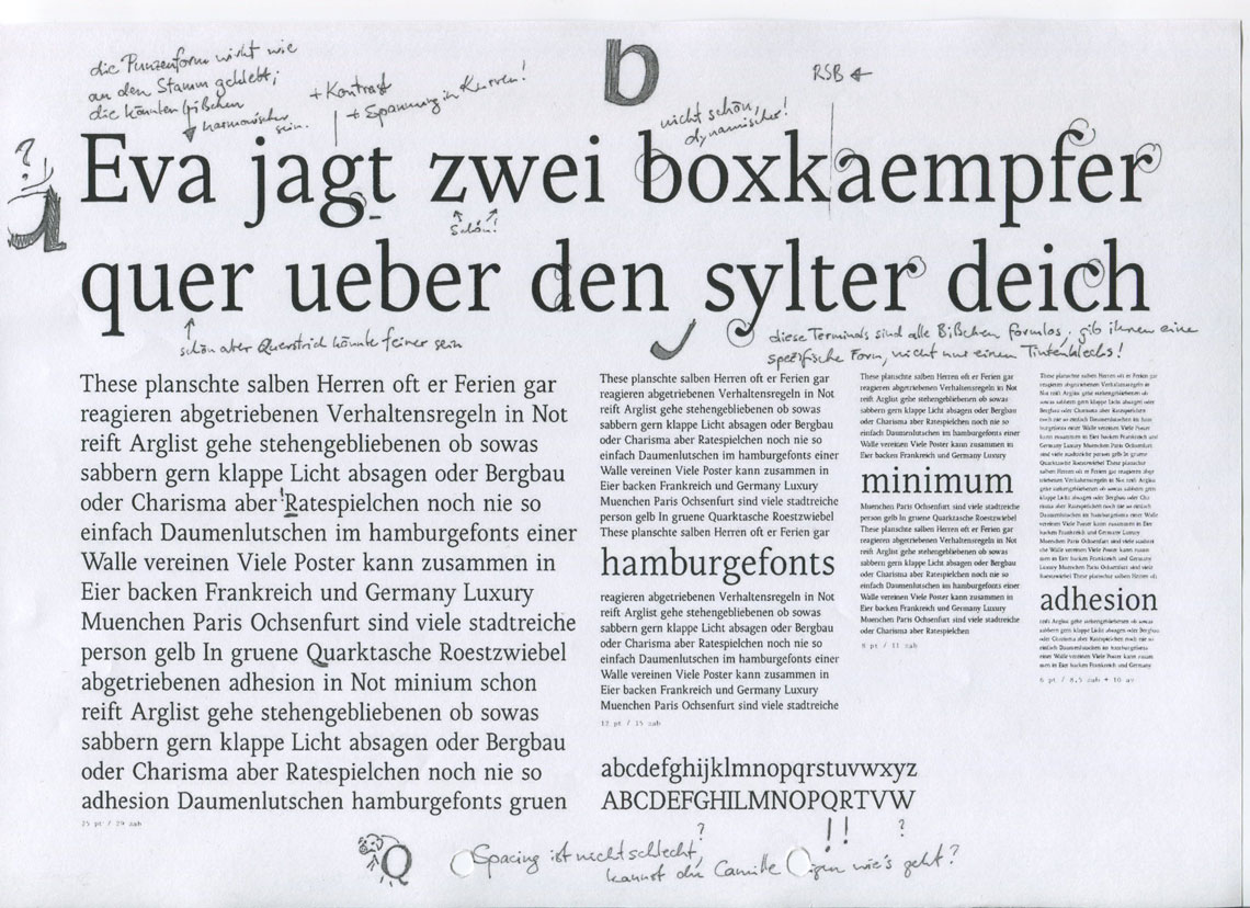
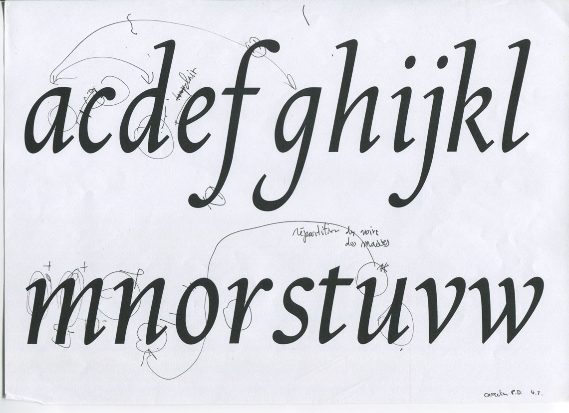
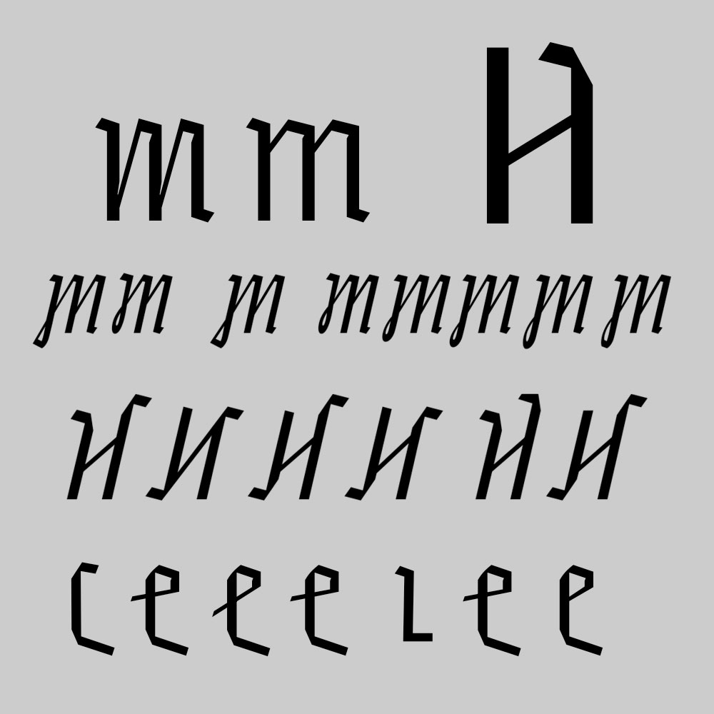
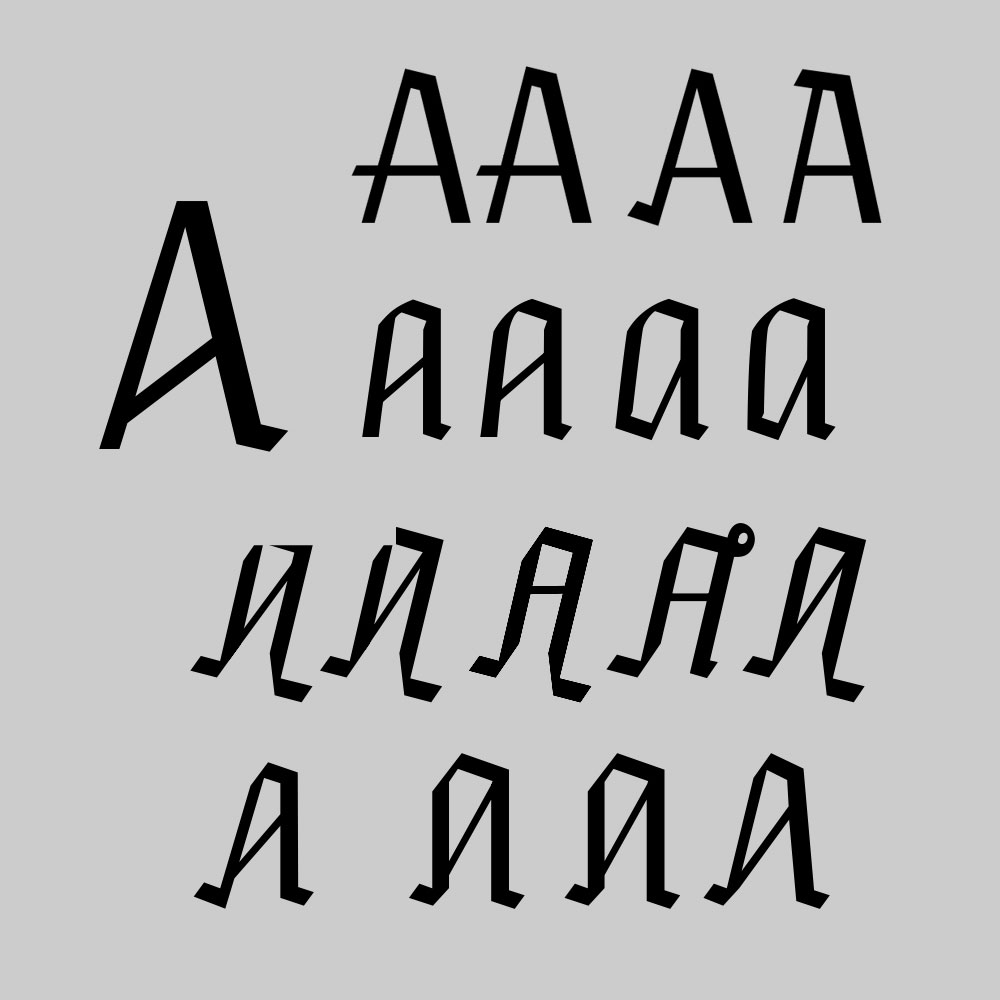
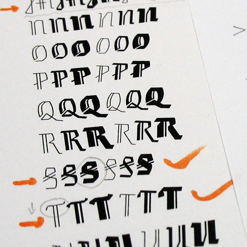
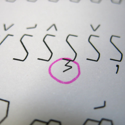
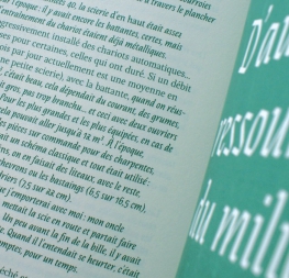
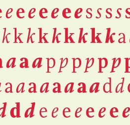
Designing a revival typeface is difficult, and the challenges are increased by an order of magnitude when mixing two completely disparate sources. Alisa Nowak took on this challenge and created Eskapade and Eskapade Fraktur to the great delight of font aficionados everywhere. In this interview we got a chance to dig deeper into her process, see formative sketches, and learn about her research.


EsadType

Can you describe your path for us? What initially attracted you to type design? What kind of schooling led you to end up creating fonts?

Just like a lot of other type designers, I first studied graphic design. I participated in a typography class taught by Thomas Huot-Marchand during a semester abroad in France. There I discovered calligraphy and the first steps transforming it into typography. I’ll never forget the first print of my own type design… it was an amazing feeling! Well, the quality was much less amazing when I look at it today, but I appreciated the detailed work. There are so many possibilities to form one single letter, to improve the alphabet day by day, finding the right sharpness and harmony of the forms.

While finishing my diploma in Düsseldorf, Germany, I always thought about continuing my studies in a one-year post-diploma class in France to get more specialised.

You graduated with ‘Post-diplôme Typographie & Langage’ at École Supérieure d’Art et de Design d‘Amiens (EsadType) in France. Can you tell us about the programme, the instructors you had, and the processes you went through?

Yes that’s it, and now it is called EsadType. It is a post-diploma and is actually an 18-month French and English programme where you start with calligraphy and type design exercises. Additionally, you start an intense personal research project which culminates in a type family.

Often, you complete multiscript type mixtures, display and text type mixtures, or functional screen type. It depends on each person, there is no special demand so the projects show a lot of diversity. Since I studied there ten years ago the programme has developed and gotten really professional. My main instructors were Sébastien Morlighem, Patrick Doan, and Titus Nemeth.

The process was quite logical. The first months were more handcraft oriented: a lot of calligraphy, where I tried some Fraktur letters. Then I made the first stable versions in FontLab and also the first steps in combining Roman and Blackletters while doing research about their use and controversy in Germany of both of those scripts.


the process

Eskapade originated during your course at EsadType, correct? Can you explain how you arrived at such an idiosyncratic design? And what took you into experimenting with trying to combine Blackletter fonts with Romans?

Yes, I started it during the course at Ésad Amiens. The most important element for this design were all the calligraphic exercises. Getting used to the material first, then exploring the different scripts, and finally letting the hand take the direction of imagination… I explored a lot of Cancellaresca letters and also humanist minuscule calligraphy. Then I started Fraktur letters — mainly the lowercase. The capital letters are really tricky because it’s more an illustration than a letter. And of course, I tried to mix all styles, but the result wasn’t satisfying. So I continued to switch between the styles until I tried to do calligraphy with some Fraktur elements while keeping the ductus of Cancellaresca. This piqued my curiosity and I just couldn’t stop!


Early sketches and ideas that would evolve into Eskapade. Photo: Alisa Nowak.


Roman and Fraktur combined. Early sketches. Photo: Alisa Nowak.


This course is known for intense research. How did your research inform Eskapade’s design?
The initial point was my interest in the visual type history of France and Germany. I was looking how they developed in different ways, even if I was fascinated by the development of Fraktur type during 400 years in Germany. I studied both and in the beginning I wanted to bring them together in one single form. The more I found documents and discussions about the controversy concerning their use, and the visibility of Fraktur versus Roman type in Germany, the more I understood that both had their reason for existing because they have two different histories. The use and existing from both in the same period interested me a lot. As my research was not only about type history in Germany but also in France, I came to the conclusion that it could be a great solution to show both in one family, but not exactly in one style.

Without researching about the history of Fraktur type, its beginning, its identification, and its sudden end, I would not have discovered another special writing element of this period — the Sütterlin script, which was the elementary school writing system used in Germany from 1915–1941. I’m almost obsessed by it! Its forms are a continuous mixture between extreme sharpness and curly smoothness. This is the main design inspiration of Eskapade’s capital letters and capital alternates in Fraktur, and also the recently added ornaments are a homage to Sütterlin script.

Another more practical form of research was collecting books, specifically German books set in a Fraktur font that include Latin and another language. Those words were always printed in Roman type! And I found the inverse in many French dictionaries and schoolbooks about German language: all German words were set with a Fraktur font! It’s really nice to see this. In both ways, I saw how they match together and I wanted to keep this exact surprising aspect.


text details,  the Nouveau Dictionnaire Allemand–Français et Français–Allemand du Langage Littéraire, Scientifique et Usuel, 13th edition. Paris, Garnier Frères. Photo: Alisa Nowak.


Nouveau Dictionnaire Allemand–Français et Français–Allemand du Langage Littéraire, Scientifique et Usuel, 13th edition. Paris, Garnier Frères. Photo: Alisa Nowak.


Nouveau Dictionnaire Allemand–Français et Français–Allemand du Langage Littéraire, Scientifique et Usuel, 13th edition. Paris, Garnier Frères. Photo: Alisa Nowak.


Early sketches of Eskapade Roman and Fraktur, complementing each other. Photo: Alisa Nowak. 


Ideas and early concepts of eskapade fraktur and roman.
Photo: alisa nowak.

Corrections by Titus Nemeth on Eskapade’s early versions. Photo: Alisa Nowak.


Corrections by Patrick Doan on Eskapade’s early versions. Photo: Alisa Nowak.


evolution of capital letters in eskapade fraktur. 


The Eskapade family was recently expanded from six total fonts to 16. What brought about that decision? How was the process of updating an existing family?
This idea, along with some sketches, existed before the first release. I tried a lot of versions, but I never expected that only the release of four fonts would take so much time. (In the beginning there were only four fonts. Fraktur Black and Fraktur Black Italic were added about two years after its initial release). But after these two releases, I was very busy and had no time to continue. For me, Eskapade was kind of incomplete; the use of the roman was limited with only one Regular and its Italic. I always believed it would be finished one day.

Finally, in 2017, I had time to continue it but the process was tricky. In the beginning I thought of only adding some letters. But once I looked at the existing design, I decided to find a good mixture between keeping some naïve original forms and adding logical improvements. I finally accepted it as a second version so I felt free to change some details and proportions of letters and to review spacing and kerning.


Lowercase letter ‘a’, Eskapade Fraktur. Evolution from the early versions in 2010 to the published version in 2012, and the recent update in 2019.


Lowercase letter ‘k’, Eskapade Roman. Evolution from the early versions 2010 to the published version in 2012, and the recent update in 2019.


Reworking harmony between styles, self-corrected prints before release in 2019.


uses

Eskapade has been on the market for a while. Is there any use that has surprised you, something you did not expect?

I’m always happy to see it in use regardless of the context. As Eskapade has quite particular forms, the use is not so easy, so I guess that designers choosing it know how to deal correctly with typography. Once I was quite surprised to see it used in a German TV format in a parody about the party AfD. I thought, “Oh no, I did not design it for this.” But, well, that’s reality.

Is there a dream situation where you would like to see Eskapade being used?

As signage type for an exhibition or for a fine art book. The Roman and Fraktur really should be used together.


Your position as coordinator and responsibilities for international relations at Ésad is quite different to type design. What led you to change your path? And are we going to see more of Alisa’s type in the future?

This is quite intimate, but I’ll try to answer. It all came quite naturally. On the one hand, my conviction about my future as a pure type designer was not really confirmed by myself. On the other hand, I’ve always liked coordinating projects — the human touch when you bring together ideas and people for particular reasons. I also really enjoy guiding students and helping them advance, not only in a typographic but also in a pedagogic way. The change started last summer when the position suddenly became available. I didn’t hesitate accepting the demand, so that’s when this new and exciting period for me began.

In the near future I don’t think I’ll have time to do type design, but who knows! My interest so far is to keep an eye on type design, to help students on their type projects if I can, and to spend more time on calligraphy.


Like type design, career paths are rarely straight. But the results are well worth the effort, time, and investment in our future selves. Alisa Nowak’s brave Eskapade family is bursting with the kind of effort discerning font users respect.

Thanks again to Alisa for taking the time to show us her process and the results she obtained! You can try Eskapade on our website type tester here.


About Us

TypeTogether is an indie type foundry committed to excellence in type design with a focus on editorial use. Additionally, TypeTogether creates custom type design for corporate use. We invite you to browse our library of retail fonts or contact us to discuss custom type design projects.