Report on Introduction to Non-Latin Type Design Workshop
May 2019
An immersion into Arabic, Devanagari, Tamil, and Bengali at the British Library. Elena Veguillas reports on the two-day workshop ‘Introduction to Non-Latin Type Design’ led by Professor Fiona Ross, Dr Vaibhav Singh, and Borna Izadpanah.
by elena veguillas
After five great days in Vicchio with the entire TypeTogether team, I went to the British Library to enjoy two more days of intense type design at the workshop ‘Introduction to Non-Latin Type Design’. My brain was still fresh with Pooja Saxena’s and Azza Alameddine’s lectures on Devanagari and Arabic, respectively, so I was more than ready to meet Fiona Ross, Vaibhav Singh, and Borna Izadpanah. This was a great opportunity to improve my knowledge of Devanagari, Tamil, Bengali, and Arabic purely from a design perspective.
Although the workshop was aimed at the general public, only a few students were completely inexperienced with type design or typesetting. The majority were type designers or, like myself, worked with type on a daily basis. This set the scene for a high level of interaction and conversation from the very first moment.
saturday
After introductions the first day, Fiona presented the workshop’s aim and schedule and delivered the first lecture. We then started familiarising ourselves with some of the concepts we would be exploring later. She addressed the term non-Latin, a problematic one to say the least. (For further understanding of this point I recommend reading the article ‘Latin & non-Latin: The politics of script classification in the global type design industry’ by Soulaf Khalifeh, where she discusses the problems derived from a binary approach: Arabic and non-Arabic, Indian and non-Indian, etc.)
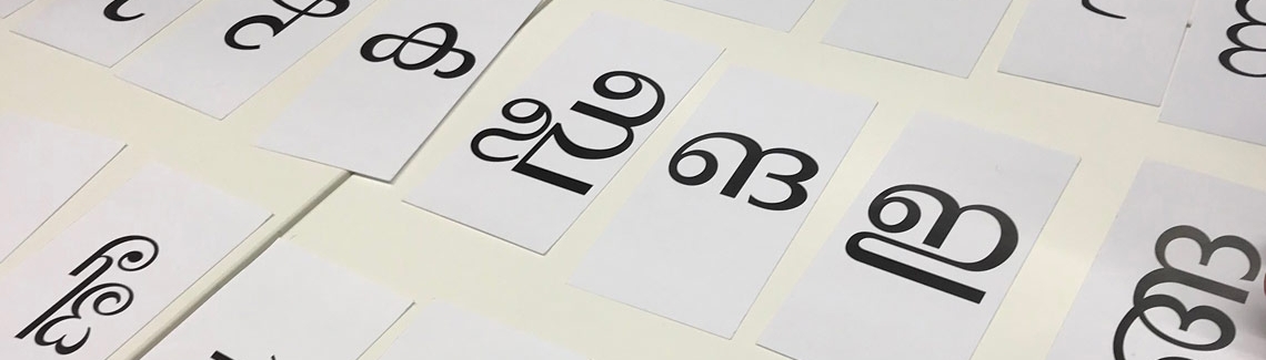
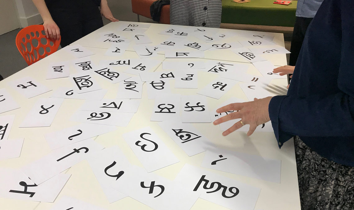
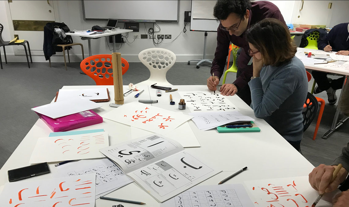
After the first lecture — where those less experienced with type might have missed some basic concepts, like the difference between type, lettering, and calligraphy — we began the first practical exercise. A simple card game was enough to have first contact with the characteristics of some scripts: contrast, weight, proportions, etc. Having to distinguish Telugu from Malayalam, Kannada, or Sinhala without indications was fun but challenging.
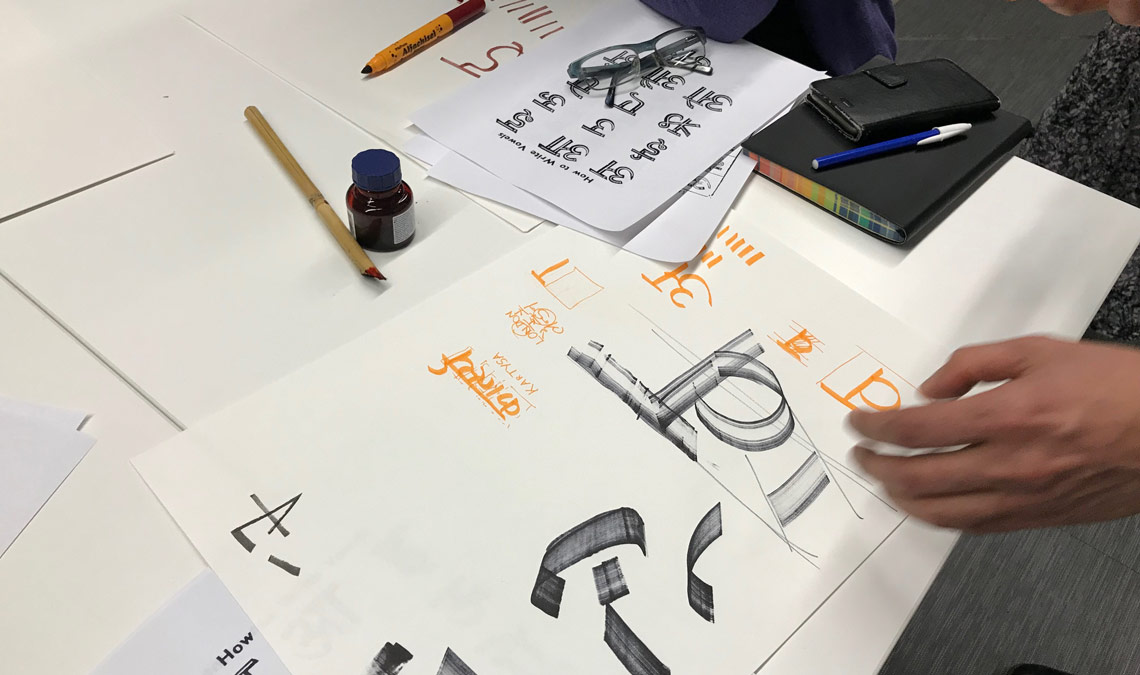
Visiting the library’s current exhibition, ‘Writing: Making your Mark’, was part of the workshop, and on Saturday we were lucky enough to have with us Emma Harrison, curator of Chinese Collections at the British Library. She explained each of the sections and the most relevant items. On Sunday we were able to take more time to go through the exhibition on our own. After a quick visit to the exhibition, we started to play with some calligraphic forms. We were encouraged to decide the script and the tools we wanted to use. The most important aspect was to understand the direction and contrast of the stroke and to get a sense of the script.
sunday
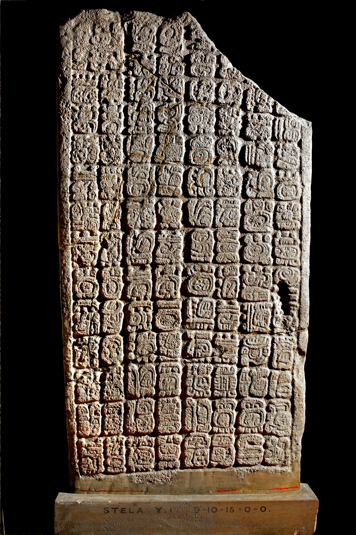
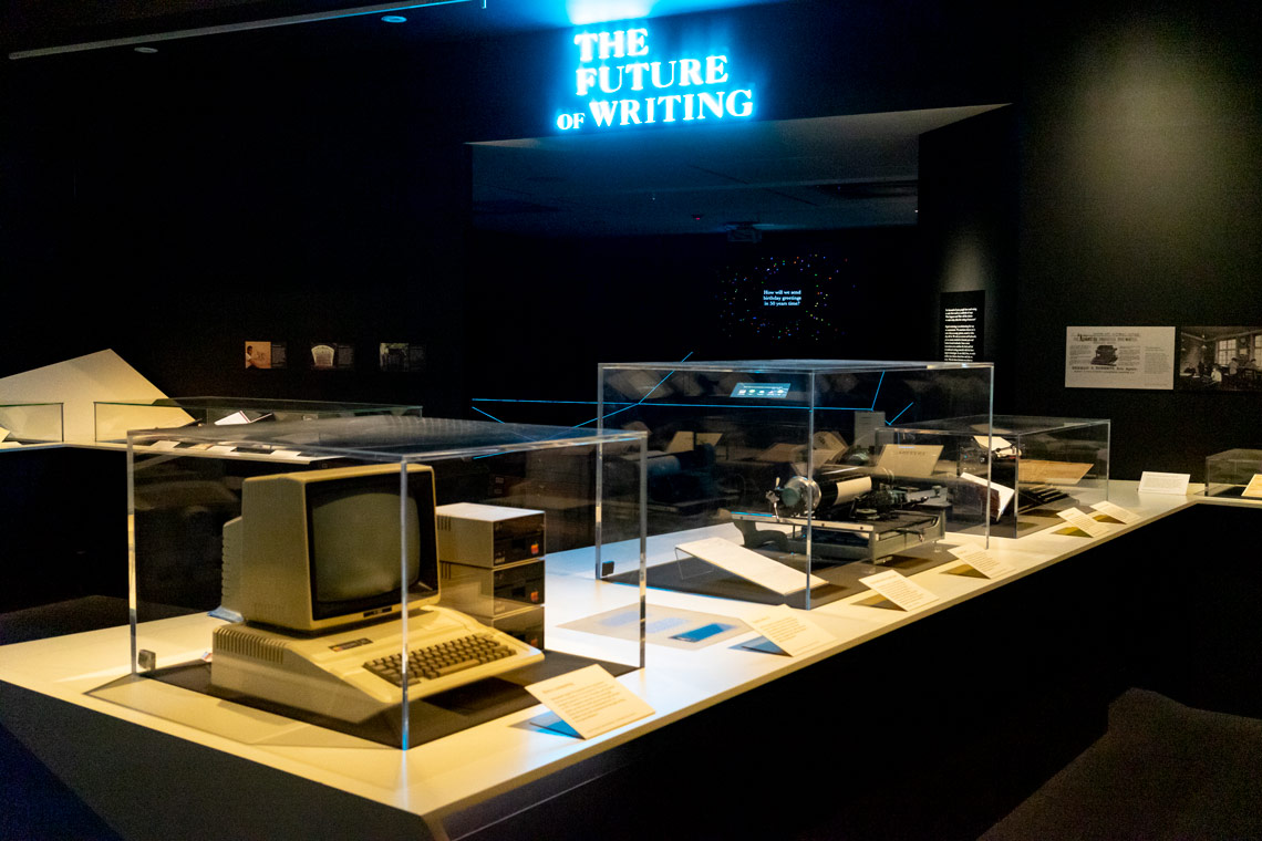
As mentioned before, on Sunday we had more time to explore the exhibition ‘Writing: Making your Mark’. It shows some of the library’s items collected from around the world, such as Mayan writing, Egyptian hieroglyphics, and more recent items like the Double Pigeon Chinese typewriter .
Although the exhibition includes some amazing items, and I definitely recommend the visit, I could not help but feel it was more oriented toward the Latin script — quite reasonable, as it was held at the British Library — which seemed like a lost opportunity to lay down stronger bridges to other cultures and scripts (something so needed these days). However, the catalogue’s content is way more exhaustive than the exhibition and, despite having one entire chapter devoted to Roman lettering, it is much better balanced.
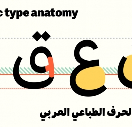
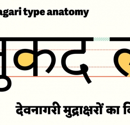
The rest of the day was a combination of theory, resources, and practice. Fiona offered a useful lecture on aspects that should be taken into consideration when designing Indian or Arabic scripts (like joining or non-joining, the direction of the script, positioning, etc.) and offered some guidelines.
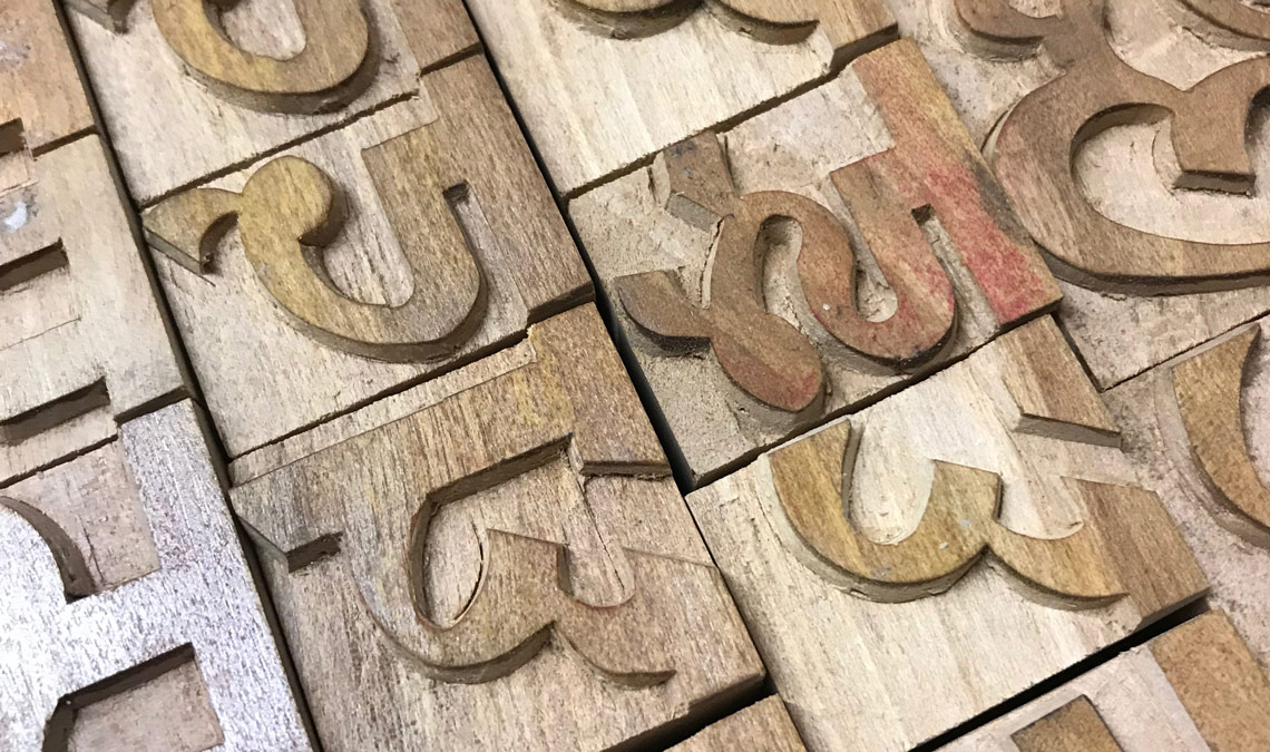
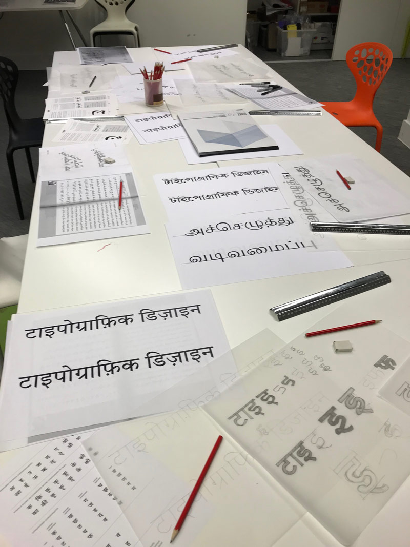
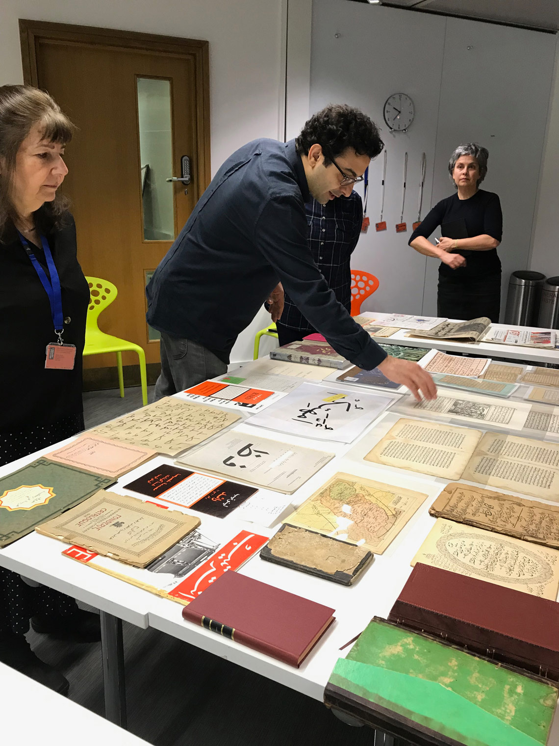
Meanwhile, Vaibhav and Borna had displayed many items (newspapers, books, manuscripts, and more) for us to touch, photograph, and study while they explained their significance. They proposed a lettering exercise consisting of tracing the skeleton of words in Arabic, Bengali, Devanagari, or Tamil, and then expanding them into low contrast forms.
For the last hours of the workshop we were invited to decide our preferences: explore the calligraphic essence of the scripts, research the letterforms with constructed lettering, dive deep into the physical items on display, or any combination of those choices. This approach meant that learning the very first steps of a new script was not overwhelming and it allowed the participants to take the most useful path to them.
The result was two fantastic and insightful days exploring Arabic and Indian type with three generous and knowledgeable tutors, a great pack of colleagues that I hope to see again soon, and a solid first step in exploring scripts beyond Latin, questioning existing designs, and using research to inform practice.
TypeTogether is an indie type foundry committed to excellence in type design with a focus on editorial use. Additionally, TypeTogether creates custom type design for corporate use. We invite you to browse our library of retail fonts or contact us to discuss custom type design projects.