Siemens Healthineers
February 2019
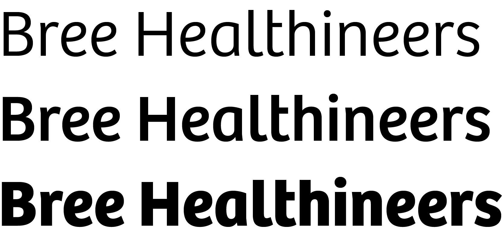
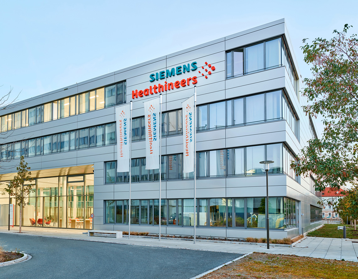
The German-based industrial manufacturing company, Siemens, created a new healthcare business with a new branding concept in 2016, choosing Bree for their logotype.
The German-based industrial manufacturing company, Siemens, created a new healthcare business with a new branding concept in 2016, choosing Bree for their logotype.
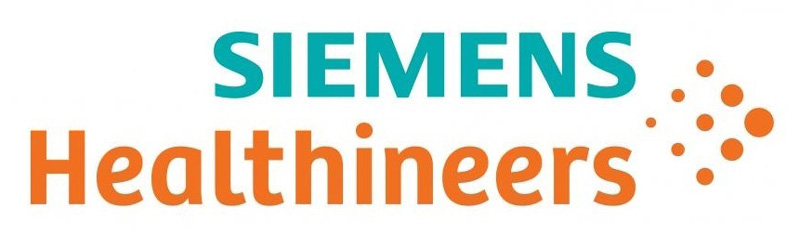
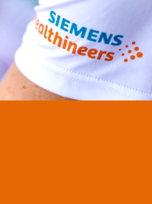
Customised logotype using our typeface Bree.
The internal designer Michael Schmidt at Siemens together with external graphic designer Roger Scrooby developed the logotype consisting of three parts:
1. Siemens: the company’s heritage.
2. The word Healthineers: referring to the people working at Siemens Healthineers.
3. The dots: symbolic, connecting the two names, and showing forward movement. The dots represent all that Siemens Healthineers has to offer — its people, its products, its services — and their forward-looking approach.
Our upright italic typeface Bree was selected as its shapes, based on handwriting, bring a human touch while representing stability and character. As is often the case with lettering though, the letter ‘t’ was tweaked to improve the l–t–h combination within the Healthineers logotype.
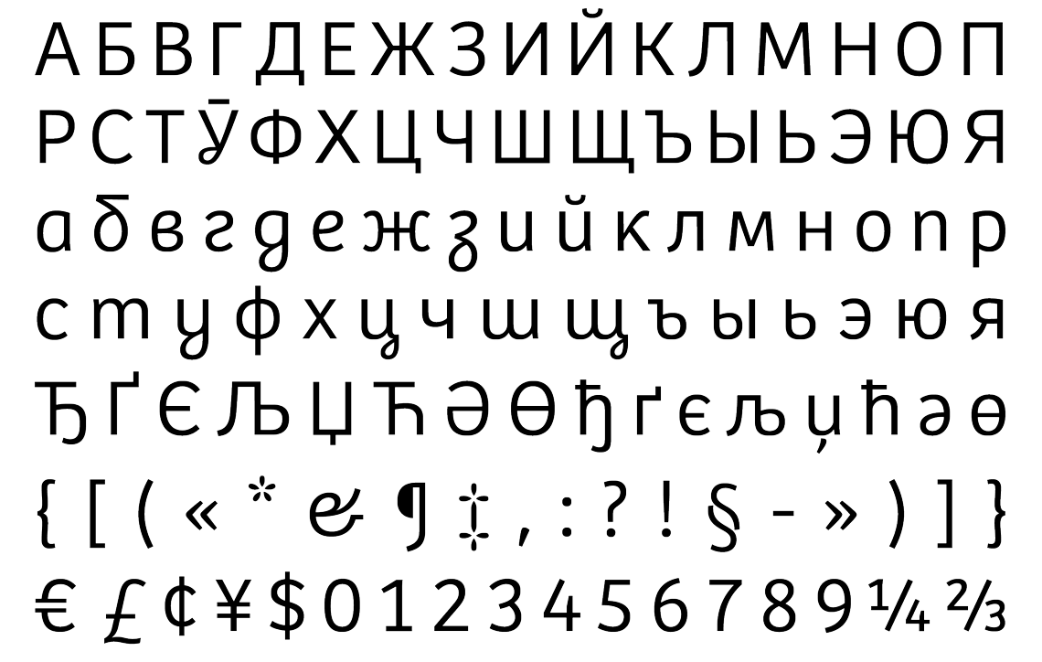
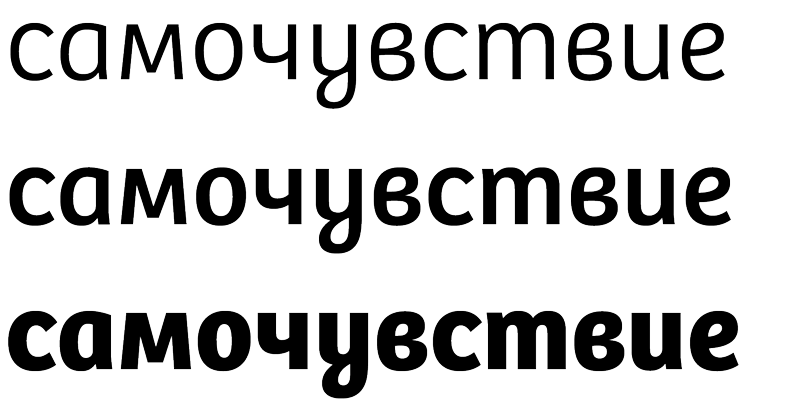
Cyrillic script extension of our Bree type family.
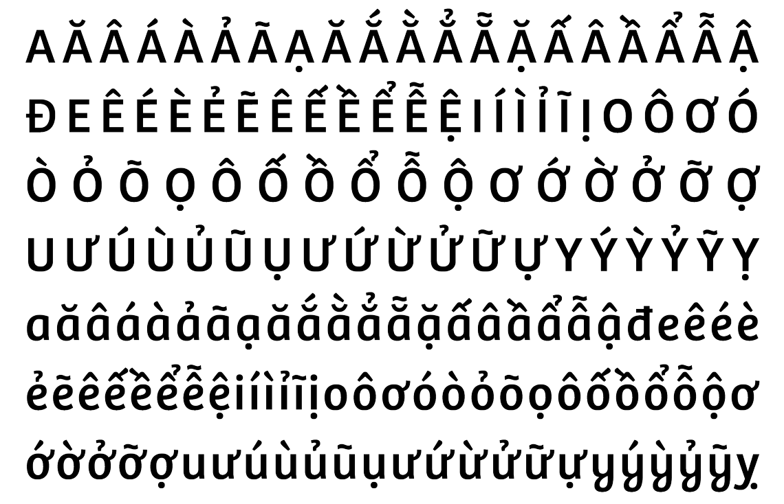
Language extension of our Bree type family to cover Vietnamese.
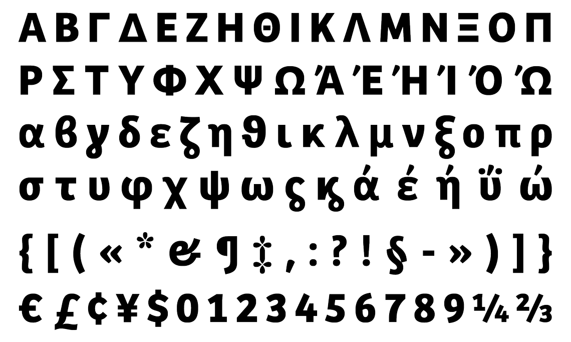
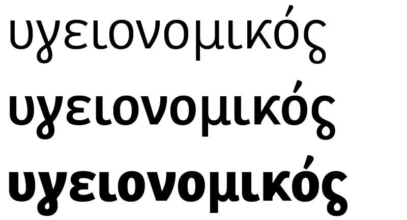
Monotonic Greek script extension of our Bree type family.
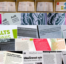
Typography is one of the central shaping elements of the brand, so as a natural consequence, the Bree family was introduced as a display typeface for distinct-looking headlines, recognizable across all touchpoints of the brand’s communication materials in combination with the font Siemens Sans for body text.
The company’s press release states, “Siemens Healthineers will continue to strengthen its leading portfolio across the medical imaging and laboratory diagnostics business while adding new offerings.” Siemens Healthineers is a global company and therefore requires broad language and script coverage. TypeTogether was approached to develop a Cyrillic, a Greek, and a Vietnamese version for SH Bree.
Bree’s special upright italic style, particularly visible in such letters as ‘a e f g k v w y z’, had to be interpreted for the two other scripts in a natural and logical way. The solution developed by using formalised shapes derived from handwriting and then adapting Bree’s loops into the design where it made sense.
The three weights, Light, Regular, and Bold, also share the same stem thickness, vertical proportions, and a variety of design details, such as terminals and outstrokes. The Greek was designed by Irene Vlachou and the Cyrillic by Veronika Burian with consultation by Vera Evstafieva.
Bree Greek.
Bree Cyrillic.
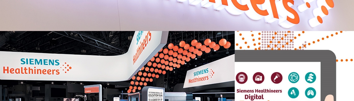
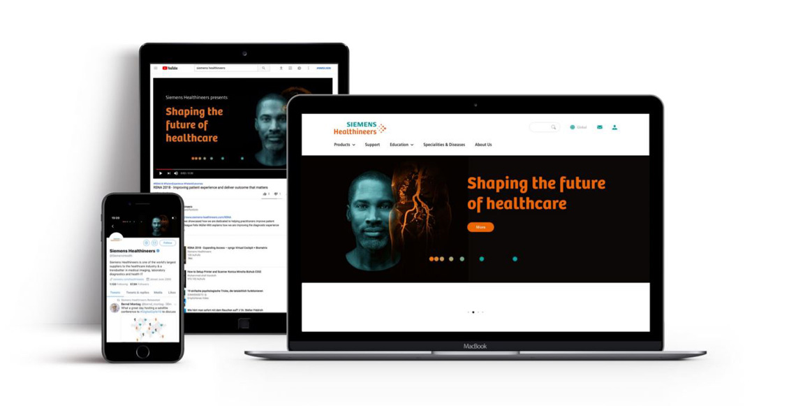
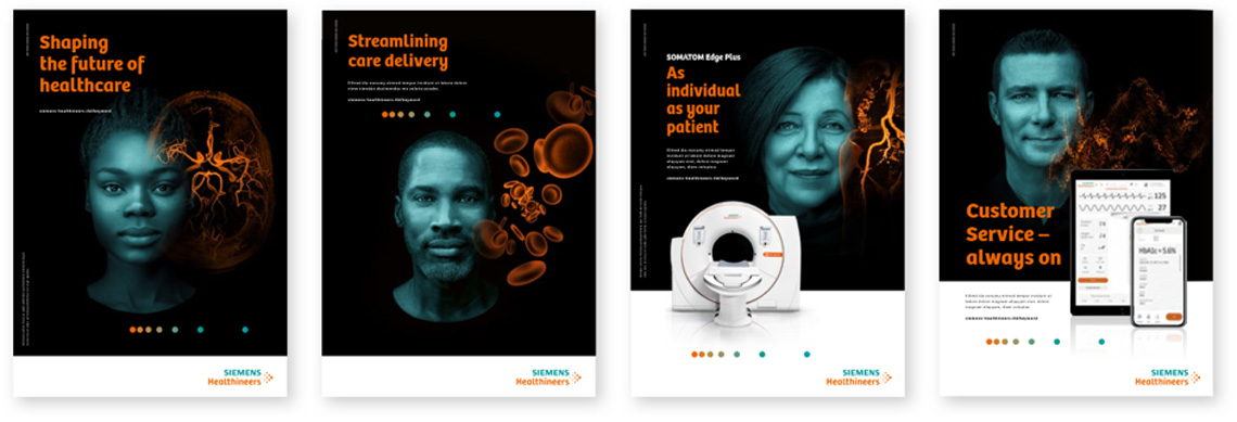
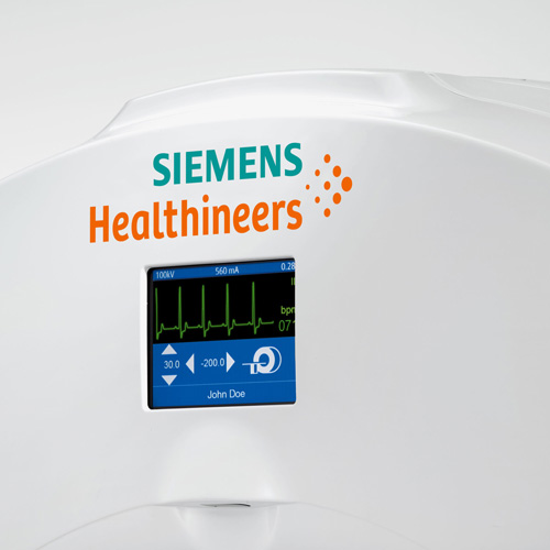
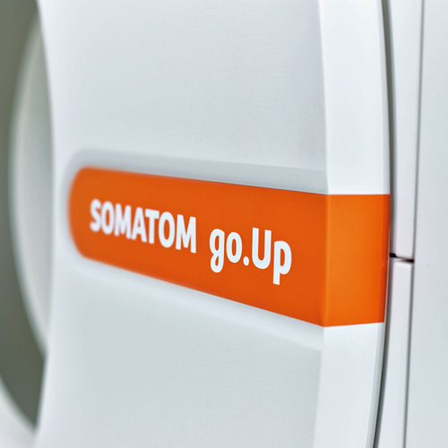
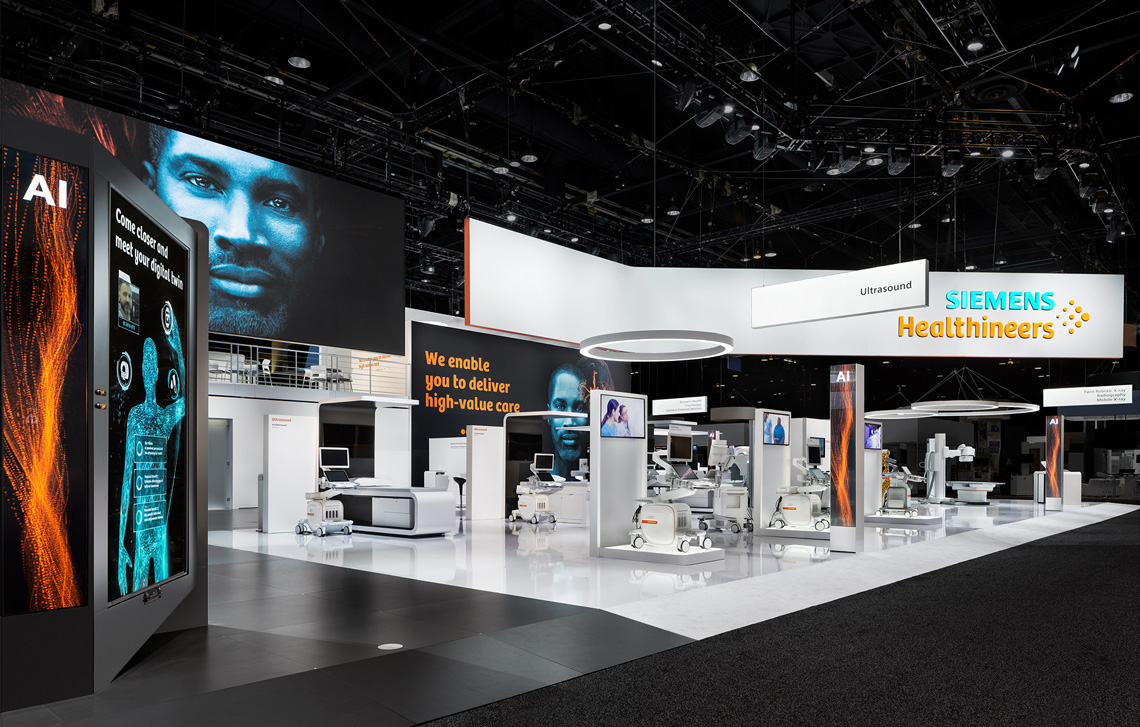
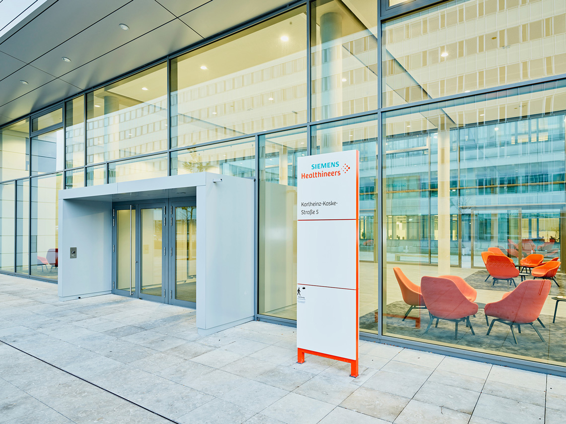
Bree-SH has been now been implemented in the Siemens Healthineers Brand Expression where it mainly appears in headlines on websites, communication collaterals, graphics, magazines, trade shows, events, and as a product tag on products.
All pictures are courtesy of Siemens Healthineers GmbH.

TypeTogether is an indie type foundry committed to excellence in type design with a focus on editorial use. Additionally, TypeTogether creates custom type design for corporate use. We invite you to browse our library of retail fonts or contact us to discuss custom type design projects.