NRK Bespoke Typeface

February 2018

The Norwegian public TV station, NRK, commissioned TypeTogether to create a tailored typeface for their new branding based on Leftloft’s LFT Etica. Since LFT Etica had already been established in NRK’s identity program, TypeTogether collaborated with the original designers at Leftloft to accomplish this goal, eventually creating the wide-ranging LFT Etica Sheriff as a result.

Norwegian public TV station, NRK, commissioned TypeTogether to create a tailored typeface for their new branding

Norwegian public TV station, NRK, commissioned TypeTogether to create a tailored typeface for their new branding

point of origin

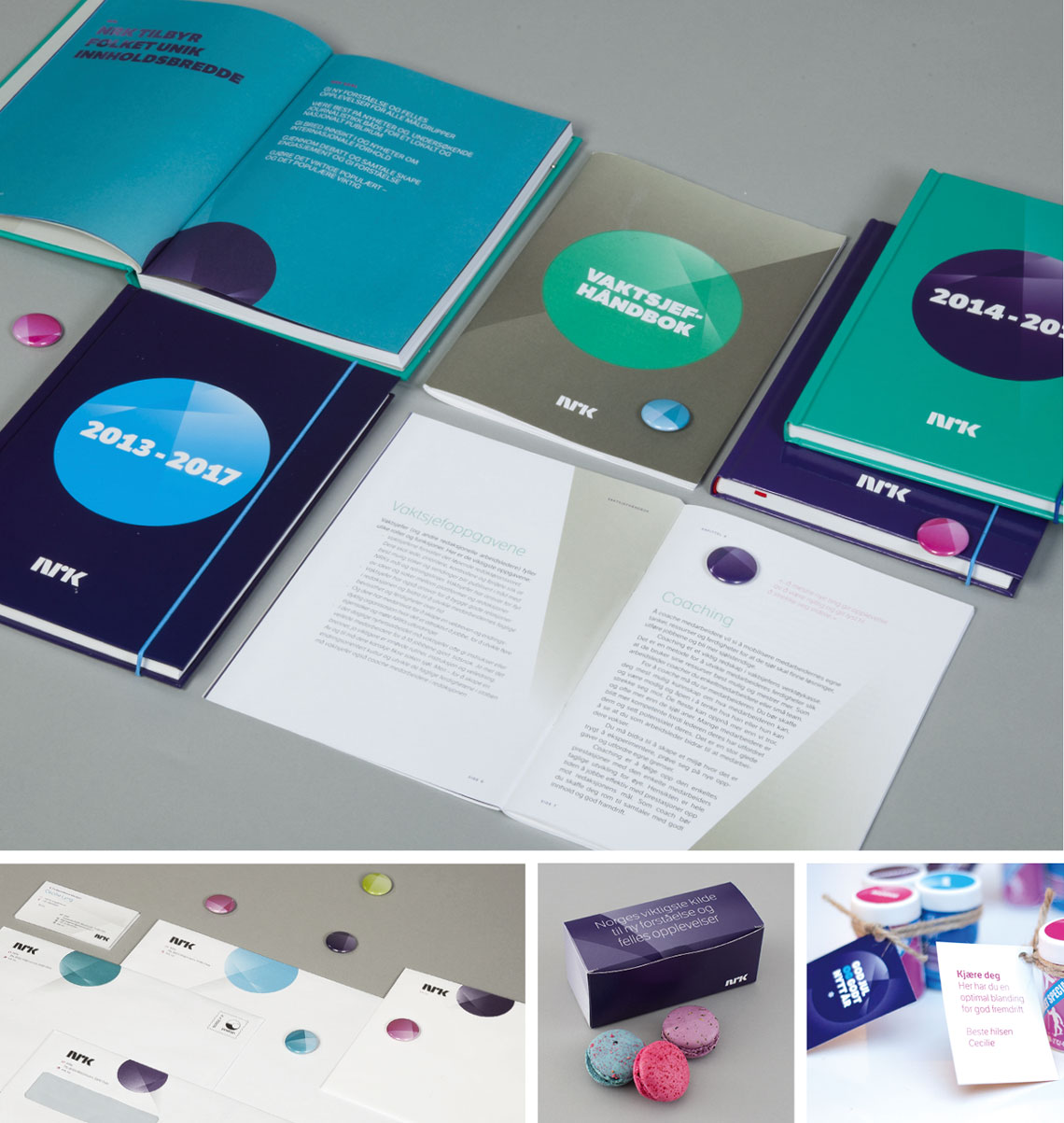
NRK wanted to strengthen and improve their brand position. So in 2010 the internal design team at NRK collaborated with the Scandinavian Design Group (SDG) in developing a new visual identity based on NRK’s original vision and values: open, courageous, and trustworthy. This resulted in the circle divided by three lines, strong modern colours, and a contemporary typographic palette with LFT Etica. Over the next few years the typeface gained room within the NRK mother brand and in 2013/14 the need for a complimentary slab typeface arose.

This sturdy slab version of LFT Etica, was to be customised to serve NRK’s identity needs mainly for the News (Nyheter) and Sport channels on the web and TV, and as a broadcasting font. Additionally, the new slab was to be used in the logotype for Nyheter and Sport. Read more about the development here.

One of the initial concerns was the rather generous width of the LFT Etica fonts, so it was decided to test a condensed version which had already been in the beta development stage for retail. After some discussion with the internal design team at NRK and consulting SDG, the chosen starting point fell to LFT Etica Condensed Semi-Bold and LFT Etica Condensed Book.
 

Norwegian public TV station, NRK, commissioned TypeTogether to create a tailored typeface for their new branding

NRK's corporate identity using LFT Etica.

development

The first stage was comprised of three design suggestions within the slab theme. The words Nyheter, Urix, and Ytring, important to NRK, together with a small set of key letters were developed by the original designers of LFT Etica at Leftloft. Given that the role of the slab was complimentary to the original sans, the general stem thickness and vertical proportions were therefore maintained. The three directions differentiate themselves by finer details such as serif construction, terminal shape, and alternate forms of ‘a’ and ‘g’.

All design teams felt that option 3 proposed the best solution for the new brand, appearing more open and friendly than the other two ideas.

Norwegian public TV station, NRK, commissioned TypeTogether to create a tailored typeface for their new branding

Comparison of the three design directions.

Norwegian public TV station, NRK, commissioned TypeTogether to create a tailored typeface for their new branding

Design option 1 details.

Norwegian public TV station, NRK, commissioned TypeTogether to create a tailored typeface for their new branding

Design option 2 details.

Norwegian public TV station, NRK, commissioned TypeTogether to create a tailored typeface for their new branding

Design option 3 details — the direction chosen by the teams.

implementation

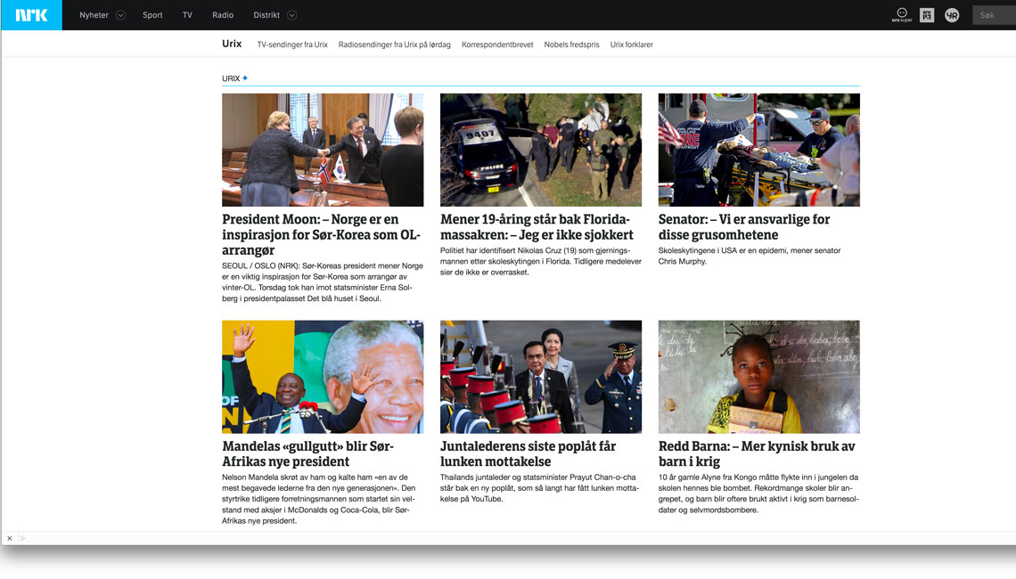
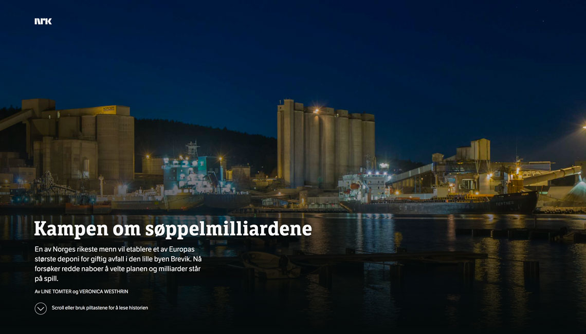
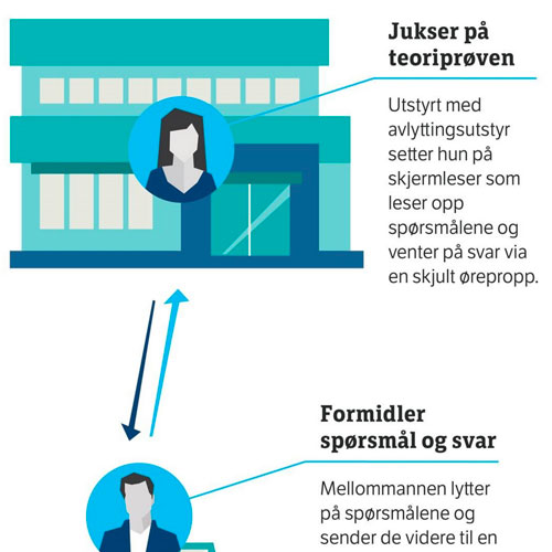
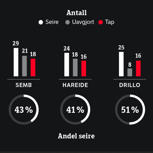
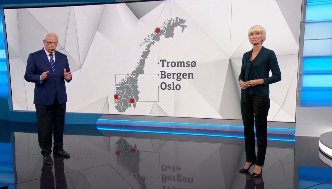
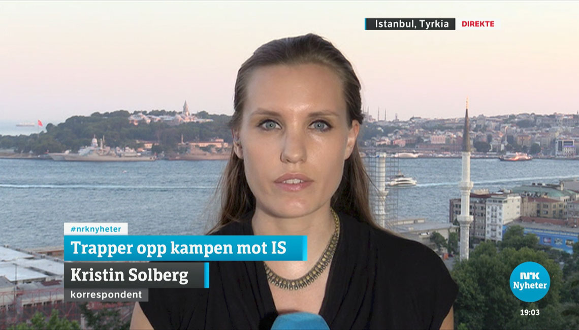
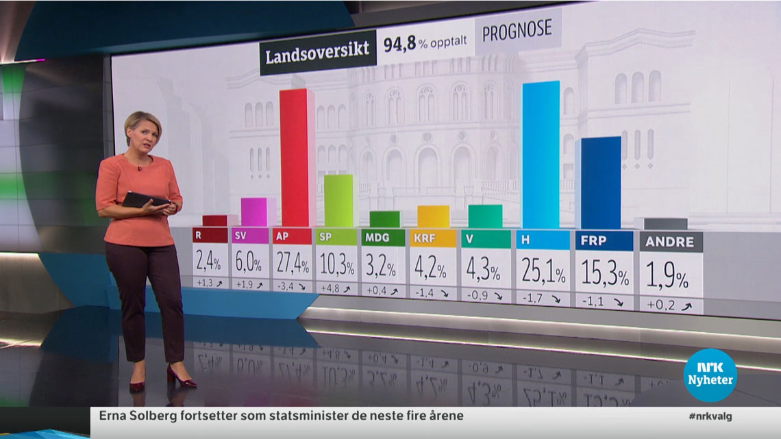
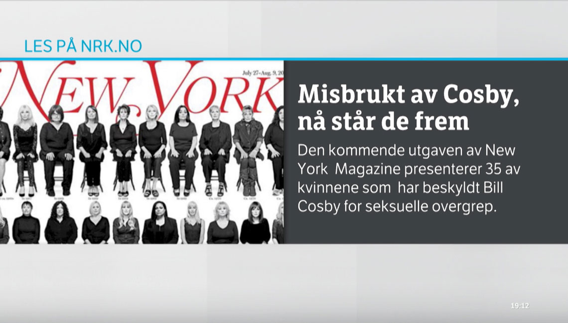
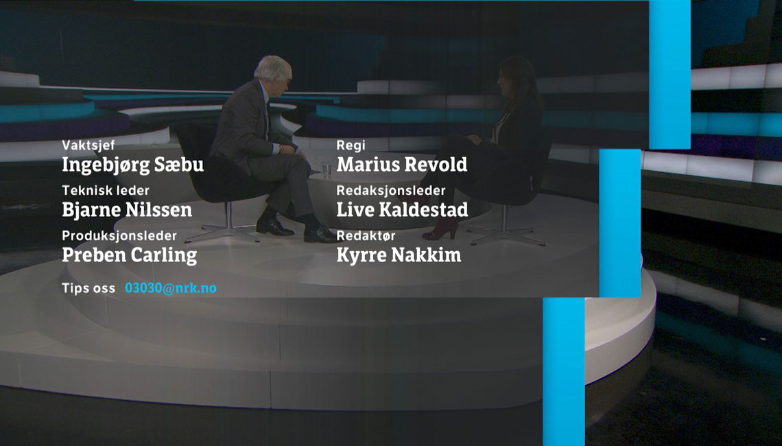
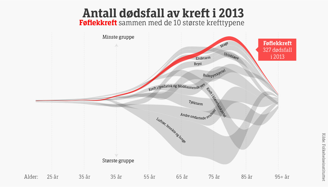
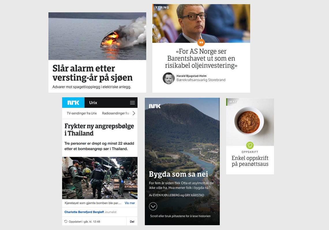
The two resulting typefaces — NRK EticaSlab SemiCondensed Book and Bold — are now used together with LFT Etica on the web and TV for headlines, graphics, and some supportive areas. As seen from the included images, they support each other in just the right way. Both are clear and approachable, both feel comforting and strong, and their balance allows the designers and infographic creators an easy way to visually show hierarchy. When an organization can “own” their look and feel through custom typography, the impact can’t be overstated. And since news is mostly read, the investment in typography — in the very words used to communicate with the audience — makes sense.

Norwegian public TV station, NRK, commissioned TypeTogether to create a tailored typeface for their new branding


Norwegian public TV station, NRK, commissioned TypeTogether to create a tailored typeface for their new branding

LFT Etica sheriff

As spin-off from this custom project, Leftloft together with Octavio Pardo continued to expand and develop a whole set of weights, which then became LFT Etica Sheriff — a total of 36 styles from light to extrabold and in condensed and compressed widths, all with matching italics.

Norwegian public TV station, NRK, commissioned TypeTogether to create a tailored typeface for their new branding
SaveSave

About Us

TypeTogether is an indie type foundry committed to excellence in type design with a focus on editorial use. Additionally, TypeTogether creates custom type design for corporate use. We invite you to browse our library of retail fonts or contact us to discuss custom type design projects.