The new Jass card game
October 2018
Creative director Jens Riedweg modernises the popular Swiss card game, Jass, using new illustrations, perfect printing, and the Abril family.
Creative director Jens Riedweg modernises the popular Swiss card game, Jass, using new illustrations, perfect printing, and the Abril family.
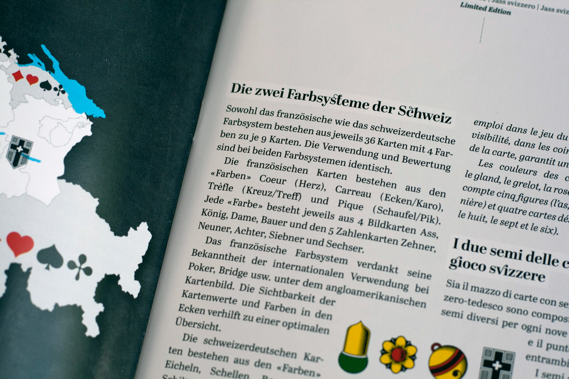
Jass is a card game popular throughout Germany, Switzerland, some areas of Austria, France, and Italy. Jass is a national pastime in Switzerland, so much so that it has become the popular name for any trick-taking card game. In 2014 the Swissmint, the official mint of the Swiss Confederation, issued a small set of “Jass card game” commemorative coins as part of its annual national sport series.
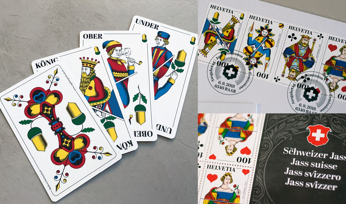
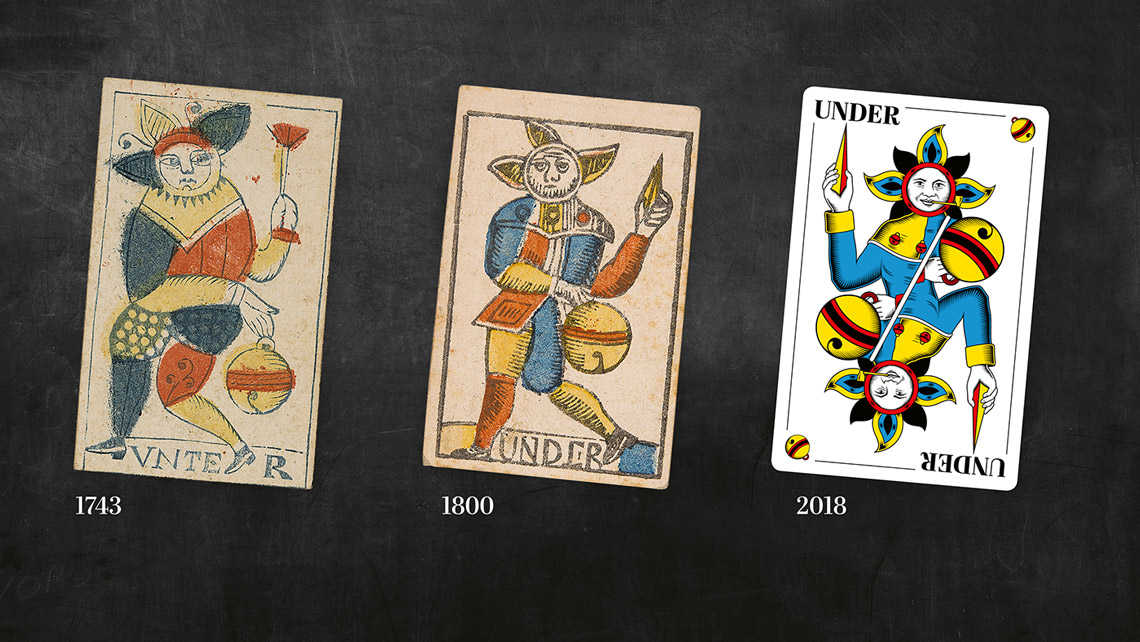
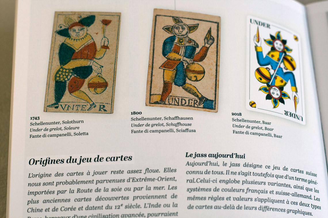
Despite its popularity, for many years Swiss Jass cards have been based on wood engravings, lacking typographic consistency and using blurry illustrations. Creative director Jens Riedweg took the initiative to update the old design. In the end it became more than just a new version of the old cards; it was a complete overhaul that required an attentive eye to aesthetics and details, including technical issues related to paper, such as thickness, softness, pliability, and printing.
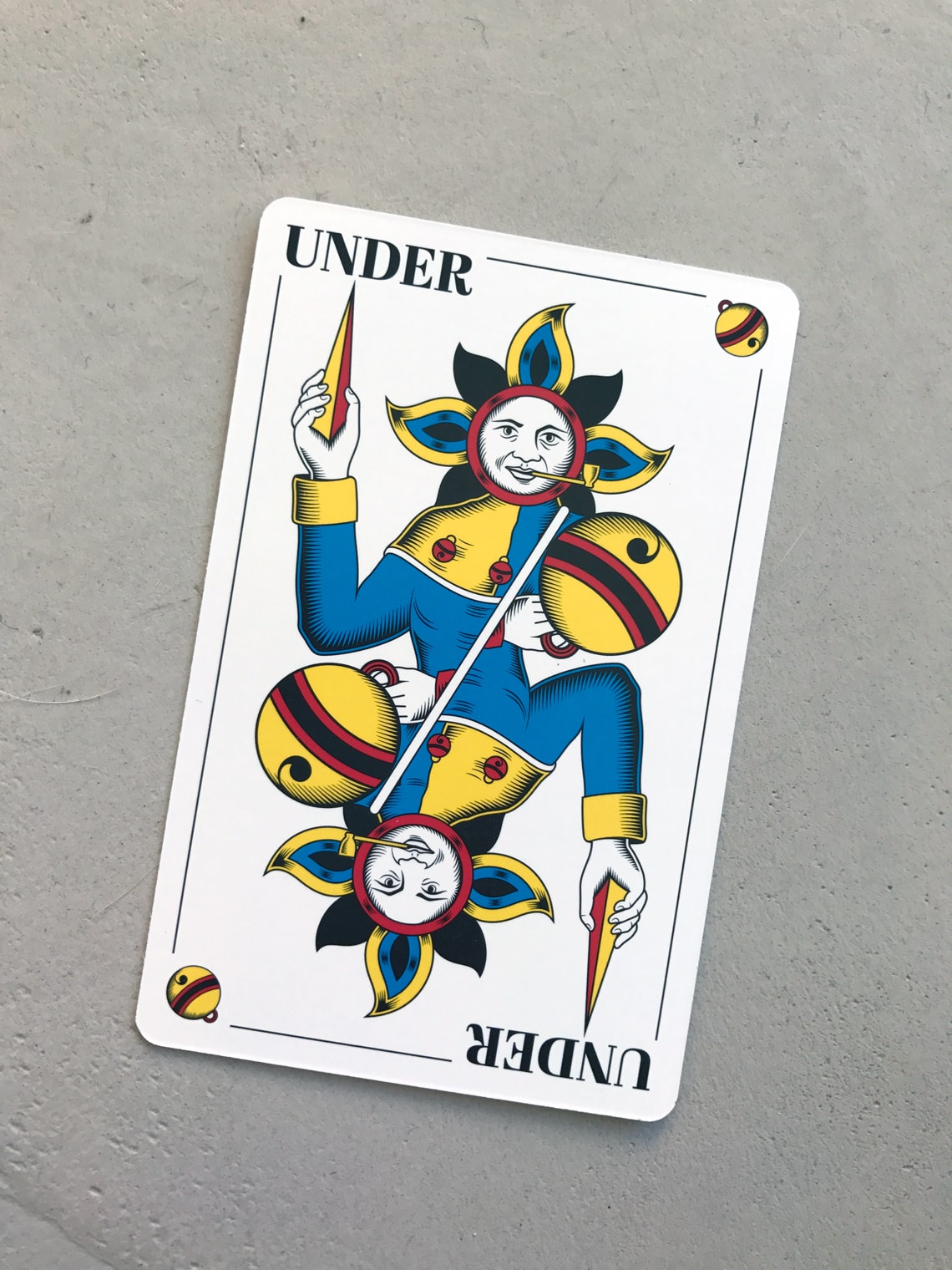
For Jens it was very clear that this was not just an update. “The design of Swiss Jass cards has always bothered me: 70-year-old unclear illustrations and inconsistent fonts in various sizes, reader-unfriendly and impure. What could be more appropriate than to take the redesign into my own hands? It wasn’t an artistic realisation. Instead, the outdated cards were to be upgraded to a modern level while retaining their traditional design. The hatching in the new design is vector-based. As a result, the colours are clearly differentiated and the cards generally appear rich in contrast. In addition, the cards can be scaled as desired without losing their sharpness and accuracy.”
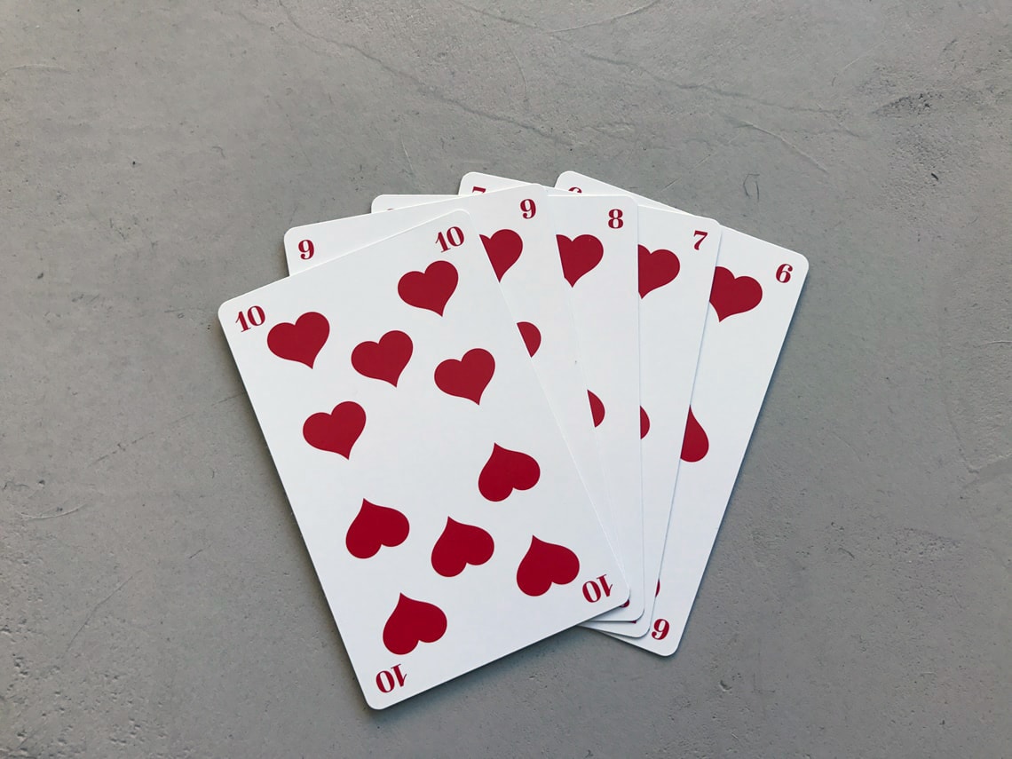
For this new and improved version of Swiss Jass cards Jens choose our Abril font family, which shared characteristics with the old lettering, but added consistency and a modern feel. “As a typographic designer, I paid particular attention to the choice of typeface. In the end I decided on the font family Abril — a modern interpretation of a classicist Antiqua. The majuscules and minuscules as well as the serifs are straighter, the transitions more angular; the knit strength contrast between the stem and the crossbar is very strong. The font developers had the same high standards as I did when designing the cards — a love for detail which runs through the whole design.”
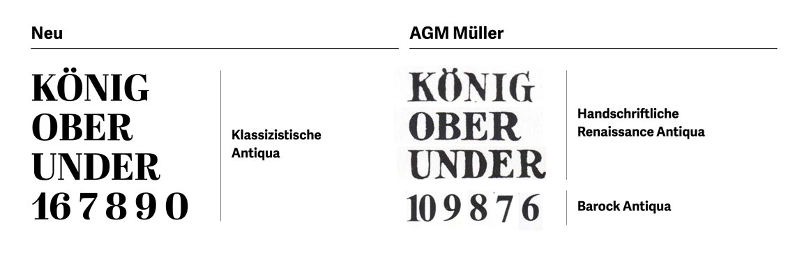
The new typographic system on the left, using Abril, and the previous lettering on the right. Image supplied by Jens Riedweg.
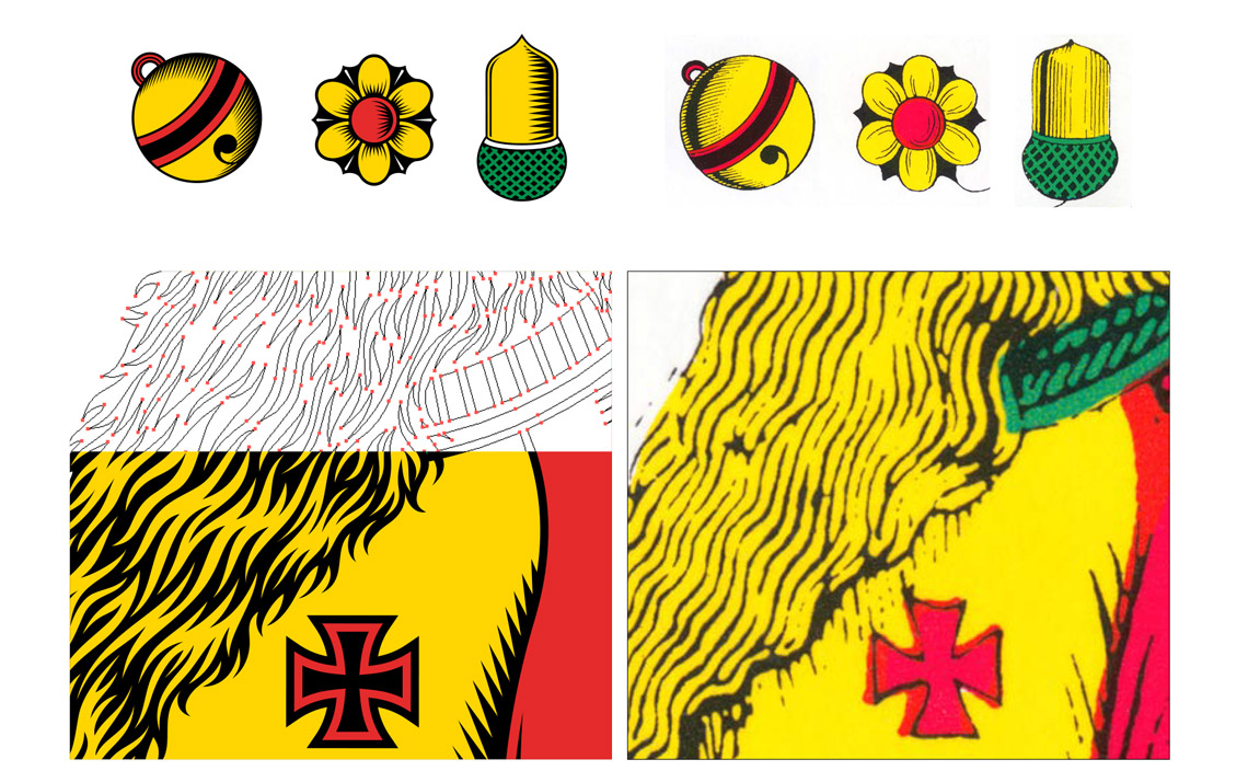
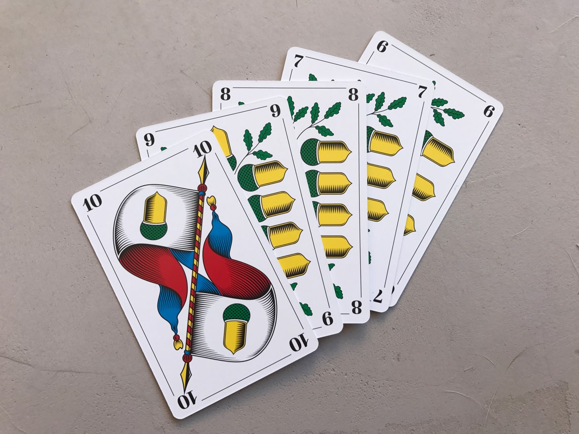
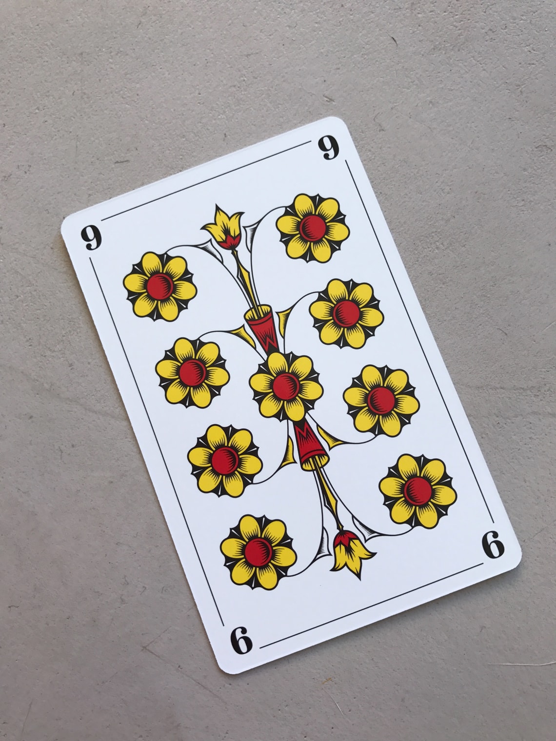
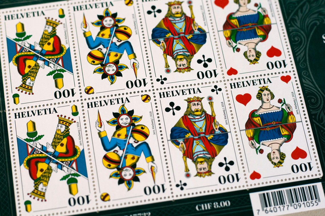
All the illustrations were redrawn and vectorised, improving the details and colours. Image supplied by Jens Riedweg.
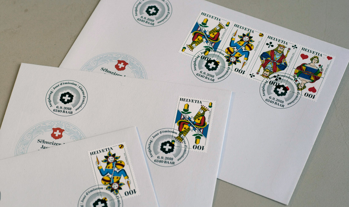
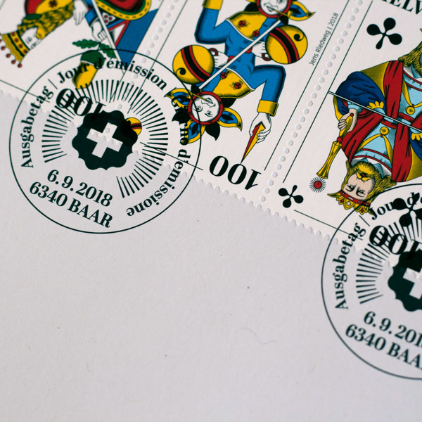
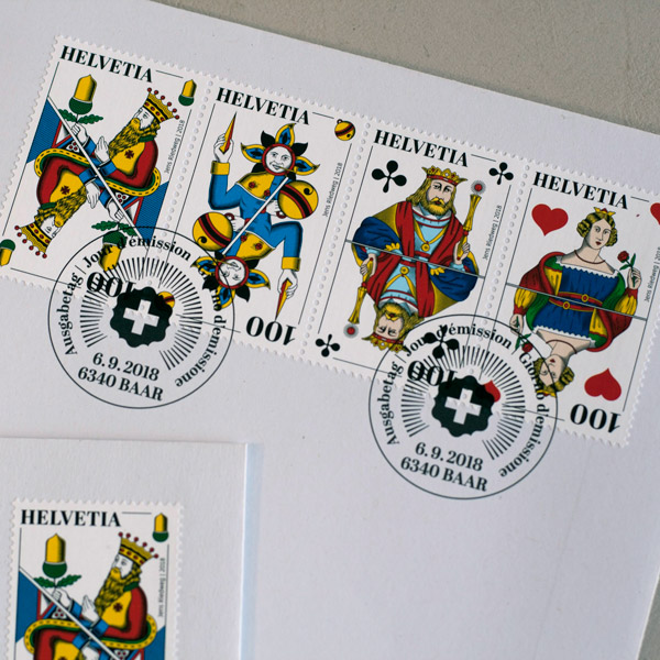
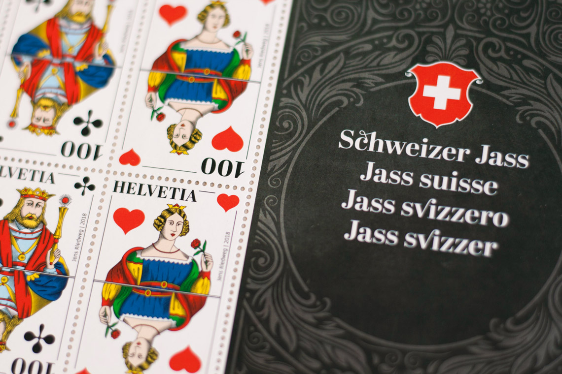
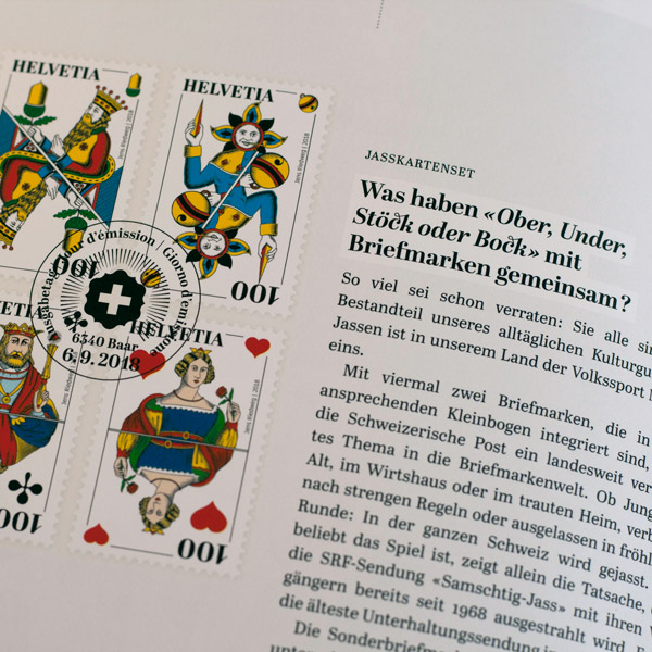
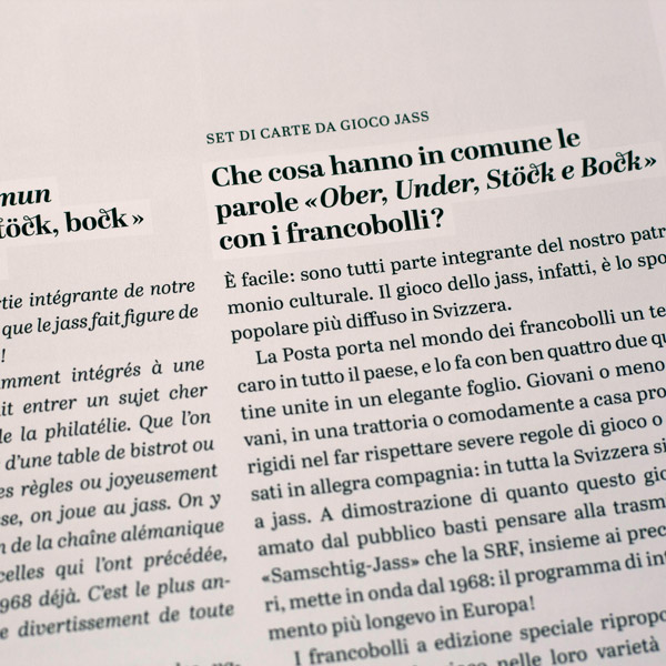
Considering how popular the game is, it is not surprising that a series of stamps have been issued by Swiss Post featuring Jens Riedweg’s new design. All the various editions of the new cards can be ordered from the Schweizer Jass website, including a limited edition that echoes the postage stamps.
TypeTogether is an indie type foundry committed to excellence in type design with a focus on editorial use. Additionally, TypeTogether creates custom type design for corporate use. We invite you to browse our library of retail fonts or contact us to discuss custom type design projects.