Abril Almeria, a custom type family
July 2012
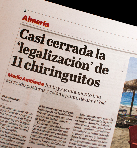
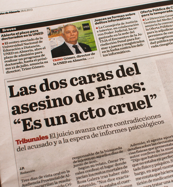
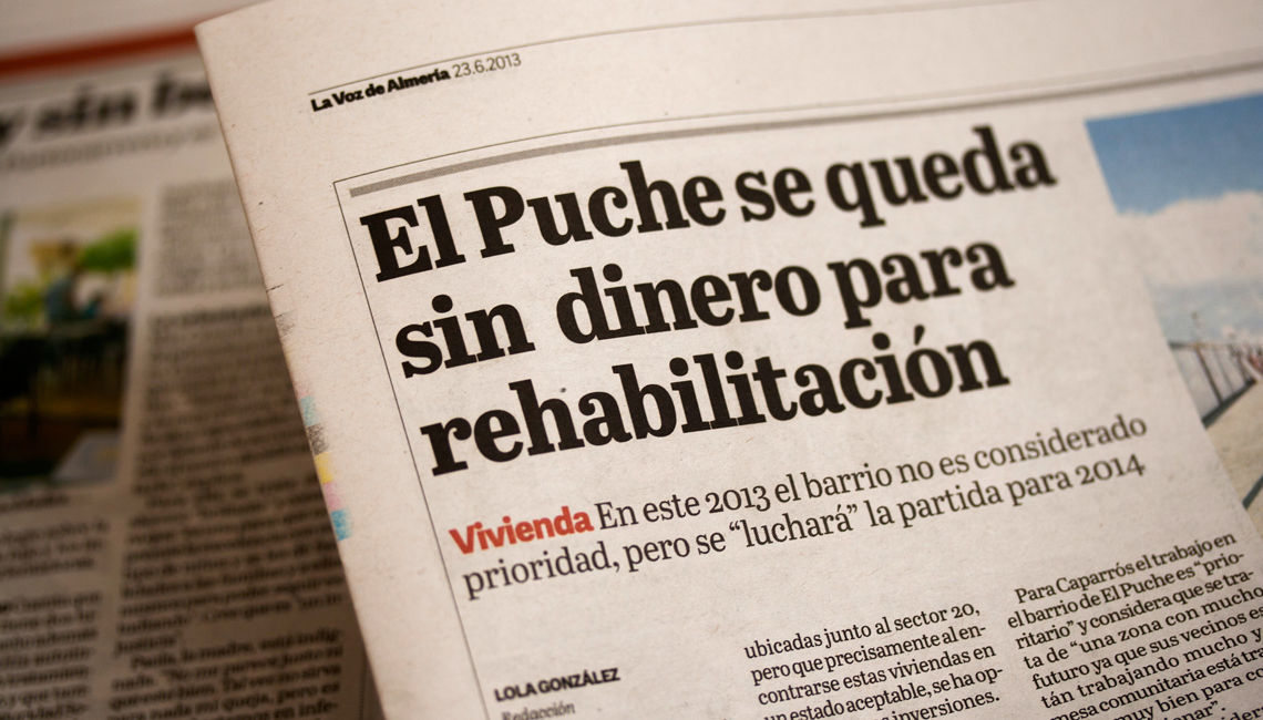
TypeTogether collaborated with the renowned news design and consultancy firm Cases i Associats to develop a titling typeface for the daily newspaper La Voz de Almería.

TypeTogether collaborated with the renowned news design and consultancy firm Cases i Associats to develop a titling typeface for the daily newspaper La Voz de Almería.
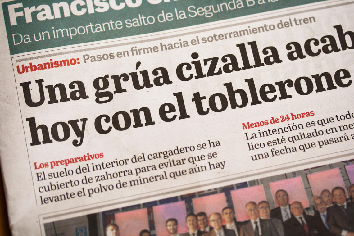
The design of this custom font, based on Abril Text, delivers a striking typographic color for titles in a wide range of sizes, and supports the newsy yet appealing aspect of the newspaper. Cases i Associats' art director for this project, Violeta Valle, collaborated closely with Burian and Scaglione in the fine tuning of these tailored headlines, which furnished La Voz de Almería with a highly effective and unique voice.
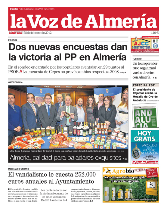
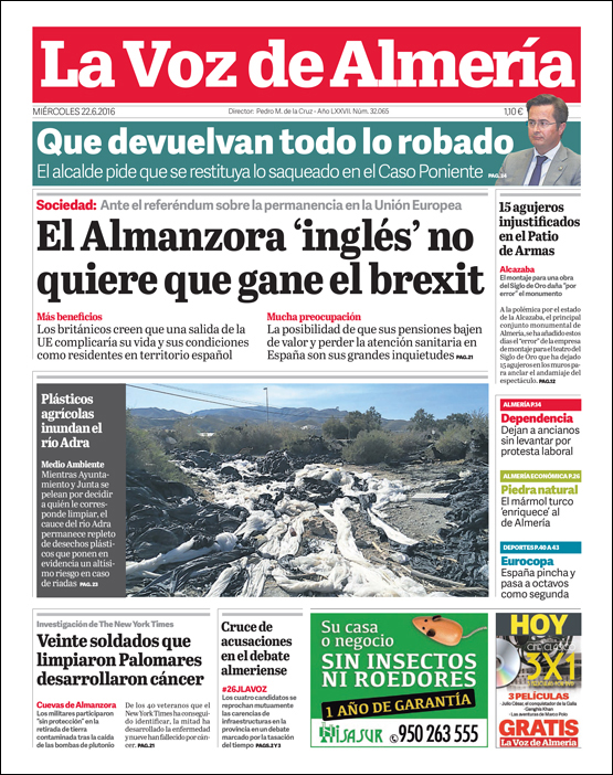
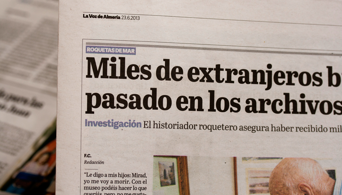
Even the slightest adjustment in a font can make a sensible difference in typesetting. In this vein, text-intensive pieces such as newspapers, web portals or magazines depend a good deal on the graphic designer’s typographic sensitivity and good taste.
News consultancy firm Cases i Associats contacted us to develop a tailored font based on our own newspaper type family Abril. The objective was to generate a new style that, while sharing the curve strength and low contrast of the Abril text fonts, could be used for setting titles.
Lettershapes, proportions, color and spacing in headline typefaces are distinctly different from text fonts. The personality of lettershapes in headlines should be molded in careful agreement with the editorial direction of a publication. For the development of Abril Almería we were able to work side by side with the news consultants in the fine tuning of a new typeface for these tailored headlines, which furnished La Voz de Almería with a highly effective and unique voice.
The resulting face is based on Abril Text, but due to its display use, some features were changed. For example, some of the optical compensations, such as the serif angle, necessary for text sizes, were removed. This adds to the newsy feel and gives the shapes more evenness along the x-height. Additionally, the letter widths and spacing were condensed to fit more characters per line and the overall color was increased to deliver more impact in large headlines on the front pages.
TypeTogether is an indie type foundry committed to excellence in type design with a focus on editorial use. Additionally, TypeTogether creates custom type design for corporate use. We invite you to browse our library of retail fonts or contact us to discuss custom type design projects.