In late 2018 our Chinese partners FounderType approached us with a very interesting project — redesigning a type family for Geely, one of the most important car manufacturers in the world. What started as rather technical work allowed us to grow even more in our knowledge of branding for the automobile industry, hybrid analogue, digital user interfaces, and legibility.
Assessing obvious trends
Design school teaches us that when facing a new design project, the first thing to do is to learn as much as possible about it. In the case of Geely, this meant understanding what companies in the car industry do in terms of visual communication, understanding trends, cultural context, product localisation, and how to communicate everything effectively. But it did not take much research to see that there is a very clear typographic style car manufacturers favored for their logotypes.
We initially searched for other brands located in mainland China, such as Chery, Dongfen, and Changan. While each of them is clearly unique, there is an obvious trend. All of the wordmarks look mechanical, based on geometric shapes that favour straight lines and slow rounded curves. They are also set in uppercase letters and the character width is very uniform, almost looking like a monospaced font.
It could be argued that this last feature provides brands a more consistent approach when they sit next to their Chinese counterparts, as the Chinese writing system is monospaced itself. But it takes just a quick, broader glimpse to see this is not just a theme in China, but the theme of the car industry everywhere — West and East, large and small companies, big and little cars, luxury and budget vehicles.
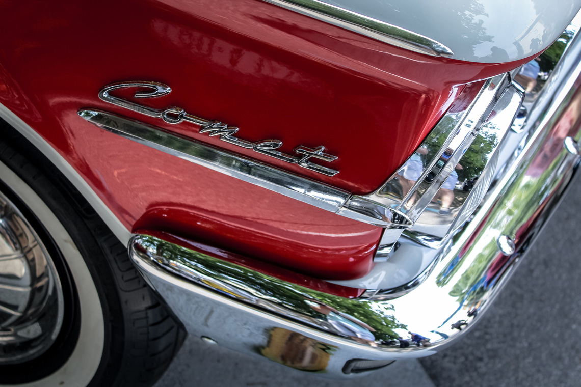
It is hard to say when the trend started, but clearly it was not always like this. The very good Chromeography website has an amazing collection of photos “in praise of the chrome logos and lettering affixed to vintage automobiles”. There we find plenty of serif, script, connected cursive, and compressed sans letters in older car badges. And in all cases they seem to be the product of skilled hand lettering, while the typefaces we see in newer logos appear to be simply chosen from a font in a menu and, sometimes, slightly modified.
When automobiles had curves and chrome. Photo by Nikola Treći.
It’s all Novarese’s fault
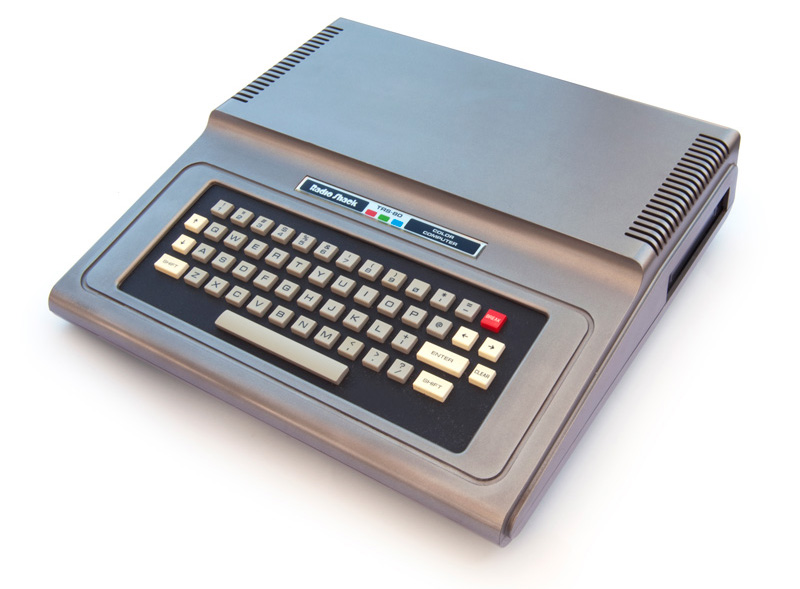
The search for these wide, mechanic, and geometric shapes leads us to Microgramma, an all caps typeface cut by Alessandro Butti and Aldo Novarese for the Nebiolo type foundry in 1952. The font was very popular in the ’60s, but in the late ’70s it struck some nerve deep within the film and TV industry and began being used in popular science fiction franchises such as Alien and Star Trek. In the 1980s and ’90s car companies like Chrysler, Honda, and Nissan used Microgramma for their vehicles’ button switches and model badges.
16K TRS-80 Color Computer 1 used Novarese’s Microgramma for the keyboard. Photo Wikimedia Commons.
Eurostile, a project based on Microgramma, was cut in 1962 by Novarese himself and also published by Nebiolo. The Eurostile type family followed the same design principles of slowly drawn machine-like shapes with a strong horizontal feel, but it was a more refined typographic product. It had the lowercase alphabet and several series of different widths. It was more successful than Microgramma and likewise was used for science fiction themed works, eventually making its way into the car industry as well.
(Though unrelated to our topic, it is an interesting fact that the Nebiolo foundry was acquired by Italian car giant Fiat in 1978 and continued to manufacture and sell printing presses.)
Legibility matters
Geely, like many others, followed the Novarese style for its wordmark. Four of its five letters follow a square structure based on contrast-less horizontal and vertical strokes with rounded corners. It is important to point out that in these drawings the round letter ‘G’ has the same structure as square letters ‘E’ and ‘L’. Whether following the same look and feel as so many other car manufacturers was the right approach is better judged by branding specialists, but as typography experts we are compelled to mention yet again that “a font is not a logo”. (Read our article Happy New Branding about this.)
This also brings up another hint for anyone working on logotypes or wordmarks and an accompanying brand typeface for text. The logo or wordmark should be its own thing, and the text family should be its own thing. Their unique needs will — and should — make them inherently different. One typeface shouldn’t be forced to do it all.
The typeface originally created for Geely tried to follow the company’s logo as closely as possible. There were many technical issues in the uppercase letters, ranging from errors in the horizontal proportions to colour and ductus inconsistencies, and in the lowercase it simply did not work. This is because capital letters in Latin-based languages are mostly straight lines, while the lowercase letters are mostly not straight lines. Forcing one into the style of the other, as when they tried to force the straight horizontal line theme into the lowercase Geely alphabet, makes them more and more illegible.
In fact there are no lowercase horizontal strokes except in ‘z’ and the bars in ‘t’, ‘e’, and ‘f’. Though we proposed a solution to incorporate these horizontal strokes, it led to other poor design decisions in the stroke connections, spurs, and crotches — the spots needed for letter recognition and for legibility purposes.
Wise compromises
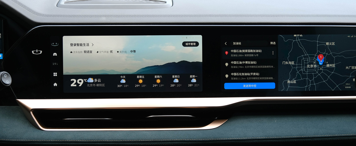
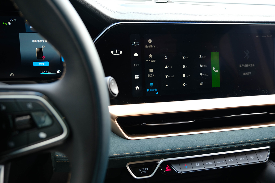
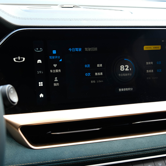
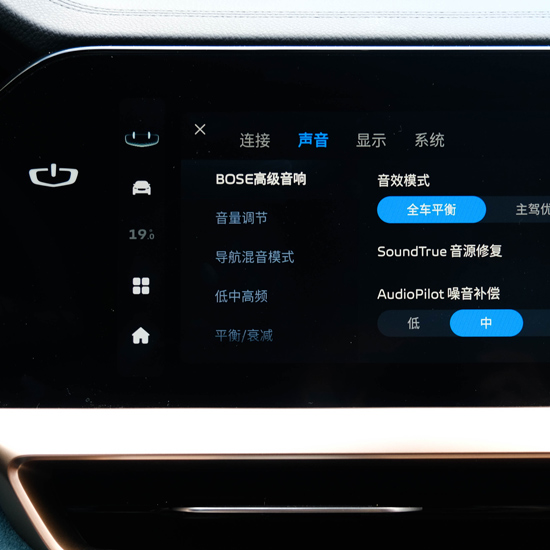
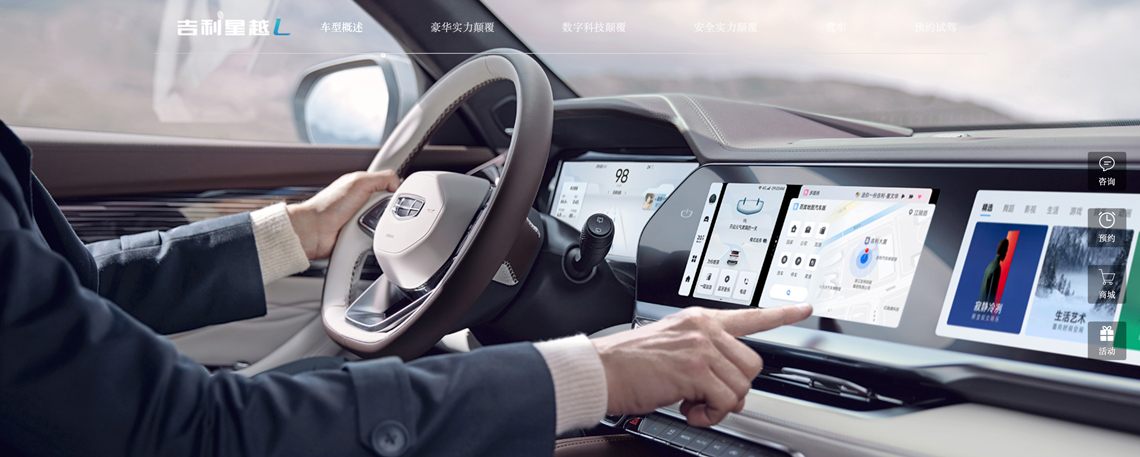
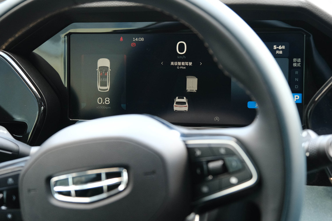
The commissioned typeface was to be used in printed and digital advertisements and in the user interface of the cars, including the dashboard, the infotainment system, and the physical switches themselves. The objectives were: deliver excellent legibility both in terms of speed and efficiency, provide support for the brand, and graciously match its Chinese counterpart.
The project as it was commissioned required not the design but the re-design of an existing font. That said, the corrections and changes were so numerous that we immediately knew we had to draw the new typeface from scratch while trying to maintain certain traits.
Matching different scripts is not a simple task but in our case it was a purely technical one. We had to match size, weight, and stroke modulation. The other two goals, however, seemed to point in opposite directions and posed a design problem that would stay with us and our clients throughout the entire font development process. It became obvious that we needed to find a compromise between two extremes: either to remain close to the wordmark and sacrifice legibility, or to create a more modern and design-oriented look and feel that would depart from the brand style.
With these two opposite extremes in mind we attacked the design space and produced an array of lettershape variations in search of something TypeTogether has been doing since its beginning: an informed and modern hybrid with a classic soul.
How square can a circle be?
Type designers play a black and white game that has a well defined set of rules. We can add or remove serifs, make shapes bolder or lighter, modify and even reverse the stroke contrast, and more. But we must respect the underlying letter structure or we run the risk of it not being able to be read.
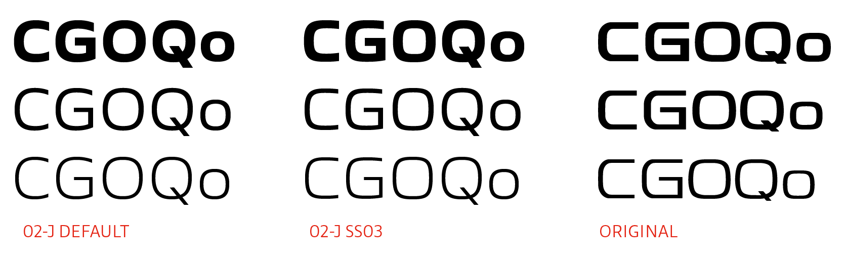
In this sense the Latin alphabet has four kinds of shapes: triangular (K V Y), square (H E D), round (O C G), and the oddballs (S Z J). These shapes have evolved with the centuries and are now part of the cultural fabric of — at the very least — the Western world. How much can we change a letter like ‘O’, making it more and more square, until it gets mistaken for ‘D’? Some designers have theorized that a letter can only be changed 5–15% before it’s indistinguishable from another letter.
We made countless iterations, tweaking the tension of round shapes to find the right balance in our design space. The goal was to make letters like ‘G, O, C, S’ slightly stiff while keeping them in tune with a highly legible lowercase alphabet. The final design is better shown in images than described in words.
Goals: exceeded
We delivered three weights ranging from extralight to bold, and an additional cut intended only for physical switches and buttons. The fonts include proportional and tabular figures which are necessary for the various dials and information sections of the displays. Furthermore, we developed a special set of wider numbers with a sportier look and feel to be used solely on the speedometer.
The readability and legibility goals were accomplished and the typeface clearly references the Geely logo without becoming a literal copy of it. The final uppercase letters are slightly more squarish than the lowercase to create a more rigid and mechanical appearance in all caps typesetting, a situation that repeats itself over and over on most car dashboards.
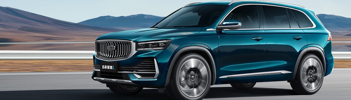
The final fonts were delivered to Geely in 2019 but we had to wait until the summer of 2021 to see them in action. It was worth the wait! The new flagship SUV, Geely Xingyue L, presented in July 2021 is already using the new Geely fonts in its navigation and entertainment display. Not only that, the Xingyue L is the first model to run Geely’s newest operating system, the Milky Way OS.
Credits: all interior photographs of Xingyue L model courtesy of Yiwei Chen.
TypeTogether is an indie type foundry committed to excellence in type design with a focus on editorial use. Additionally, TypeTogether creates custom type design for corporate use. We invite you to browse our library of retail fonts or contact us to discuss custom type design projects.