The story behind Alverata

December 2013

Inspiration for the Alverata type family comes from inscriptional Romanesque capitals and movements in the arts and design of the 20th and 21st century. Alverata takes many cues from historical examples, but does not mimic them. Elements of Romanesque letterforms still function today, and are embedded in a present-day approach to type design.

 
Part of the shrine of St Isidore, depicting the creation of Adam, in the treasury of the San Isidoro in León, Spain. Before 1063

1. Part of the shrine of St Isidore, depicting the creation of Adam, in the treasury of the San Isidoro in León, Spain. Before 1063


The inscriptions of the Romanesque period (from roughly 1000 ad until the early thirteenth century) show letterforms employed with great originality and in extraordinary variety, chiseled in stone, painted on walls, engraved in metal and executed in other ways (1, 2, 3). What turned these letterforms into Romanesque capitals was the mixing and matching of characters from three different scripts: the medieval descendants of the Roman capitalis quadrata, a series of uncials, and Insular letterforms. The angular versions of rounded letters belong to Insular art, the mixture of mainly Irish Celtic elements with Anglo-Saxon forms and motifs. The uncials arose in the fourth century in the Mediterranean area, probably in North Africa. In 597 uncials were brought to England by St Augustine, a Roman monk at the head of a group of missionaries.


Part of the tympanum of St Foy

2. Part of the tympanum of St Foy, the pilgrimage church at Conques, in southern France, depicting heaven, 1130–35.


Late Romanesque capitals in a mural from the Akataleptos monastery in Constantinople

3. Late Romanesque capitals in a mural from the Akataleptos monastery in Constantinople, in the Archaeological Museum of Istanbul. Before 1250.

Important characteristics of Romanesque capitals

The uncials were combined with the descendants of the Roman square capitals and the angular Insular forms and taken together to the European continent, first by Hiberno-Scottish monks in the first half of the seventh century. It is probable that uncials also penetrated north of the Alps through the agency of clergy travelling between Rome and northern Europe. Towards the end of the seventh and in the eighth century Anglo-Saxon missionaries such as St Boniface and St Willibrord also took the mixture of the three scripts with them; this then spread widely through monasteries such as the abbey at Echternach. The mixture was first applied and further developed in manuscripts, wherein written letterforms with the characteristics of the Romanesque capitals can be found between 950 and 1000 ad (4). The three sorts of letter were adapted to each other in terms of proportions and detailing. Important features of the Romanesque capitals in inscriptions include low stroke con­trast (little difference between thick and thin parts), gradual transitions from thick to thin, straight parts widening toward their ends, and small, triangular serifs (5, 6a, b).


Page from the Ansfridus Codex, f 120, Museum Catharijneconvent, Utrecht.

4. Page from the Ansfridus Codex, f 120, Museum Catharijneconvent, Utrecht. Made in St Gallen between 950 and 1000.


5. Important characteristics of Romanesque capitals in inscriptions: slight differences between thick and thin parts; gradual transitions from thick to thin parts; straight parts that widen towards their end and have short triangular serifs.


Intriguing Variations

Romanesque capitals were varied endlessly. The letters were reversed, joined to­gether to make ligatures and were intertwined, small examples being nested — placed inside or alongside the capitals — and both letters and the spaces between them would often be widened or narrowed, often to fit text into the space available, but sometimes for no apparent reason. The most intriguing of these variations is the seemingly random positioning of Insular letterforms and uncials in a text (6a, b).


6a, b.  Details of four reliefs at the Pieterskerk, Utrecht. Probably made near Maastricht shortly after 1148. The main characteristics of the Romanesque capitals in inscriptions are clearly visible here. The occurrence of variant letterforms is illustrated by the tree M’s in mulierum mens, the three T’s in devota putat, and the two U’s in mulierum. The second, reversed, U is a form that is often found in the work of Romanesque letter carvers. Elsewhere the L in mulierum is noticeably wide and the N in mens rather narrow.


By no means did all these variations occur in every inscription. The angular variants of round letters and the uncials were never evenly distributed, nor were they in constant use. At the beginning of the twelfth century the angular versions of round letters began to lose ground, and in the second half of the century they became positively rare. Uncials took longer to be regularly used in inscriptions than angular variants, but were used through­out the Romanesque period before ultimately evolving into the gothic capitals.

The positioning and distribution of Insular letterforms and uncials, while irregular, was almost certainly done deliberately. Variation, varietas (1), was fundamental to Romanesque art and architecture. It included the deliberate use of older architectural parts, as can be seen, for example, in the exterior walls of Pisa cathedral. In Romanesque sculpture, varietas occurs for example in historiated capitals, as in the famous cloister at Moissac in Southern France, probably to counteract boredom among monks. The monotony of monastic life might also be relieved by variety in reading: ‘one should read now things new or then old, now obscure, then plain … now something serious, then something lighthearted’ (Peter of Celle). Augustine of Hippo (354–430), among others, connected varietas and diversitas, referring not to the ‘fitness’ of the elements together as a whole, but to their great differences which are nonetheless brought together, an apt description of the uses of Romanesque letterforms, and especially of their continuously changing positions in text.

7. Gilt copper plate, part of a large gold cross, c. 971. Treasury of Essen cathedral. The inscription mentions an abbess Ida (see Fillitz (1993) pp. 392–3). Notable letters include flattopped A, wide B whose intersecting round strokes do not meet the vertical stroke, uncial E, S slanting to the left, M with short diagonals and R with a double-curved leg. These letterforms are early Romanesque, or, following German terminology, Ottonian.


8. Detail of bronze door, Bonanno Pisano, Monreale cathedral, Sicily, 1186.


The irregular positioning of letterforms may also be connected with the medieval interest in language games. This interest can be seen, for example, in leonine verse which has a characteristic internal rhyme pattern. The texts of many Romanesque inscriptions take this form. Possibly the irregular positioning of the alternative letterforms functioned as a mnemonic device, serving to make the reader pay attention, so that texts were better remembered. And there are several other explanations for the irregular positioning and distribution of letterforms.

In general, multiformity appears to have been important to the medieval mind. Artisans almost certainly took pleasure in letterform variety, in the positioning and distribution of existing forms, and in the creation of new ones. Play with letters and with the language they served was part of a larger context of Romanesque art and architecture, which was also characterized by inventiveness and variation in the eleventh and twelfth centuries.

modern influences

The modern influences on the design of Alverata stem from twentieth-century movements in the arts and design and from several recent developments. Whereas type design in the twentieth century was based in part on historical models, there was also enthusiasm for the future, with some — notably the Futurists themselves — dismissing the past as irrelevant. Proposals for renewal, leading to Modernism, went neck to neck with the appreciation of history that was at the heart of Modern Classicism.

Modernism was an international and many faceted movement, with, for example, as components Russian Constructivism and De Stijl in the Netherlands. The movement was inspired by social changes, such as the Russian revolution of 1917, and by developments of technology, for example of film and photography, or of the car and the plane – changes and developments which had far reaching cultural consequences as well. Modernist typography was especially influential in Northern Europe, with, among many others Piet Zwart (1885–1977), from the Netherlands, or Bauhaus teachers such as László Moholy-Nagy (1895–1946) and Josef Albers (1888–1976). Futura (1927/8) by Paul Renner (1878–1956) is an important modernist type design. Jan Tschichold (1902–1974) was also very inlfuential, with his book Die neue Typographie, from 1928. The modernist’s optimism and desire for renewal have marked his outlook on type design.

After a rough encounter with Nazism in 1933, Tschichold made an about-turn, became a modern classicist and an ally of, for example, Stanley Morison (1889–1967), the spiritual father of Times New Roman (1931). Often, Modern Classicism is associated especially with revivalism in typography, with type designs like the Golden Type (1891), designed by Emery Walker (1851–1933) for William Morris (1834–1896) or Bembo (1929) by the Monotype Corporation. In fact it was a widespread movement, manifest in the arts, architecture and, for example, fashion. Antoine Bourdelle (1861–1921) and Aristide Maillol (1861–1944) were modern-classicist sculptors, Pablo Picasso (1881–1973) made modern-classicist work after the First World War, depicting, for example, minotaurs. The fashion designs of Madame Grès (1903–1993) belong to this movement as does the work of the Dutch type designer Jan van Krimpen (1892–1958). His influence on Dutch type design reached far into the twentieth century and can be found in Unger’s early work. During his design education (1963–1967) he was taught by the modern classicist Theo Kurpershoek (1914–1998), as well as the modernist Charles Jongejans (1918–1995).


9. Blue curve vi, Ellsworth Kelly, 1982. Stedelijk Museum, Amsterdam.


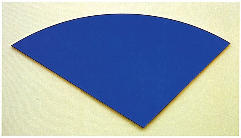
One aspect of modern art which had a lasting influence on Unger's designs is pure form, as a consequence of reduction and abstraction. Artists, such as the sculptors Constantin Brancusi (1867–1957) and Alexander Calder (1878–1976), have left many examples, as has, among others, the painter Ellsworth Kelly (1923). His Blue Curve (1982) (7) and drawings of plants and leaves can be related to the shapes of the spaces within and between Unger's letters, as well as with parts of the letters themselves.

Apart from being influenced by movements in the arts and design, twentieth-century type designers were often in search of purely practical solutions, such as fitting out type to survive the heavy conditions of newspaper production, or making type simple, sturdy and friendly, for example for early readers. Taken together, such solutions can be labeled as ‘typographical pragmatism’ — a view of the field whose effects can also be discerned in his work. Excelsior (1931), by Chauncey Griffith (1879–1956), is an example of this pragmatic approach, as is Century Schoolbook (1923) by Morris Fuller Benton (1872–1948). The design of Alverata is also influenced by the work of some famous predecessors, such as William Addison Dwiggins (1880–1956, e.g. Electra, 1936) and Roger Excoffon (1910–1983, e.g. Antique Olive, 1960–70).

After 1945 Modernism and Modern Classicism were often intermingled, but the old tenets continued to survive and towards the end of the fifties Modernism made a comeback. Under the influence of societal change, this revitalized Modernism came to be overshadowed by much more informal typography, boosted by the arrival of, for example, small printing machines, during 1970s. This trend was in turn reinforced by the arrival of small computers which could run programs that enabled the owner to create not only his own types, but also his own complete graphic design. What followed was a constant succession of approaches to type design, typography and graphic design, culminating in the final decade of the twentieth century with the virtual abandonment of established typographical patterns.

Following the waning of this movement at the beginning of the twenty-first century, it is possible to discern a number of principal currents in type design. Many designers today are continuing to take complete ownership of the letterforms and subject them to far-reaching personal rearrangement. Meanwhile, however, individual inter­ests have been joined by growing interest in collaboration between de­signers and extending typographic combinations, for example bringing together scripts from differing cultures — Asiatic, say, together with Latin. Alongside undiminished interest in classical serifed types, sans serifs, often neutral in character, steadily gain ground. We have custom types: fonts, designed for businesses and organizations.

There is also the ‘early twenty-first-century model’, whose letters have been brought closer together in the horizontal dimen­sion, some narrow letterforms being widened and some wide letters being narrowed. The difference between thick and thin is slight, and the serifs are usually short and sturdy. To these basic characteristics designers often add strong, personal features. The advantage of letterforms like these is that they can work throughout the spectrum from very large to very small sizes, plus they can be used with virtually all technologies and in every medium: from ink jet and laser printers to high-quality offset; on smooth and rough paper; and on monitors and displays both old and new, big and small. It is a robust and flexible model whose origins lie in the twentieth century, for example in typewriter and newspaper faces. Since the beginning of the twenty-first century it has increasingly been the starting point for type designers.

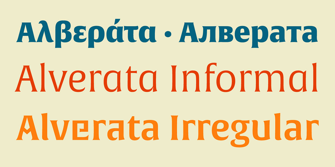
The large type family is another important development. Serifed letterforms and sans serifs have been combined and mixed from early in the twentieth century. Now, not only are different scripts joined, such as Latin, Greek, Cyrillic or Devanagari, but also formal, informal and even unconventional versions. The concept of the large type family is sometimes the subject of experimentation, as, for example, having a combination of several italics only, upright and slanted, condensed and wide.(2)

Yet there is at present (2014) no single main development, no dominating style. Type design goes, like all design, in many different directions, often as individual approaches and as experimentation. The experiments are aimed at answering questions such as: will the continuing migration by readers from paper to screen change reading habits and perhaps letterforms as well, or: is it possible to design small and very legible letterforms for substantial amounts of text on the screens of mobile devices?

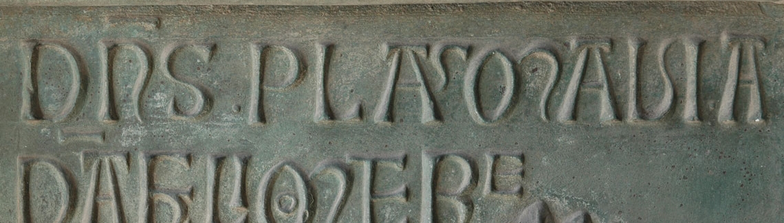
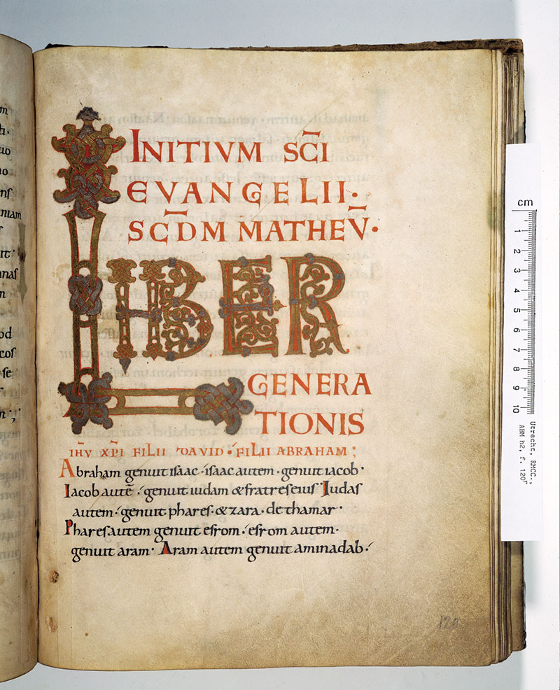
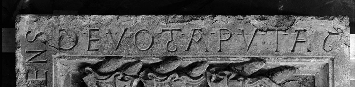
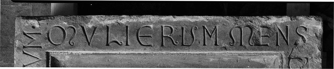
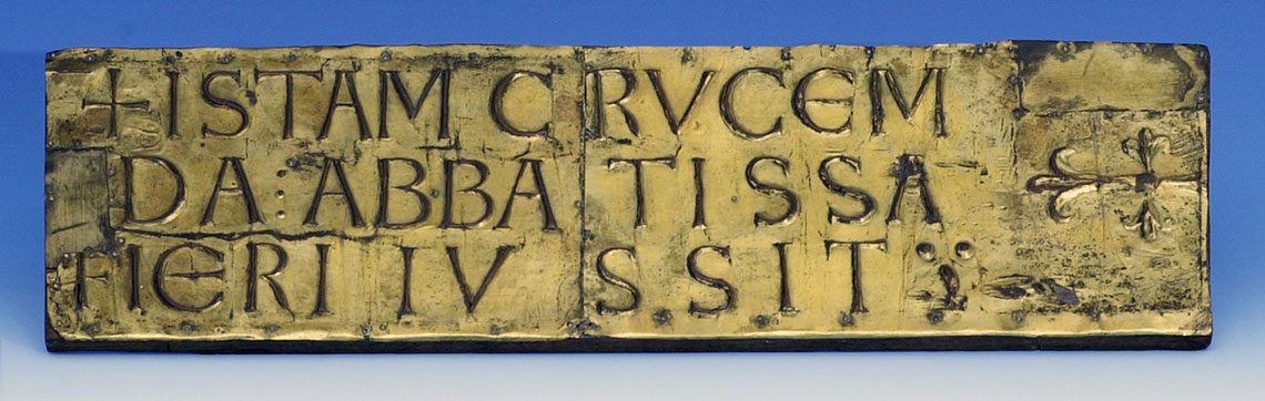
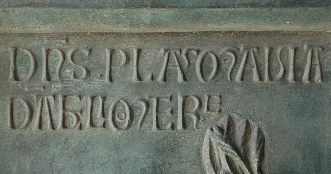
With its Incises class, Maximilen Vox’s (1894–1974) typeface classification (1954) offers the surprising possibility of bringing Romanesque and modern letterforms together in a single category and a single design. Incises (or glyphic letterforms) are reminiscent of letters chiseled in stone. It is a small group of type designs, including Albertus (1938) by Berthold Wolpe (1905–1989) and Optima (1958) by Hermann Zapf (1918). Unger's early work Amerigo (1986) fits into this category too.

10. The three families available within the Alverata type system.


alverata typeface

The characteristics of the early twenty-first-century model go together well with the main features of the Romanesque carved letterforms: Alverata has a large x-height and is slightly condensed. Its letterforms are robust, yet with refinement in many details, for example where curves meet straight parts, and at the ends of curved parts. The large interior spaces of the letters and the taut curves show the designer’s personal preferences and echo modern art’s pure forms. It’s historical ties link Alverata to Modern Classicism.

Alverata serves a wide readership. It is a large type family, with an Informal variant and an experimental version, the Irregular. In this sub-family the Romanesque convention of seemingly arbitrary positioning of alternative letterforms in text is brought to life again. In conventional Latin script lower-case letterforms curves and rounds prevail, whereas in the capitals straight lines and angles dominate. In Alverata Irregular these  characteristics have been exchanged, and a number of unusual alternative forms have been created, such as an angular e and u.(3) This part of the design of Alverata was also an opportunity for an investigation into exactly how far convention within the Latin script can be stretched without disturbing the readers with unfamiliar details.

Alverata Cyrillic

Alverata Greek


About Us

TypeTogether is an indie type foundry committed to excellence in type design with a focus on editorial use. Additionally, TypeTogether creates custom type design for corporate use. We invite you to browse our library of retail fonts or contact us to discuss custom type design projects.