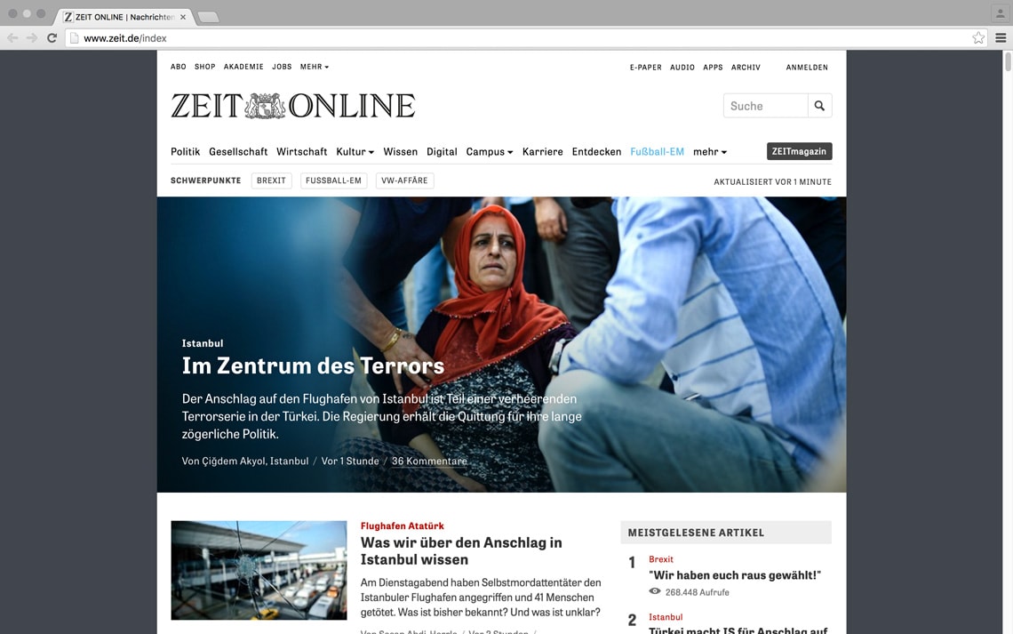
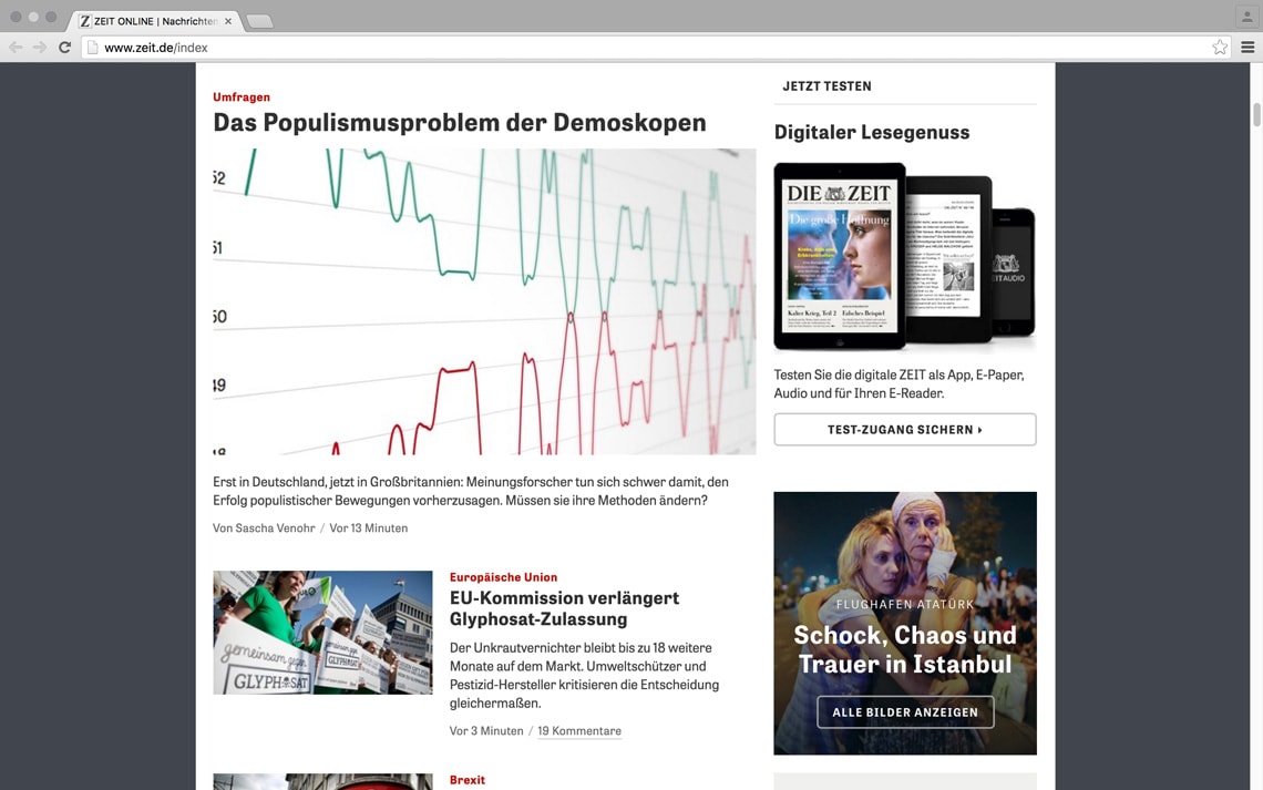
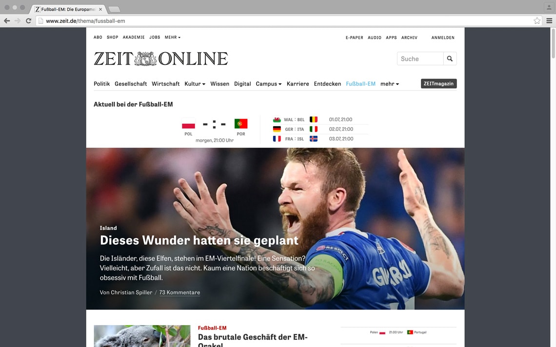
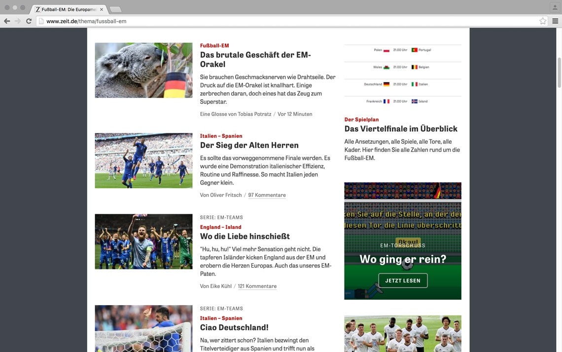
Die Zeit

February 2016

The online edition of Die Zeit, one of the largest weekly German newspapers, has been redesigned and updated during the last two years. The digital edition is using Tablet Gothic for all headline, sub headers, short texts and menus.


responsive design

The design is now fully adapted to responsive design on any screen size and platform. In addition, the digital version of the supplement, ZEITmagazin Online, designed by the German agency Edenspiekermann, is also using Tablet Gothic. According to Florian Hardwig, in Fonts in use, ‘the resulting reading experience is remarkable.’ 


About Us

TypeTogether is an indie type foundry committed to excellence in type design with a focus on editorial use. Additionally, TypeTogether creates custom type design for corporate use. We invite you to browse our library of retail fonts or contact us to discuss custom type design projects.