Typefaces for small text

January 2017

Seasoned designers know that a typeface’s size plays a critical role in its ability to be read easily. The smaller text is, the more its characteristics must be emphasised for it to look the same as it does at normal reading sizes. It’s a good idea to have a few go-to faces for minuscule type, and we’ve got just the thing.

Great fonts for small sizes


Early punchcutters already knew most of the tricks 500 years ago: the human eye can always use a bit of help when it comes to very small text. That is why their agate, nonpareil, and minion sizes featured large x-heights, wide proportions, robust serifs, low contrast, and rather loose letter fitting. They understood these characteristics improved the recognition of words and therefore facilitated legibility.

The fact is that for most typefaces legibility can drop drastically when they are used smaller than 9 points. That is when the crispness in printing — or rendering — and good glyph design choices take the front seat to drive the content to the reader. Unless glyphs and their details are made more pronounced at these sizes, legibility is severely hampered.

If we think about it more closely, small typography is more frequent than we probably realise. It appears on the back of all your utility bills and on the packaging of any medication, cleaning, or food product we buy. Furthermore, it is on the warranty of all consumer electronic products and used for the fine print of virtually everything we sign. Small text is very important and its use goes well beyond phone directories and classified ads.

In conclusion, TypeTogether recommends double-checking that your fine print really is fine. Every designer’s type library should have at least a few good typefaces specifically designed for small print. We have selected three from our catalogue for this purpose: Cora, Lipa Agate, and Edita. Read on for a better understanding of how these type families make the fine print fine.


cora

Cora is a sans serif by Bart Blubaugh that excels in legibility by offering an extra-large x-height, some stroke contrast, and capitals inspired by classical lettering. Because the letters seem large and slightly wide, Cora remains clear at smaller point sizes, giving its voice a little more volume so those in the back of the room have no trouble hearing.

Engineered to perform well on screen without losing its attraction in print, the forthright nature of Cora’s shapes allows for condensation or expansion without becoming severely distorted. Yes, you read that correctly: you can mechanically compress this font. It was built for that! Cora was awarded the first prize for Latin text typeface in the 2008 Granshan Type Design Competition.

Get the Cora family (includes 6 fonts)


edita small

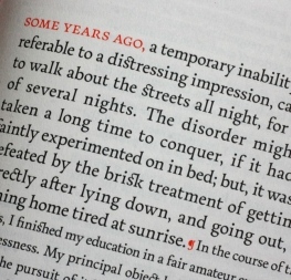
Pilar Cano’s Edita is humanist in concept but with a contemporary feel where softness and fluidity play a very important role. This family is originally intended to be used in books and magazines where text is set together with photographs and other graphic elements. However, it is versatile enough to be used in many other contexts, from novels to promotional material.

So why are we featuring it in this article? Because Edita includes two styles specially engineered for small sizes that defy the very physics of printing. With a taller x-height, heavier stems, reduced contrast, and carefully drawn inktraps, Edita Small guarantees legibility at sizes as small as five points. Edita was selected for the 2010 exhibition ‘Lletres de Barcelona’ and featured in Typography Served II. In 2011, it received a Typography Award by Communication Arts.

Get the Edita family (includes 8 fonts)


lipa agate

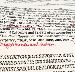
With its release in 2014, Ermin Međedović’s Lipa Agate rewrote the book on microtypography, and it did so by setting clear type at 4-point text. Lipa Agate does much more than composing good and legible text at the smallest of scales, it can do the same on newsprint, setting the bar as high as it gets regarding small text.

Lipa Agate features two primary versions, High and Low, which differ in the lowercase x-height and ascender height but keep the same width. It also has three different levels of condensations with four weights each, for a toolbox of 24 fonts engineered to deliver fine print at its best. Lipa Agate won Silver for Original Typeface in the 2014 European Design Awards and a Diploma in Rutenia 2014. It was also featured in three ‘Best of 2014’ lists.

Get the Lipa Agate family (includes 24 fonts)


About Us

TypeTogether is an indie type foundry committed to excellence in type design with a focus on editorial use. Additionally, TypeTogether creates custom type design for corporate use. We invite you to browse our library of retail fonts or contact us to discuss custom type design projects.