A low-contrast serif that is warm and even in complex settings.
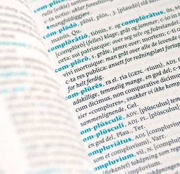
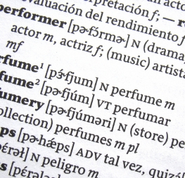
Sirba is Nicolien van der Keur’s low-contrast, high-functioning serif family. Sirba was designed with a friendly personality specifically to serve the high demands of complex text environments like dictionaries, academic texts, annual reports, novels, and magazines. Sirba’s design was guided by in-depth research of letterpress printed Bibles and dictionaries, particularly concerning readability in small point sizes.
Sirba has a classic touch revealed by its beauty in such design details as the asymmetrical bottom serifs, curved bracketing, and terminals with calligraphic undertones. Because of its open counters, large x-height, and short ascenders and descenders, it provides a pleasant reading experience and high legibility even in texts of demanding scope. Furthermore, annual reports and tables benefit from the low cap height and consistent width of the tabular numerals between the weights.
Sirba is available in the four basic styles plus a Black version, which is unique in that its proportions are designed so the counters remain prominent enough for excellent legibility when set in very small text sizes. Since the stem width is twice as thick as the Regular weight, Sirba Black’s spacing and letter width are rather generous in comparison to other typefaces of the same weight. Much attention was given to the italic and roman as equal counterparts while designing the type family. The italic distinguishes itself just enough without creating unevenness when looking at the text as a whole. To get a sense of Sirba’s personality, look at the flame-like interrobang and question mark or the artistic paragraph and section symbols.
Sirba has five styles and its character set covers over 50 languages that use the Latin script, plus polytonic Greek (consultation by Irene Vlachou and Gerry Leonidas), a full set of IPA symbols for phonetic pronunciation, and support for Cyrillic, including Bulgarian alternates (consultation by Kiril Zlatkov). It also includes many OpenType niceties such as a set of arrows, ornaments, extended ligatures, small caps, five sets of numerals, and more. Taken together, these characteristics make Sirba a great choice for handling important information in an enjoyable way.
The complete Sirba family, along with our entire catalogue, has been optimised for today’s varied screen uses.